CULTURA E SCIENZA DEL COLORE - IRIS ...
←
→
Trascrizione del contenuto della pagina
Se il tuo browser non visualizza correttamente la pagina, ti preghiamo di leggere il contenuto della pagina quaggiù
CULTURA                      COLOR
                                                                     E SCIENZA                     CULTURE
                                                                   DEL COLORE                      AND SCIENCE
                                                                       Rivista dell’Associazione Italiana Colore
                                                                                  www.gruppodelcolore.it

                                                                                  DOI: 10.23738/CCSJ.I62016.00
rivista semestrale | half-yearly journal | DOI: 10.23738/CCSJ.00

                                                                                                                   06
                                                                                                                   16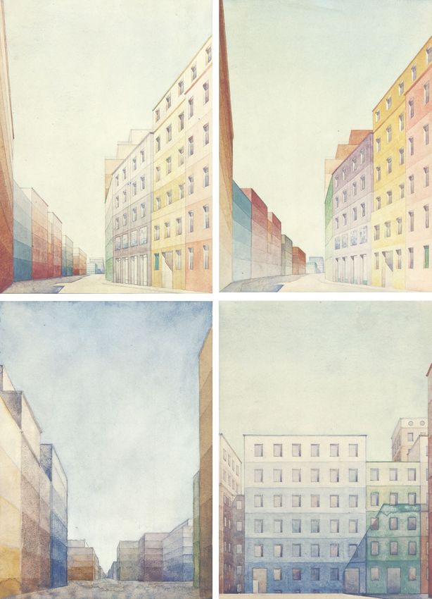
CULTURA E SCIENZA DEL COLORE                                                                        NUMERO 06 - NOVEMBRE 2016
COLOR CULTURE AND SCIENCE                                                                           NUMBER 06 - NOVEMBER 2016
Rivista dell’Associazione Italiana Colore
http://jcolore.gruppodelcolore.it/
ISSN 2384-9568
DOI: 10.23738/CCSJ.00                                                                               DOI: 10.23738/CCSJ.I62016.00

DIRETTORE RESPONSABILE | EDITOR-IN-CHIEF
Maurizio Rossi

VICEDIRETTORE | DEPUTY EDITOR
Davide Gadia

EDITORIAL BOARD MEMBERS
John Barbur (City University London, UK)                                   Manuel Melgosa (Universidad de Granada, ES)
Berit Bergstrom (NCS Colour AB, SE)                                        Anna Grazia Mignani (IFAC-CNR, IT)
Giulio Bertagna (B&B Colordesign, IT)                                      Annie Mollard-Desfour (CNRS, FR)
Janet Best (Natific, UK)                                                   Maria Luisa Musso (Universidad de Buenos Aires, RA)
Aldo Bottoli (B&B Colordesign, IT)                                         Claudio Oleari (Università degli Studi di Parma, IT)
Patrick Callet (École Centrale Paris, FR)                                  Galina Paramei (Liverpool Hope University, UK)
Jean-Luc Capron (Université Catholique de Louvain, BE)                     Laurence Pauliac (Historienne de l’Art et de l’Architecture, Paris, FR)
Osvaldo Da Pos (Università degli Studi di Padova, IT)                      Marcello Picollo (IFAC-CNR, IT)
Bepi De Mario (CRASMI, IT)                                                 Renata Pompas (AFOL Milano-Moda, IT)
Hélène DeClermont-Gallernade (Chanel Parfum beauté, FR)                    Boris Pretzel (Victoria & Albert Museum, UK)
Reiner Eschbach (Xerox, USA)                                               Noel Richard (University of Poitiers, FR)
Alessandro Farini (INO-CNR, IT)                                            Katia Ripamonti (Cambridge Research System, UK)
Christine Fernandez-Maloigne (University of Poitiers, FR)                  Alessandro Rizzi (Università degli Studi di Milano, IT)
Renato Figini (Konica-Minolta, EU)                                         Maurizio Rossi (Politecnico di Milano, IT)
Davide Gadia (Università degli Studi di Milano, IT)                        Jodi L. Sandford (Università di Perugia, IT)
Robert Hirschler (Serviço Nacional de Aprendizagem Industrial, BR)         Raimondo Schettini (Università degli Studi di Milano Bicocca, IT)
Sandra Krasovec (Fashion Institute of Technology, USA)                     Gabriele Simone (ST Microelectronics, IT)
Francisco Imai (Canon, USA)                                                Andrea Siniscalco (Politecnico di Milano, IT)
Lia Luzzatto (Color and colors, IT)                                        Ferenc Szabó (University of Pannonia, HU)
Kevin Mansfield (UCL, UK)                                                  Mari UUsküla (Tallinn University, EE)
Veronica Marchiafava (IFAC-CNR, IT)                                        Francesca Valan (Studio Valan, IT)
Gabriel Marcu (Apple, USA)                                                 Ralf Weber (Technische Universität Dresden, DE)
                                                                           Alexander Wilkie (Charles University in Prague, CZ)
PEER REVIEW PROCESS
Tutti gli articoli inviati alla rivista “Cultura e Scienza del Colore -    All articles submitted to “Cultura e Scienza del Colore - Color
Color Culture and Science” sono sottoposti ad un processo di               Culture and Science” journal are peer-reviewed according to the
revisione secondo la seguente procedura:                                   following procedure:

PRIMA REVISIONE                                                            FIRST REVIEW
La Commissione degli Editori Associati valuta ogni articolo per            The Associate Editors Committee evaluates each article in order
determinare se il tema e il contenuto sono di interesse per la rivista     to define if topic and content is suitable for consideration by the
“Cultura e Scienza del Colore - Color Culture and Science”. Una            “Cultura e Scienza del Colore - Color Culture and Science” journal.
volta selezionati gli articoli, la Commissione degli Editori Associati     Once the article pass the initial review, the Associate Editors
seleziona una serie di revisori scegliendoli in base all’esperienza        Committee selects several referees based on their expertise in the
degli stessi in un particolare settore disciplinare o tema.                particular field or topic.

SECONDA REVISIONE                                                          SECOND REVIEW
Ogni articolo è revisionato da due revisori in un processo in cui essi     Each article is reviewed by two referees under a double-blind peer
stessi e gli autori sono mantenuti anonimi. Ai revisori è chiesto di       review process where the authors and the reviewers are kept
valutare l’articolo considerando la sua originalità, la metodologia        anonymous. Referees are asked to evaluate the manuscript based
applicata e l’impatto sulla ricerca o sulla pratica professionale.         on its originality, methodology and impact to research and relevance
Dopo aver raccolto i commenti dei revisori, il consiglio di redazione      to the professional practice. After collecting the referees’ reports,
elabora ed invia al direttore responsabile un giudizio riassuntivo         the editorial board makes a recommendation on the acceptability
sull’accettazione o meno dell’articolo al direttore responsabile.          of the article to the Editor in Chief.

COLLABORATORI | CONTRIBUTORS
Valeria Biasi, Letizia Bollini, Paolo Bonaiuto, Alessio Cardaci, Tiziana
Cavaleri, Isabelle Clonier, Fabio Colonnese, Paola Croveri, Osvaldo
da Pos, Annamaria Giovagnoli, Chiara Gregoris, Michela Lecca,
Giulia Pellegri, Anna Piccirillo, Renata Pompas, Antonella Versaci
                                                                                                                       GRUPPO DEL COLORE
                                                                                                                       ASSOCIAZIONE ITALIANA COLORE
REDAZIONE | ASSOCIATE EDITORS
Aldo Bottoli, Daria Casciani, Davide Gadia, Veronica Marchiafava,
Alessandro Rizzi, Francesca Valan                                                                                     CULTURA E SCIENZA DEL COLORE
                                                                                                                        COLOR CULTURE AND SCIENCE
EDITORE | PUBLISHER                                                                                                    Rivista dell’Associazione Italiana Colore
Gruppo del Colore – Associazione Italiana Colore                                                                     Registrazione presso il Tribunale di MIlano
www.gruppodelcolore.it                                                                                                                 al n. 233 del 24.06.2014
06                       SOMMARIO | SUMMARY

     ENGLISH | ITALIAN   Editorial                                                                                5
                         by Maurizio Rossi

                         Chromatic gradation as a symbolic and spatial device in the                              7
                         European context: Piero Bottoni’s Cromatismi architettonici
                         La gradazione cromatica come dispositivo simbolico e volumetrico nel contesto europeo:
                         i Cromatismi architettonici di Piero Bottoni
                         by Fabio Colonnese

                         The restoration of color in the French historic cities:                                  23
                         approaches, methods and experiences
                         Il restauro del colore delle città storiche francesi: approcci, metodi ed esperienze
                         by Antonella Versaci, Alessio Cardaci

                         Colour and light in communication of fabric façades                                      37
                         Il colore e la luce nella comunicazione delle facciate tessili
                         by Chiara Gregoris

             ENGLISH     Emotional Qualities of Colours Added to Humorous 47
                         Illustrations
                         by Valeria Biasi and Paolo Bonaiuto

                         Topos vs. Iris. Colour design in Web 3.0 mobile app and OS: 53
                         a critical review
                         by Letizia Bollini

                         Chromatic and decorative                        planning choices: geometry, 61
                         knowledge and survey
                         by Giulia Pellegri

                         Colorimetric and spectrophotometric analyses for an 71
                         ecoinnovative application of natural dyeing in textile
                         conservation
                         by Tiziana Cavaleri, Isabelle Clonier, Paola Croveri, Annamaria Giovagnoli, Anna
                         Piccirillo

              REVIEW     Food, colour and art                                                                     80
                         by Renata Pompas

            COLOUMN      Communications and Comments                                                              82
                         by Michela Lecca and Osvaldo da Pos
7

Chromatic gradation as a symbolic
                                                                                                                                            1
                                                                                                                                             Fabio Colonnese
                                                                                                                                            fabio.colonnese@uniroma1.it

and spatial device in the European                                                                                                          1
                                                                                                                                             Department History, Drawing,
                                                                                                                                            and Restoration of Architecture

context: Piero Bottoni’s Cromatismi                                                                                                         Italian translation provided:
                                                                                                                                            ‘La gradazione cromatica come

architettonici                                                                                                                              dispositivo simbolico e volumetrico
                                                                                                                                            nel contesto europeo: i Cromatismi
                                                                                                                                            architettonici di Piero Bottoni’

ABSTRACT
In 1926, the young Piero Bottoni painted a series of watercolor studies entitled
Cromatismi architettonici. They are almost unique in the Italian urban studies, proposing
color gradations as a key to “symphonic” orchestrating the redevelopment of urban
street fronts. This article puts Bottoni’s proposal in relation not only to Le Corbusier’s
contemporary research, with whom he had a correspondence, but also to some
contemporary experiences in Europe concerning the use of color gradations in
architecture. Later, it analyzes the watercolor perspectives, the far-from-ideal city to
which they were addressed and their potential illusory and regenerative outcomes.
Finally, this article proposes a digital edition of the drawings, by means of a color
interpretation procedure that provides the basis for an application of Cromatismi on
a portion of the urban facades of Via Roma, Milan. This result, obtained through
chromatic treatments of a photography, not only explicit the visual outcomes of
Cromatismi in a photographic vision but it highlights a number of technical and
operational issues that would have strongly affected the realization of such a color
project. Nevertheless, time has proven that many of Bottoni’s intuitions were valid
for the purpose of color plans, occasional redevelopment of slums and precise
perceptual effects in architecture.

KEYWORDS
Piero Bottoni, Cromatismi Architettonici, Color plan, Perception of architecture,
Digital Photography model, Chromatic gradations in architecture

Received 25 November 2015; Revised 30 May 2016; Accepted 30 September 2016

CITATION: Colonnese F. (2016) ‘Chromatic gradation as a symbolic and spatial device in the European
context: Piero Bottoni’s Cromatismi architettonici’, Cultura e Scienza del Colore - Color Culture and
Science Journal, 06, pp. 07-22, DOI:10.23738/ccsj.i62016.01

Fabio Colonnese is architect, draftsman and Ph.D. in Drawing and Survey of Architectural Heritage at Sapienza University of Rome,
Italy, where he also taught geometry, survey and drawing of architecture. He wrote Il Labirinto e l’Architetto (2006), Movimento Percorso
Rappresentazione (2012), and a number of articles on the topic of representation of architecture, city, and landscape.

Cultura e Scienza del Colore - Color Culture and Science | 06 | 2016                                                  ISSN 2384-9568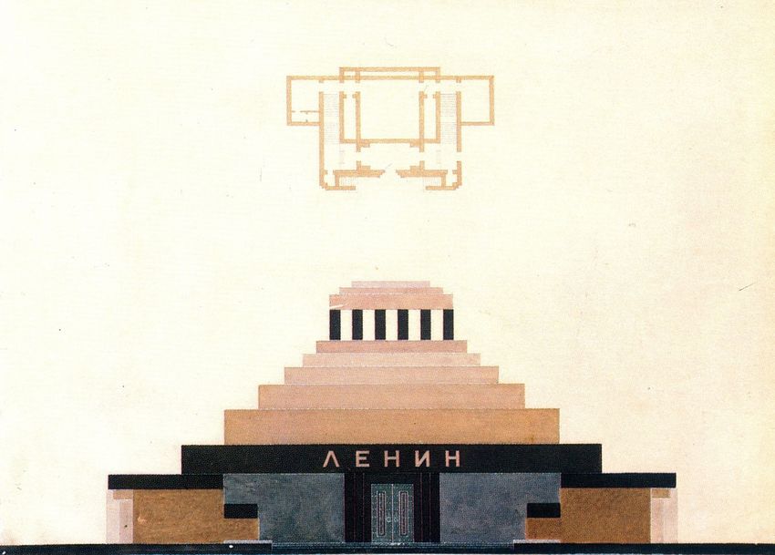
8   DOI:10.23738/ccsj.i62016.01                                                                                Colonnese F.

        There is another kind of perspective which I                  “Evvi un’altra prospettiva, la quale chiamo
        call aerial, because by the difference in the                 aerea imperocché per la varietà dell’aria si
        atmosphere one is able to distinguish the                     possono conoscere le diverse distanze di varî
        various distances of different buildings when                 edifici terminati ne’ loro nascimenti da una
        their bases appear to end on a single line, for               sola linea, come sarebbe il veder molti edifici
        this would be the appearance presented by                     di là da un muro che tutti appariscono sopra
        a group of buildings on the far side of a wall,               l’estremità di detto muro d’una medesima
        all of which as seen above the top of the wall                grandezza, e che tu volessi in pittura far parer
        look to be the same size; and if in painting                  più lontano l’uno che l’altro; è da figurarsi
        you wish to make one seem farther away                        un’aria un poco grossa. […] E questa regola
        than another you must make the atmosphere                     farà che gli edifici che sono sopra una linea
        somewhat heavy.[…] And as a consequence                       parranno d’una medesima grandezza, e
        of this rule it will come about that the buildings            chiaramente si conoscerà quale è più distante
        which above a given line appear to be of the                  e quale è maggiore dell’altro.”
        same size will be plainly distinguished as to                 Leonardo da Vinci, Della prospettiva aerea
        which are the more distant and which larger                   [1]
        than the others.
        Leonardo da Vinci, Of Aerial Perspective [1]
                                                                 1. INTRODUZIONE

    1. INTRODUCTION                                              Nel 1927 il ventitreenne Piero Bottoni, non
                                                                 ancora laureato, espose sei studi ad acquarello
    In 1927, the twenty-three years old Piero                    dal titolo Cromatismi architettonici alla III Mostra
    Bottoni exhibited six watercolor studies entitled            delle Arti Decorative di Monza, al Kunstgewerbe
    Cromatismi Architettonici at the III Exhibition of           Museum di Zurigo e, l’anno dopo, anche a Roma,
    Decorative Arts in Monza, at the Kunstgewerbe                alla celebre Esposizione Italiana di Architettura
    Museum in Zurich and, a year later, at the                   Razionale [2]. I disegni illustravano nuovi criteri
    famous Italian Exhibition of Rational Architecture           di colorazione dei fronti edilizi mediante l’utilizzo
    in Rome [2]. The drawings were illustrating                  di gradazioni cromatiche in grado di interpretare
    new criteria for coloring of building fronts by              visivamente i loro valori architettonici e di
    using gradations able to visually interpret their            metterli a servizio di una percezione urbana
    architectural values and make them instruments               sinfonica (Figura 1).
    for a symphonic urban perception (Figure 1).                 Nel testo che accompagna i disegni su Architettura
    In the text accompanying their publication in                e Arti Decorative, egli si dice
    Architettura e Arti Decorative, he claimed he was
                                                                       “convinto che la funzione ‘volumetrica’ del
        “convinced that the ‘volumetric’ function of                  colore non sia stata mai sufficientemente
        color has never been sufficiently studied and,                studiata e che, d’altra parte, il valore di ‘massa-
        on the other hand, the ‘mass-volume’ value                    volume’ attribuito da un colore a un solido
        awarded by a color in a geometric solid has                   geometrico, abbia una funzione grandissima
        a great function in aesthetic balancing and                   nell’equilibrio estetico e nell’apprezzamento
        in appreciation of ‘resistant’ values of each                 dei valori ‘resistenti’ di ogni struttura”. [3]
        structure” [3].
                                                                 Così Bottoni interpretò le facciate degli edifici
    Thus, Bottoni interpreted the facades of the                 della sua “città ideale” come astratte quinte
    buildings of his “ideal city” as abstract urban              urbane disponibili a dimostrare le potenzialità
    scenes available to demonstrate the semantic                 semantiche del pragmatico quanto ambizioso
    potential of his pragmatic and ambitious project.            progetto. Il 12 dicembre 1927 Bottoni inviò a Le
    In December 12th, 1927 Bottoni sent to Le                    Corbusier gli esiti della sua ricerca cromatica e
    Corbusier the results of his research on color               il maestro svizzero gli rispose con una lettera
    and the Swiss master replied with a letter full              piena di complimenti per l’impostazione
    of compliments for the scientific approach and               scientifica e per l’uso costruttivo del colore.
    his “constructive” use of color. Despite his young           Nonostante la sua giovane età, Bottoni sentì
    age, Bottoni needed to measure its polychrome                quindi il bisogno di confrontare la sua intuizione
    intuition with an interlocutor who was innovative            policroma con un interlocutore tra i più
    in the European scene. This episode is revealing             innovatori del panorama europeo, rivelando da
    of his desire, if not necessity, for finding a place         subito il desiderio, se non la necessità, di trovare
    in the European context, as indeed he did along              per il suo lavoro una collocazione nel contesto
    his long career, by taking part to CIAM and many             europeo, come del resto farà per gran parte
    other international events.                                  della sua carriera, partecipando ai Ciam e a
                                                                 molti altri eventi internazionali.

    ISSN 2384-9568                          Cultura e Scienza del Colore - Color Culture and Science | 06 | 2016 | 07- 22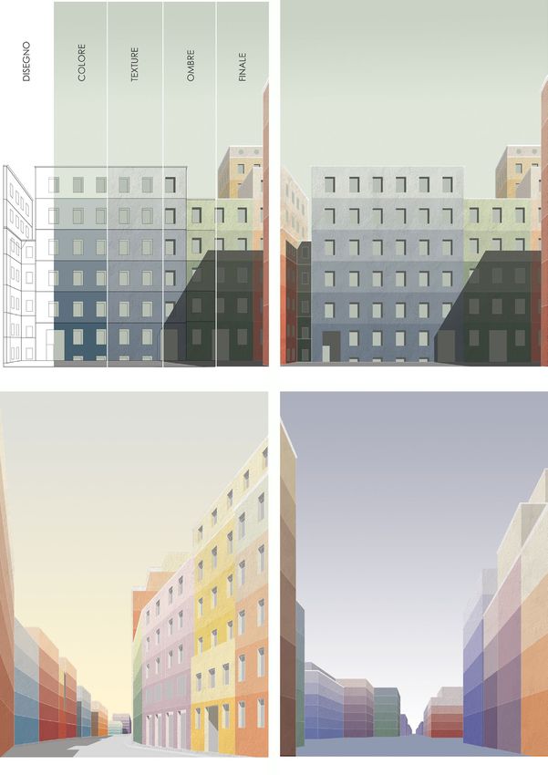
Chromatic gradation as a symbolic and spatial device in the European context: Piero Bottoni’s Cromatismi architettonici                                      9

                                                                                                                 Figure 1 - P. Bottoni, Cromatismi
                                                                                                                 architettonici, 1927. Above: Street 2
                                                                                                                 with ascending brightness; Street 2
                                                                                                                 with descending brightness. Below:
                                                                                                                 Street 1 at the vesper; Street 3.
                                                                                                                 Archivio Piero Bottoni, DAStU,
                                                                                                                 Politecnico di Milano

                                                                                                                 Figura 1 - P. Bottoni, Cromatismi
                                                                                                                 architettonici, 1927. In alto: Strada 2 a
                                                                                                                 luminosità ascendente e discendente;
                                                                                                                 in basso: Strada 1 al vespro, Strada
                                                                                                                 3. Archivio Piero Bottoni, DAStU,
                                                                                                                 Politecnico di Milano.

2. CHROMATIC GRADATION                                     2. GRADAZIONI CROMATICHE
   IN THE EUROPEAN ARCHITECTURE                               NELL’ARCHITETTURA EUROPEA

In the twenties European architecture, the                 Il dibattito sul colore nell’architettura europea
debate on color took place mainly out of Italy,            degli anni Venti si svolse soprattutto oltralpe,
in distant environments animated by the avant-             in ambienti culturalmente distanti fra loro ma
garde desire to revolutionize the appearance and           parimenti animati dal desiderio avanguardistico
efficiency of the city. To Le Corbusier, Bottoni’s         di rivoluzionare il linguaggio e l’aspetto delle
urban polychromie could not be dissociated from            città. Se la policromia urbana di Bottoni per Le
new architectural composition criteria without             Corbusier non poteva essere dissociata da
reducing to an otherwise simple corrective, a              nuovi criteri di composizione architettonica,
superficial remedy against                                 riducendosi altrimenti ad un semplice correttivo,
                                                           un rimedio contro
    “the arbitrariness that governs the construction
    of the current city” [4];                                   “la casualità che presiede alla costruzione
                                                                della città attuale” [4],
on the contrary, Farbigestadt devotees appreciated

Cultura e Scienza del Colore - Color Culture and Science | 06 | 2016 | 07- 22                   ISSN 2384-9568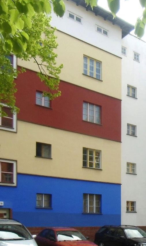
10 DOI:10.23738/ccsj.i62016.01 Colonnese F.
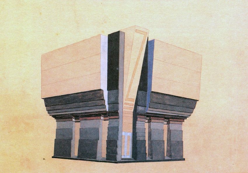
Figure 2 - J. Duiker and J.G.
Wiebenga, Nirwâna Housing Living
Room, The Hague, 1917-1928
Figura 2 - J. Duiker e J.G. Wiebenga,
Soggiorno delle residenze Nirwâna a
L’Aia, 1917-1928
it as a scientific reference that deserved to be per i fautori della Farbigestadt essa costituì un
translated and published [5] especially for its riferimento scientifico che meritava di essere
vernacular potential [6]. The idea of the “colorful tradotto e pubblicato [5] soprattutto per le sue
city” was derived from the transparent city potenzialità vernacolari [6]. L’idea della “città
dreamed of by Paul Sheerbart and inspired by colorata” derivava dalla città trasparente sognata
the experience of the Glass Pavilion Bruno Taut da Paul Sheerbart e ispirata dall’esperienza del
had designed for the Cologne Exhibition of 1914. Padiglione di Vetro progettato da Bruno Taut per
Its l’esposizione di Colonia del 1914. La sua
“dome, in rhombic spaces between the “cupola, negli spazi rombici compresi tra le
reinforced concrete ribs, was illuminated by nervature di cemento armato, era illuminata
Luxfer glass prisms arranged so as to create da prismi di vetro Luxfer disposti in modo da
a sort of nuanced sunrise. The colors in fact creare una sorta di alba trascolorante. I colori
began ‘with the night blue in the lower zone, infatti iniziavano ‘con il blu notte della parte
passed through the green moss, rose to inferiore, passavano per il verde muschio
golden yellow, and ended in the upper space salivano al giallo oro, e all’apice dello spazio
with a radiant yellow light’” [7]. terminavano con un radioso giallo chiaro’”
[7].
Also by virtue of such an experience,
mythologized by the demolition of the pavilion In virtù anche di una tale esperienza, mitizzata
and perpetuated in the writings of the Gläserne dalla stessa demolizione del padiglione e
Kette in the pages of Frühlicht, the color gradation perpetuata negli scritti della Gläserne Kette sulle
acquired a symbolic value, which could be pagine di Frühlicht, il tema della gradazione
applied from the scale of the room to that of cromatica acquistò un valore simbolico ancor
a city. In Nirwana residential building in The prima che percettivo, che poteva applicarsi dalla
Hague (1917-1928), architects J. Duiker and scala della stanza a quella della città. Gli architetti
J.G. Wiebenga [8] proposed an elaborate color J. Duiker e J.G. Wiebenga, che nell’edificio
solution in the living room opened on the long residenziale Nirwâna a L’Aia (1917-1928) [8],
ribbon angular window through a gradation proposero una elaborata soluzione cromatica
of colors which increases brightness and per il soggiorno spalancato sulla lunga finestra
warmness from floor to ceiling (Figure 2). Bruno a nastro angolare, mediante una gradazione
Taut experienced instead the color as spiritual di colori che aumenta di luminosità e calore
ISSN 2384-9568 Cultura e Scienza del Colore - Color Culture and Science | 06 | 2016 | 07- 22Chromatic gradation as a symbolic and spatial device in the European context: Piero Bottoni’s Cromatismi architettonici 11
and social catalyst in the great urban laboratory
of Magdeburg, to transcend the austere forms of
the Wilhelmine architecture into
“a joyful architecture, able to instill a sense of
optimism and harmony in daily life” [9].
Taut assumed the color theme for a more central
role, and even independent from the formal one,
since
“it does not necessarily run parallel to that
of the form but, in contrast, it may either
interbreed with this, or dissociate to create a
dissonance in the reunification with the other
theme” [10].
The same assumptions can be found in the use
of gradations in the revolutionary Russia, where
the colors took on a subversive power and Figure 3 - B. Taut, Housing in Berlin-
precise political significance, useful to announce Weissensee, 1928-30 (Photo by the
author)
the advent of a new civilization. When the Cubist
artist Natan Altman intervened pictorially on the Figura 3 - B. Taut, Residenze a Berlin-
monumental facade of Petrograd, with shades Weissensee, 1928-30 (Foto di F.
from yellow to red, Kazimir Malevich interpreted Colonnese).
it in a political and evolutionary key: salendo verso il soffitto (Figura 2). Bruno Taut
sperimentò invece il colore come catalizzatore
“the form of the International presents a spirituale e sociale nel grande laboratorio urbano
chromatic palette. Now we have three forms di Magdeburgo, per trascendere le “seriose”
of the International, which are distinguished forme dell’edilizia guglielmina in
by the color intensity. The first is characterized
by a yellow background, in which a red “una architettura gioiosa, capace di instillare
component creates ‘the orangeness’; in the nella vita quotidiana un senso di ottimismo e
second, this shade increases to become fully di armonia” [9].
orange. The third should be completely red,
as the form of the Third International should Taut ipotizzava per il tema cromatico un ruolo
aspire to eliminate the differences and its red ancora più centrale e perfino autonomo rispetto
will be the color of equality” [11] . a quello formale, visto
In the land of the Soviets, the gradation was “che non deve necessariamente correre
designed not only to symbolize the social parallelo a quello della forma ma, al contrario,
evolution but also to manipulate the perception può incrociarsi con questo, staccarsi, creare
of space. Precise experiments in this direction una dissonanza nella riunificazione con l’altro
were conducted in VKHUTEMAS art school tema” [10].
(Higher Art and Technic Institute). Set up in
Moscow as part of the reforms promoted Gli stessi presupposti si ritrovano nell’utilizzo
since 1918 by the People’s Commissariat delle gradazioni cromatiche nella Russia
for Education, it encouraged the exploration rivoluzionaria, dove i colori assunsero un potere
of space, rhythm, and color through an eversivo e precisi significati politici, utili a
interdisciplinary approach, involving scientists, mettere in scena l’avvento di una nuova civiltà.
philosophers, artists, linguists, and architects to Quando l’artista cubista Natan Altman intervenne
redefine the relationships artistic and intellectual pittoricamente sulle facciate monumentali
production establishes with the reality. dell’allora Pietrogrado, con gradazioni dal giallo
In the 1923 course guided by V. F. Krinsij, a al rosso, Kazimir Malevich ne fornì una lettura in
demonstration design for a Soviet Pavilion for chiave politica ed evolutiva:
silicone products adopted gray to red grades to
mark the jagged exterior surfaces, enhancing “la forma dell’Internazionale presenta una
its volumetric articulation (Figure 4). Conversely, tavolozza cromatica. Adesso abbiamo tre
in 1929 Mausoleum for Lenin, Scusev applied forme dell’Internazionale, che si distinguono
color gradations to the upper pyramid to “fade” tra loro per l’intensità del colore. La prima è
its revolutionary red in the atmosphere, and with caratterizzata da un fondo giallo, nel quale
Cultura e Scienza del Colore - Color Culture and Science | 06 | 2016 | 07- 22 ISSN 2384-956812 DOI:10.23738/ccsj.i62016.01 Colonnese F.
Figure 4 - Soviet Pavilion for silicone
products, Course of prof. V.F.Krinsij,
ass. M. P Korzev, S.V.Glagolev, 1923
Figura 4 - Padiglione sovietico
dei prodotti siliconici, Corso del
prof. V.F.Krinsij, ass. M. P Korzev,
S.V.Glagolev, 1923
Figure 5 - A.V. Šcusev, Mausoleum
for Lenin in Moscow, 1929
Figura 5 - A.V. Šcusev, Mausoleo per
Lenin a Mosca, 1929
it symbolically the last revolutionary echoes, like una componente rossa crea ‘l’arancionità’;
an application of Leonardo’s “aerial perspective” nella seconda, questa tonalità aumenta fino
(Figure 5). a diventare pienamente arancione. La terza
deve essere completamente rossa, poiché la
VChUTEMAS teachers such as El Lissitzky, forma della Terza Internazionale deve aspirare
Stepanova, Vesnin, Exter, Malevich, and Tatlin ad eliminare le differenze e il suo rosso sarà il
addressed the research colore dell’uguaglianza” [11].
“from painting to architecture, from the flat Nel paese dei Soviet la gradazione cromatica
surface and color to the volume and space” era studiata non soltanto per simboleggiare
[12 ]. l’evoluzione sociale ma anche per manipolare la
percezione spaziale. Precise sperimentazioni in
Kandinsky himself taught there before getting tal senso furono condotte nella scuola superiore
to the Bauhaus in 1921, interlacing his research d’arte VCHUTEMAS (Ateliers superiori tecnico-
with that of his friend Paul Klee, who was in artistici), istituita a Mosca nell’ambito delle
Weimar from the previous year. Kandisky’s vision riforme promosse dal 1918 dal Commissariato
ISSN 2384-9568 Cultura e Scienza del Colore - Color Culture and Science | 06 | 2016 | 07- 22Chromatic gradation as a symbolic and spatial device in the European context: Piero Bottoni’s Cromatismi architettonici 13
of the spiritual life in the form of Popolare dell’Istruzione allo scopo di favorire
l’esplorazione di spazio, ritmo e colore attraverso
“a large acute triangle divided into unequal un approccio interdisciplinare, che coinvolgeva
sections, which narrow upwards” [13] scienziati, filosofi, artisti, linguisti e architetti per
ridefinire le relazioni che la produzione artistica
can be found also in Klee’s painting schemes e intellettuale instaura con la realtà.
[14] and indicates their common interest for In un disegno dimostrativo del 1923 nel corso
color gradations. In the twenties, the Swiss artist guidato dal V.F.Krinsij per un Padiglione sovietico
tested them to achieve a synthesis between their dei prodotti siliconici, fasce cromatiche dal grigio
symbolic value of evolution and change and the al rosso scandiscono le superfici scalettate
purely perception of movement and variation dell’involucro, contribuendo ad accentuare
in depth. He applied squared and striped color l’apparenza della sua articolazione volumetrica
gradations to both recognizable figures and (fig. 4). Viceversa, nel Mausoleo per Lenin di
ambiguous abstract shapes open to figuration A.V. Šcusev del 1929, la gradazione cromatica
[15], often inspired by urban visions [16]. dei gradoni della sovrastante piramide sembra
una applicazione della “prospettiva aerea” di
3. “CROMATISMI ARCHITETTONICI” Leonardo, utile a “sbiadire” il rosso rivoluzionario
nell’atmosfera e con esso simbolicamente gli
While twenties European architects mostly ultimi echi rivoluzionari (Figura 5).
attributed symbolic values to color gradation, Nel VChUTEMAS, insegnanti come El Lissitzky,
Piero Bottoni was rather interested in its Stepanova, Vesnin, Exter, Malevich e Tatlin
perceptual potential to rearrange and transform orientarono le ricerche
the increasingly kinematical vision of existing
urban fronts. His six studies in pencil and “dalla pittura verso l’architettura, dalla
watercolor on 24,8x18,0cm vertical sheets [17] superficie piana e dal colore verso il volume e
are today kept in the Archivio Piero Bottoni in lo spazio” [12].
Milan and have been already widely studied
[18]. They show four different urban pieces that Lo stesso Kandinsky vi insegnò prima di
are also four different visions of the idea of city: giungere al Bauhaus nel 1921, intrecciando così
the city on the sea (Street 4, S4), with a large le sue ricerche a quelle dell’amico Paul Klee, che
crescent waterfront; the “picturesque city” (Street si trovava a Weimar dall’anno precedente. La
2, S2), with wavy edges that define a medieval visione della vita spirituale in forma di
corso; the “modern city” (Street 1, S1), with the
straight avenue that opens into a square. The “un grande triangolo acuto diviso in sezioni
last watercolor (Street 3, S3) abandons the urban diseguali, che si restringono verso l’alto” [13],
scale and seems to focus on the architectural
one, showing the two buildings coupled along a espressa da Kandinsky già nel 1912, si ritrova
road. A part the “waterfront” – probably the most anche negli schemi pittorici di Klee [14]. Lo
distant from Bottoni’s background – which is svizzero negli anni Venti sembra sperimentare
artificially “seen” from an observer as high as the le gradazioni cromatiche per cercare una
fifth floor, the other perspective views have the sintesi tra il loro valore simbolico di evoluzione
points of view of a man walking in the middle of e cambiamento e quello puramente percettivo
road, probably to show both building fronts. di movimento e variazione di profondità. Non è
The presence of openings both on the two fronts affatto trascurabile che molti dei suoi acquarelli,
of the “picturesque city” street (S2) and on the che usano gradazioni cromatiche in fasce e
frontal buildings (S3), confirms that each color riquadri per la loro capacità di scomporre e
band is one floor tall and identifies the internal qualificare la superficie pittorica sia in geometrie
apartments or offices. aperte alla significazione sia in figure ambigue
The represented urban spaces do not seem to e riconoscibili [15], appaiono ispirati proprio alla
follow an overall project. The absence of axes visione delle quinte urbane [16].
of symmetry, volumetric hierarchies or simply
a continuous crowning –which Bottoni instead 3. “CROMATISMI ARCHITETTONICI”
refers to in his text – suggests they are “pictures”
from an existing city. Most of the buildings, A dispetto della lettura prevalentemente
tall from 4 to 8 floors, are simple scenes that simbolica che gli architetti europei attribuivano
are beyond any architectural characterization. negli anni Venti alle gradazioni cromatiche,
Nonetheless, Bottoni could not help but Piero Bottoni era invece interessato alle
suggesting some special solutions, such as the sue potenzialità percettive di riordinare e
portholes on top of a tower in S3, while in S2 trasformare la visione sempre più cinematica
he designed large openings at the first floor delle quinte urbane esistenti. I suoi sei studi
of a building and a gradual retreating of the a matita e acquarello di formato rettangolare
Cultura e Scienza del Colore - Color Culture and Science | 06 | 2016 | 07- 22 ISSN 2384-956814 DOI:10.23738/ccsj.i62016.01 Colonnese F.
upper floors. Anyway, all of the views show verticale 24,8x18,0cm [17],conservati presso
only civil buildings: monuments and churches l’omonimo archivio a Milano e già ampiamente
seem banished from the Bottoni’s city. Any sign studiati [18], mostrano quattro differenti
of life is missing, too: no people, cars or street brani urbani che sono anche quattro diverse
furniture. The shadows are the only evidence of concezioni o momenti della città: la città di mare
a precise time in this atopic place. As specified (Strada 4, S4), con un ampio crescent – oggi si
by the captions, S1 is presented in two different direbbe waterfront – rivolto verso l’acqua; la città
times, at midday (S1m) and vespers (S1v) (but pittoresca (Strada 2, S2), con i fronti ondulati
in reality some facades show slightly different che definiscono un corso di sapore medioevale
colors). S2 is presented at noon but in two o settecentesco; la città moderna (Strada 1,
different color schemes. S3 is presented in the S1), con il rettifilo che si allarga in una piazza.
afternoon while the waterfront in S4 does not L’ultimo acquarello (Strada 3, S3) abbandona
show a precise timing. la scala urbana e sembra concentrarsi su
Bottoni’s use of colors requires further quella architettonica, mostrando frontalmente
explanation. The hue (“color”) identifies the due edifici accoppiati lungo una strada. Se
building while a single grade (a variation in escludiamo il waterfront – probabilmente il più
“intensity” and “brightness”) identifies a horizontal distante dall’ambiente culturale di Bottoni –
portion as tall as a floor, marking it on all visible che appare artificiosamente visto dall’alto,
fronts. In general, the brightness seems to be all’incirca alla quota del quinto piano, le altre
quite constant along the vertical gradations; the prospettive seguono il punto di vista di un
more evident exception is the yellow face in S2, uomo che cammina nel bel mezzo della strada,
which, after the first two floors, seems to start probabilmente per mostrare al meglio entrambi
from a darker tone. Often the field that ends i fronti edilizi.
the gradation toward the dark appears abruptly La presenza delle bucature, su due fronti della
saturated, breaking away from the constant step città pittoresca e su quella frontale, permette di
of the chromatic scale. stabilire che le fasce cromatiche corrispondono
In some cases, the hues that alternate along alla altezza di un piano, identificando quindi le
the street fronts are chosen to accentuate the porzioni corrispondenti agli appartamenti o agli
mutual contrast, in other cases to attenuate it. uffici interni.
An example of the former case is in S2, where Gli spazi urbani rappresentati non sembrano
some of facades on left show a combination seguire un progetto d’insieme. L’assenza di
of complementary colors like aquamarine assi di simmetria, di gerarchie volumetriche o
green and red; an example of the latter case semplicemente di un coronamento continuo – a
is in S3, dominated by a combination of blue cui invece si riferisce Bottoni nel testo – fanno
and green. The two versions of S1 show some pensare ad una città esistente. La gran parte
interesting cases of chromatic inversion: in degli edifici, alti dai 4 agli 8 piani, sono semplici
particular, buildings with two different blue hues quinte che sfuggono la caratterizzazione
are translated into complementary gradation architettonica. Ciò nonostante Bottoni non
between yellow and green. resiste dal suggerire alcune soluzioni particolari,
come gli oblò in cima ad una torre in S3, le
4. A SPATIAL INTERPRETATION bucature a scala maggiore al primo piano di un
OF CROMATISMI edificio, esili arretramenti dei fronti dal secondo
piano in poi oppure il progressivo arretramento
The city Bottoni illustrated in his six watercolors degli ultimi piani di un corpo di fabbrica in S2.
is the city of the past and the present, in which Tutte le viste mostrano esclusivamente edifici
the voids of streets and squares still form the core generici: monumenti e chiese sembrano bandite
of the urban structure, just before modernistic dalla città di Bottoni. Ugualmente è assente
urban planners shift the design focus on the ogni segno di vita: niente abitanti, automobili o
blocks. The very concept of a color plan for arredo urbano. L’unico elemento che stabilisce
urban design can only come from the Raumkunst un tempo preciso di questo luogo atopico sono
concept of a city as a system of open spaces. This le ombre. S1 è presentata in due momenti
is related to the late XIX century urban planning diversi, al mezzogiorno (S1m) e al vespro (S1v),
manuals, such as Hermann Maertens’ studies come specificamente indicato in didascalia (ma
for Der Optische Massstab, through which he had in realtà cambia anche la veste cromatica di
mathematically connected visual physiology alcune facciate). S2 è invece presentata sempre
and proportions of urban voids [19]. Camillo al meriggio ma in due vesti cromatiche diverse.
Sitte’s research had instead contributed not only S3 è rappresentata al pomeriggio mentre la
to consider the blocks as volumes serving the palazzata a mare in S4 non ha una collocazione
experience of urban space, but also to condemn temporale precisa.
the abuse of bird-eye’s views and to revive the L’uso che Bottoni fa del colore richiede
glory of the perspective view at human eye level un approfondimento. La tonalità (“colore”)
ISSN 2384-9568 Cultura e Scienza del Colore - Color Culture and Science | 06 | 2016 | 07- 22Chromatic gradation as a symbolic and spatial device in the European context: Piero Bottoni’s Cromatismi architettonici 15
in urban planning [20], as testified also by the identifica l’edificio mentre la singola gradazione
Cromatismi. (“intensità”) ne identifica una porzione orizzontale
Bottoni did not pursue a form indifferent to alta quanto un piano, marcandolo su tutte le
the content, but a key to express it, a sort facce visibili. In generale le fasce cromatiche
of chromatic interface between interior and orizzontali presentano una gradazione costante
exterior. To explain his Cromatismi, he adopted e ininterrotta della luminosità verso l’alto o verso
terms such as intensity, pressure, resistant values, il basso. L’unica eccezione evidente è costituita
center of gravity, loads, etc. with the clear intention dal fronte arretrato giallo di S2 che, dopo i primi
of leading the operation with scientific criteria, due piani, riparte da un tono più scuro. Spesso il
as he will do in his entire career. The choice to campo che conclude la gradazione verso lo scuro
apply chromatic bands as tall as the internal appare bruscamente saturato, staccandosi dal
space are has the consequence of highlighting passo costante della scala cromatica.
the floors constituting each building, projecting In alcuni casi le tonalità che si alternano lungo
the form of private spaces onto the public la strada sono scelte per accentuare il contrasto
fronts and, indirectly, reverberating the human reciproco, in altri casi per attenuarlo. Al primo
measure. The color gradation should produce caso appartengono alcune facciate lungo il
an optical exaltation of the values of mass fronte stradale sinistro di S2, in cui Bottoni
and volume, also through the expression of dispone gradazioni di tinte complementari
the quantity and quality of the loads supported verde acquamarina e rosso; al secondo caso
by the structure. Thus, the version with darker quelle in vista frontale di S3, blu e verdi. Le due
grades down would express “a sense of balance versioni di S1 presentano alcuni interessanti
and rest” [21] due to the intrinsic identities “bright casi di inversione cromatica: in particolare gli
is light” and “dark is heavy”. edifici caratterizzati da due diverse tinte blu si
However, there is a “plastic” interpretation, too. traducono in gradazioni complementari invertite
Bottoni surely knew Leonardo da Vinci’s valuable tra il giallo e il verde.
observations on “aerial perspective” in epigraph All’esito finale dei sei acquarelli concorrono,
[22]. The Milanese architect could be supposed infine, le didascalie che li accompagnano, nelle
to promote – in a purely scenic and illusory quali Bottoni integra le informazioni visive –
terms – a different space interpretation of urban decisamente depauperate nella loro versione
fronts. The gradations would favor the perception editoriale in bianco e nero – con l’indicazione del
of a fading of the higher part of the buildings momento del giorno e dell’effetto complessivo.
or a gradual shifting of the individual floors,
up to configure ideally stepped urban fronts. 4. L’INTERPRETAZIONE SPAZIALE
This is a formal typology mainly introduced by
DEI CROMATISMI
Antonio Sant’Elia’s La Città Nuova (1914) and
Adolf Loos with his Terrassenhäus and Ziggurat-
La città che Bottoni illustra nei sei acquarelli è
shaped buildings for hotels and civic halls. In the
la città del passato e del presente, in cui i vuoti
twenties, Henri Sauvage associated his name
di strade e piazze formano ancora il fulcro della
to numerous studies for an habitat hygenique
struttura urbana, poco prima che gli urbanisti
through immeubles à gradins which could appear
spostino l’accento sui pieni degli isolati. Il
as a modern Parisian ziggurat. In Milan, both
concetto stesso di un piano urbano del colore
Piero Portaluppi, with the 1920 Amarillo district
non può che scaturire dal concetto di Raumkunst
for Allabanuel, and Giovanni Muzio, with his
e di città come sistema di spazi aperti. Esso
1921 stepped houses for artists [23], knew this
è cioè legato alla manualistica urbanistica
typology and may have introduced it to Bottoni.
di fine Ottocento, come gli studi di Hermann
The stepped housing model inspired also other
Maertens sulla Optische Massstab, che avevano
Italian architects, such as Innocenzo Sabatini
legato matematicamente fisiologia visiva e
and Mario Ridolfi, both present in the same
proporzioni dei vuoti urbani [19]. Le ricerche
Italian Rational Architecture Exhibition where
di Camillo Sitte avevano invece contribuito
Bottoni exhibited his watercolors
non solo a considerare gli isolati alla stregua
di volumi neutri al servizio dell’esperienza
5. THE CROMATISMI FROM spaziale urbana, ma anche a rinverdire i fasti
WATERCOLORS TO DIGITAL dello scorcio prospettico ad altezza d’uomo, per
AND REALITY secoli trascurato in favore di totalizzanti viste
a volo d’uccello [20], che si riflette nell’idea di
Much of the undeniable charm of Bottoni’s Bottoni di presentare gli effetti dei cromatismi
Cromatismi resides not only in the ordered vision mediante prospettive ad altezza d’uomo lungo
and chromatic symphony of the city as well the diverse tipologie di spazi urbani.
poetic and vaguely disturbing atmospheres, I cromatismi non costituiscono una maschera
but also in the technique: watercolor inevitably indifferente al contenuto ma una chiave per
evokes the idea of manual labor, human footprint esprimerlo. Le finestre rettangolari disegnano
Cultura e Scienza del Colore - Color Culture and Science | 06 | 2016 | 07- 22 ISSN 2384-956816 DOI:10.23738/ccsj.i62016.01 Colonnese F.
Figure 6 - From left to right, above
to below: Stages from the process
of digital reproduction of Cromatismi;
digital version of S3, afternoon; digital
version of S2, midday; digital version
of S1, vesper (elaboration by the
author)
Figura 6 - Da sinistra a destra,
dall’alto in basso: Fasi del processo di
riproduzione digitale; versione digitale
di S3, pomeriggio; versione digitale di
S2, meriggio; versione digitale di S1,
vespro (elaborazione di F. Colonnese).
and a sense of art, playing, and nostalgia, too. To un reticolo regolare, secondo uno schema
evaluate Cromatismi with eyes detached from all che si stava affermando come la più diffusa
this, the author has arranged a digital version interpretazione dell’edificio per abitazioni da
of the six of them (Figure 6). From a digital parte degli architetti razionalisti. La scelta di
reproduction of each of them, the author has applicare fasce di colore pari alla altezza degli
redrafted the wireframe structure of buildings interpiani ha la conseguenza di evidenziare
with regard to the visible vanishing points (two- i piani di cui si compone ogni edificio e, di
dimension model). This stage has highlighted conseguenza, di proiettare in facciata la misura
the existence of a strict perspective structure but degli spazi domestici (e indirettamente del corpo
at the same time, a certain irregularity in the size umano).
of plans and floors. Per spiegare i suoi cromatismi architettonici,
From digital images of watercolors, three values l’architetto adotta termini come intensità,
of color have been sampled at the extremes pressione, valori resistenti, baricentro, carichi, ecc. col
and middle of each graduated sequence. They chiaro intento di guidare l’operazione con criteri
have been used to produce a vertical gradient scientifici, come accadrà in tutta la sua carriera.
from which the author has selected the color La colorazione dovrebbe quindi produrre una
values for the individual tonal gradations that esaltazione ottica dei valori di massa e volume,
have been applied to the raster version of each anche attraverso l’espressione della quantità e
ISSN 2384-9568 Cultura e Scienza del Colore - Color Culture and Science | 06 | 2016 | 07- 22Chromatic gradation as a symbolic and spatial device in the European context: Piero Bottoni’s Cromatismi architettonici 17
Figure 7 - Chromatic palette adopted
in Cromatismi architettonici; Digital
simulation of color plan application to
buildings facades in Via Roma in Milan
(image by the author)
Figura 7 - Palette cromatica utilizzata
nei Cromatismi architettonici;
applicazione digitale dei cromatismi
ai fronti edilizi di via Roma a Milano
(elaborazione di F. Colonnese).
of the CAD two-dimensional model. This phase della qualità dei carichi sopportati dalla struttura.
has revealed occasional intensity corrections Così la versione con gradazioni più scure verso
adopted by Bottoni to mark the contrast between il basso esprimerebbe “un senso di equilibrio e
adjacent bands. di riposo” [21] in virtù delle intrinseche identità
After importing the CAD drafted views into “chiaro è leggero” e “scuro è pesante”.
Adobe Photoshop, the selected colors have been Rileggendo le preziose osservazioni di Leonardo
applied to the buildings. A single color for the sky da Vinci sulla prospettiva aerea in epigrafe,
and windows has been chosen for all the views, certamente note anche a Bottoni [22], si
although in reality it varies slightly within the potrebbe ipotizzare che l’architetto milanese
same drawing. Black-filled layers with different cercasse anche di favorire – in una chiave
opacity have simulated shadows and shades prettamente scenografica e illusoria – una
while a texture has been applied to simulate a diversa lettura spaziale dei fronti urbani. Le
generic plaster texture. gradazioni cromatiche favoriscono infatti la
This operation has resulted in converting the percezione di una dissolvenza della parte alta
watercolor shades in coordinates according to degli edifici oppure di uno slittamento graduale
the Adobe RGB Color Space. The digital version dei singoli piani, andando a configurare
of colors Bottoni chose to illustrate his plan, idealmente dei fronti urbani a gradoni. È questo
which have been collected as a partial color un modello insediativo introdotto dai disegni di
Cultura e Scienza del Colore - Color Culture and Science | 06 | 2016 | 07- 22 ISSN 2384-956818 DOI:10.23738/ccsj.i62016.01 Colonnese F.
abacus, offers a total visual control over the final Antonio Sant’Elia (La Città Nuova, 1914) che negli
effect. anni Venti era stato proposto da vari autori. Henri
Starting from this intermediate product, a part Sauvage legò il suo nome a numerosi studi per
of Bottoni’s color plan has been virtually tested un habitat hygenique attraverso immeubles à gradins
in a photograph of an existing urban context che potevano apparire come moderni ziggurat
such as Via Roma in Milan, whose completion parigini. Nell’ambiente milanese, sia Giovanni
dates back to the years of Cromatismi (Figure Muzio, con le case per artisti nel 1921 [23],
7). After desaturating the buildings elements che Piero Portaluppi conoscevano tale modello
in Photoshop, the author has applied color insediativo e potrebbero averlo introdotto a
gradations layers according to the more evident Bottoni. Al modello “gradonato” si ispiravano
horizontal partitions of facades. altri autori italiani, come Innocenzo Sabatini
This stage has evidenced some difficulties o Mario Ridolfi, entrambi presenti nella stessa
in the treatment. The modern building on the Esposizione Italiana di Architettura Razionale
right, already articulated by regular horizontal di Roma del 1928 nella quale Bottoni espose
bands, happens to “painlessly” accept the nuovamente i propri acquarelli.
color gradations; the building on the left, with
simple rectangular windows, “allows” it, too;
the following building, featuring bugnato and
6. I CROMATISMI DALL’ACQUERELLO
Baroque-style frames, instead “resists” to the AL DIGITALE E AL REALE
treatment. At the same time, this experiments
highlight the chromatic role of the secondary Gran parte dell’innegabile fascino dei disegni di
elements Bottoni has censured in his drawings, Bottoni risiede non solo nella visione ordinata
such as vegetation, signs, furniture, vehicles, e cromaticamente sinfonica della città e nelle
even the red porphyry cobbles. atmosfere poetiche e vagamente inquietanti,
Beyond the final visual effect this process has ma anche nella tecnica utilizzata: l’acquarello
highlighted a number of unresolved issues, in inevitabilmente evoca l’idea del lavoro manuale,
part apparently neglected by Bottoni, in part dell’impronta umana oltre che un certo senso
related to the current appearance of the city. The di arte, di gioco e, oggi, anche di nostalgia. Per
former group includes: valutare i Cromatismi con occhi distaccati da
tutto ciò, ne sono state redatte delle versioni
• the color criteria to be used for facades digitali, frutto di un procedimento che è stato
that have a hierarchical structure applicato ai sei studi (Figura 6). A partire dalle
antagonist to the horizontal bands, for riproduzioni digitali degli acquarelli, è stato
example with giant orders or decorative effettuato il ridisegno della struttura lineare
themes overlapping it; in ambiente CAD con riferimento ai punti di
• hesitations regarding the chromatic fuga. Questo ha evidenziato l’esistenza di una
treatment of facades covered with rigorosa struttura prospettica ma al tempo
marble, stone, brick and ceramics; stesso, una certa irregolarità nelle dimensioni
• the chromatic role of trees, gardens dei piani. Dalle immagini digitali degli acquarelli,
and private vegetation in such a scenario; sono stati campionati due valori cromatici agli
• public lighting criteria to be accorded estremi di ogni sequenza graduata: a partire da
or not with the color plan; essi, è stata prodotta una sfumatura verticale da
• the perception of the colorful fronts on cui sono stati estratti i valori cromatici relativi
means of transportation, whose speed alle singole gradazioni cromatiche che sono
and visual field condition the perception stati applicati alla versione raster del ridisegno
of urban fronts. vettoriale. Questa operazione ha invece rivelato
le occasionali correzioni di intensità adottate
The latter group includes: da Bottoni per rimarcare il contrasto tra fasce
contigue.
• the doubts raised by the current Il colore del cielo e delle finestre è stato scelto
presence of signs and billboards, which unico per tutti gli elementi, anche se in realtà
contributes to a prevailing effect of visual varia leggermente all’interno dello stesso
confusion; disegno. Ombre proprie e portate sono simulate
• the potential contribution of public and mediante l’applicazione di velature di grigio. È
private street furniture, especially tents stata infine applicata una texture per simulare
and umbrellas; l’effetto visivo dell’intonaco. Tale operazione è
• the conflictual relationship with urban servita a convertire le sfumature ad acquarello
pollution and the progressive blackening in dati cromatici digitali secondo le coordinate
of the facades. dello spazio-colore Adobe, offrendo un controllo
visivo complessivo sull’effetto finale. Le tinte
The actual submission of the color plan for a scelte da Bottoni per illustrare il suo piano
ISSN 2384-9568 Cultura e Scienza del Colore - Color Culture and Science | 06 | 2016 | 07- 22Chromatic gradation as a symbolic and spatial device in the European context: Piero Bottoni’s Cromatismi architettonici 19
symphonic effect would imply its more or less sono state raccolte e ordinate in un parziale
contemporary application street by street. This abaco cromatico. La possibilità di applicare
would involve not only the necessary financial la restituzione prospettica ha inoltre offerto
and administrative procedures but also a reliable l’eventualità di rileggere la vera forma dei luoghi
criterion [24] for the conversion from Adobe urbani rappresentati.
chromatic coordinates after the simulation to A partire da questo prodotto intermedio, il
the RAL color coordinates, for example, which passo successivo è consistito nel testare
are commonly used for the paintings in the virtualmente almeno una parte delle
building industry (and were curiously introduced soluzioni cromatiche di Bottoni su un
in 1927). Moreover, the aged and heterogeneous contesto urbano esistente. Nella fotografia di
surfaces of existing buildings are supposed to un tratto di via Roma a Milano, la cui edilizia
react to colors in many different ways; not to risale agli anni degli acquarelli (Figura 7),
mention the difficulties to adopt massively a le tinte degli elementi edilizi sono state
mobile scaffolding to be either moved along “desaturate” e sono stati applicati dei veli
the sidewalks or hung from the top of the taller cromatici a luminosità crescente verso l’alto
buildings. in ambiente Photoshop. L’esecuzione di
questo procedimento ha messo in evidenza
6. CONCLUSIONS una serie di questioni irrisolte, in parte
apparentemente trascurate da Bottoni, in
Around the twenties, some European architects parte legate all’aspetto attuale della città. Al
were concerned with color gradations especially primo gruppo appartengono:
for their spiritual potential; others, as Piero
Bottoni was, for their ability to influence the • i criteri di colorazione da utilizzare
perception of depth and organically connote the per facciate che presentano una
urban spaces. Le Corbusier put emphasis on struttura gerarchica antagonista alle
the “physical function” and “space-creating action” fasce orizzontali, per esempio con
performed by Bottoni’s Cromatismi, however, ordini giganti o sovrapposizioni di temi
hoping to see them used with intent “symphonic” decorativi;
with the other architectural components. Yet, • le perplessità legate al trattamento
Bottoni’s realism towards the urban context cromatico di facciate rivestite con
had made him aware of the difficulty of acting marmi, pietre, mattoni e ceramiche;
on land values and property in order to plan a • il ruolo cromatico che in un tale
radical evolution of the existing urban landscape scenario si troverebbe a svolgere la
the way the Swiss master was proposing. He vegetazione pubblica e privata;
thought rather to the way of pragmatically • i criteri di illuminazione pubblica in
encourage citizens to regain a playful expression funzione o meno del piano del colore;
of their civic sense, a cross between a Futurism • la percezione dei fronti mediante i
destabilizing provocation and a reassuring mezzi di trasporto, che per velocità e
urban décor scheme. He designed the color campo visivo disponibile ne condizionano
plan to revitalize the perception of urban la percezione.
fronts by horizontal bands and to “retune” the
cacophonous urban scenery. A symphonic and Al secondo gruppo appartengono invece:
collective impression of the city could favor
a significant upgrading of a community. It is • i dubbi sollevati dalla presenza attuale
plausible that citizens, by seeing first recognized della segnaletica e dei cartelloni, che
their individuality in a harmonized collective contribuisce ad un prevalente effetto di
context, would actively participate in the social confusione visiva;
organism in which they are living in. Even in this • il potenziale contributo di arredi
utopian collectivism, Bottoni was trying to fit into stradali pubblici e privati, in particolare
certain European proposals, in particular those di tende e ombrelloni;
related to the innovative housing districts. • il conflittuale rapporto con
The process of historical background l’inquinamento stradale e il progressivo
reconstruction, analysis and spatial interpretation, annerimento delle facciate.
digital reproduction of watercolors and digital
simulation of the application of color gradations Accade così che nel foto-ritocco di via Roma,
on a compatible urban site is illustrative and l’edificio a destra, già articolato da marcapiani
perfectible (starting from the optical scanning regolari, accolga in maniera indolore lo schema
criteria of the original watercolors, which any di Bottoni; l’edificio a sinistra, con finestre
discourse on the supposed “faithfulness” of the rettangolari semplici, lo consenta; mentre quello
model must be postponed to). This process, even successivo caratterizzato da bugnato e cornici
more than the final visual product, has been baroccheggianti, “resista” al trattamento. Allo
Cultura e Scienza del Colore - Color Culture and Science | 06 | 2016 | 07- 22 ISSN 2384-9568Puoi anche leggere