Friedrich Ernst von Garnier: un pioniere del color design Friedrich Ernst v. Garnier: a true color design pioneer
←
→
Trascrizione del contenuto della pagina
Se il tuo browser non visualizza correttamente la pagina, ti preghiamo di leggere il contenuto della pagina quaggiù
IL COLORE SECONDO / COLOUR ACCORDING TO [(1 + 2) 3 4 5 6 7 8 9 10 11 ]

Friedrich Ernst von Garnier: un pioniere del color design
Friedrich Ernst v. Garnier: a true color design pioneer

di/b y : Magda Spagnoli
fo to/pho to : ©F. Ernst v.Garnier

Un incontro con il maestro                Meeting the German artist
tedesco nel suo studio di Hof             at his Hof Iben studio in
Iben a Fuerfeld in Germania               Fuerfeld, Germany

Le origini del successo di Friedri-       The origins of Friedrich Ernst          in quell’occasione egli comprese          understood that creating a new
ch Ernst von Garnier trovano le           v.Garnier’s success are rooted in       che creare un nuovo linguaggio            chromatic language for buildings
loro radici nell’ambito della grafi-      the field of graphics and visual        cromatico per gli edifici doveva          had to become the field of a new
ca e delle arti visive, alla fine degli   arts, when he was working as a          diventare l’ambito di una nuova           profession: the color-designer.
anni Sessanta lavorava come gra-          successful advertising graphic          professione: il color-designer.           During his forty-year-long career
fico pubblicitario di successo.           designer in the late Sixties.           Nel corso di quarant’anni di car-         in the colour-design field (Farb-
Durante il suo percorso lavorativo        Nonetheless, during his working         riera nell’ambito del color design        gestaltung), v.Garnier has de-
tuttavia andava maturando in lui          experience, he gradually felt the       (Farbgestaltung), ha ideato e rea-        signed and carried out chromatic
un desiderio particolare, che le          desire to turn his graphic ideas        lizzato progetti cromatici di nume-       projects for several buildings and
sue idee e creazioni grafiche, ri-        and creations, which he perceived       rosissimi edifici e manufatti: resi-      manufactured products: houses,
tenute troppo effimere nel campo          as too fleeting in the advertising      denze, edifici industriali, chiese,       industrial buildings, churches,
pubblicitario, potessero trasfor-         field, into visible and long-lasting    scuole, uffici, centri commerciali,       schools, offices, shopping cent-
marsi in elementi comunicativi vi-        communication elements within           opere stradali, pali eolici e altro an-   ers, wind pole structures and
sibili e durevoli nella sfera urbana      the urban and social spheres.           cora (nuove edificazioni, ristruttu-      much more (new buildings, resto-
e sociale.                                When he met Hans Scharoun, an           razioni e restyling), realizzati con      rations and restyling), achieved
Fondamentale per la sua evolu-            essential step in his professional      diverse tecniche e materiali, per         using different techniques and
zione professionale fu l’incontro         evolution, in Berlin, the two had a     buona parte create ad hoc.                materials. Most of these project
con Hans Scharoun a Berlino,              chance to discuss the issues con-       La sperimentazione è parte del            were specially designed.
dove i due ebbero l’occasione di          nected to the building reconstruc-      suo percorso progettuale da sem-          Experimentation is part of his
discutere sulle problematiche             tion of the years after the Second      pre in evoluzione, dove lo studio         ever-evolving project design,
legate alla mancanza del colore           World War in Germany, which was         del colore si relaziona alla visione      where the colour study is related
nell’edilizia della ricostruzione del     distinguished by a complete lack        metodologica organica: die orga-          to the organic methodological vi-
secondo dopoguerra in Germania;           of colour. It was then that v.Garnier   nische Farbigkeiten. Le originali         sion: die organische Farbigkeiten.

42 COLORE                                                                                                                                                        COLORE 43
Friedrich Ernst Von Garnier
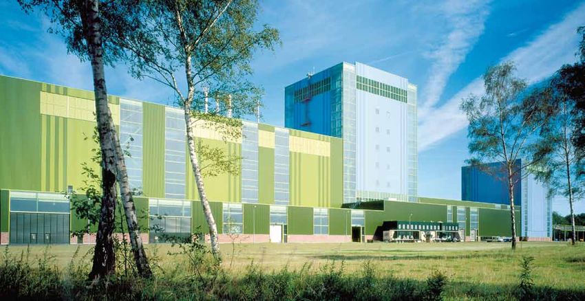
A pagina 43 e accanto: particolare Nella pagina precedente: viste
dell’interno dell’impianto industriale dell’hangar per i cantieri navali dal
di Rasselstein, realizzato per centro storico di Stralsund e dal mare.
ThyssenKrupp: la scelta delle nuances Le sfumature ordinate e il colore delicato
si relaziona evidentemente anche ad rendono percettivamente “leggero”
aspetti psicologici, spesso inconsci. l’enorme edificio. Premio europeo per
Negli impianti industriali v.Garnier le costruzioni in acciaio, Londra, 1999.
utilizza intenzionalmente il colore
“pink” nelle parti che non devono On previous page: views of the
essere toccate in quanto pericolose, shipyards hangar from the centre of
perchè gli operai (solo uomini) hanno Stralsund and from the sea. The regular
un’avversione, un’antipatia spontanea nuances and the delicate colour convey
nei confronti di questa tonalità. a “lightweight” perception to the huge
building. European Structural Steel
On page 43 and beside: interior detail Design Award, London, 1999.
of the Rasselstein industrial plant,
designed for ThyssenKrupp: the
nuances selection is clearly connected
also to psychological aspects, often
unconscious. In the industrial plants,
v.Garnier intentionally employs the
“pink” colour in the dangerous areas,
since workers (only men) have a
natural aversion and dislike for this
shade.
riflessioni e considerazioni in tal The following principle sums up il Product Award per la sua colle- awarded the Product Award for his
senso si possono riassumere in these original observations and zione di ceramiche Viva® per Klin- Viva® tiles collection, designed for
questa massima: “Il colore è luce. considerations: “Colour is light. genberg; a Londra nel 1999 vince Klingenberg; in 1999, in London,
Luce è calore. Calore è energia. Light is warmth. Warmth is ener- il Premio europeo per le costru- he won the European Structural
Energia è vita. Vita è colore”1. gy. Energy is life. Life is colour”1. zioni in acciaio in relazione alla Steel Design Award, in particular
particolare sensibilità utilizzata for the peculiar sensitivity he em-
L’attività di v.Garnier si esplica V.Garnier’s work expands in sever- nella progettazione cromatica ployed in the chromatic design
in molteplici direzioni e lo porta al directions and brings him to ex- dell’hangar per cantieri navali di of the shipyards hangar of Stral-
ad esprimere pensieri e conside- press ideas and opinions also as a Stralsund, città anseatica, situa- sund, the Hanseatic city, located
razioni anche come sociologo e colour sociologist and philosopher. ta nel mar Baltico, bene artistico on the Baltic Sea, a UNESCO World
filosofo del colore. Sono davvero Indeed, his three publications, en- mondiale dell’Unesco. Gli viene Heritage Site.
preziose le tre pubblicazioni dal titled Meine farbigere Welt, are assegnato una seconda volta nel In 2003, in Lucerne, he won again
titolo Meine farbigere Welt, ovve- quite relevant; the title means 2003, a Lucerna, il medesimo ri- this same prize for his project
ro il mio mondo più colorato, dove ‘my more colourful world’, and in conoscimento in relazione al pro- of the ThyssenKrupp Steel AG in
illustra le sue idee sul colore in this book, he shares his ideas on getto per la ThyssenKrupp Steel Dortmund.
architettura, in relazione al consi- colour in architecture, connected AG a Dortmund. Finally, we should also mention
derevole percorso come Farbge- to his significant experience as a Ricordiamo infine la mostra per- his own exhibition, held in Berlin
stalter (color designer). Farbgestalter (color designer). sonale tenuta a Berlino nel 2004 in 2004 at the Scharoun philhar-
Il curriculum professionale è His professional resume boasts alla filarmonica di Scharoun nel- monic society, within an event
costellato da numerosi ricono- European and international l’ambito di una manifestazione dedicated to organic architecture.
scimenti a livello europeo e mon- awards for his colour design dedicata all’architettura organica. Our talk with the German artist,
diale per le realizzazioni di color creations and his chromatic col- Il nostro colloquio con il maestro who is 73 years old, takes place
design e le collezioni cromatiche; lections; v.Garnier has designed tedesco, oggi settantatreenne, in Hof Iben, at his home/studio,
ne ha progettate più di venti per more than twenty collections for avviene a Hof Iben, nel suo studio a rural construction, restored in
aziende come Eternit, Creaton, companies such as Eternit, Crea- e residenza, un nucleo edilizio 1976, with an open courtyard,
ThyssenKrupp, Villeroy & Boch, ton, ThyssenKrupp, Villeroy & rurale a corte aperta ristrutturato located in Fuerfeld, close to Bad
per citarne solo alcune. Boch, to mention just a few. nel 1976 e situato a Fuerfeld, vici- Kreuznach, in the Rhineland-Pa-
no a Bad Kreuznach, nella regione latinate region.
Nel 1985 negli Stati Uniti ottiene In 1985, in United States he was della Renania Palatinato. V.Garnier has chosen this place for
02
44 COLORE_ottobre
COLORE 2008 COLORE 45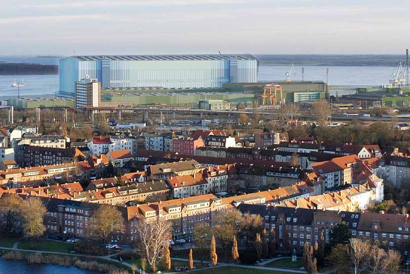
IL COLORE SECONDO / COLOUR ACCORDING TO [ 1 2 3 4 (5 + 6) 7 8 9 10 11 ] Friedrich Ernst Von Garnier
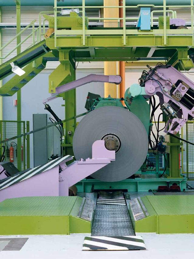
Dortmund: impianto industriale FBA 8 progettato per ThyssenKrupp. È importante Dortmund: FBA 8 industrial plant, designed for ThyssenKrupp. In the chromatic
nella ricerca della cromaticità dei grandi impianti industriali creare un gioco tra research for big industrial sites, it’s important to create an interplay between light
chiaro e scuro, in modo particolare con le sfumature verdi e azzurre. Premio europeo and dark colours, particularly with green and blue shades. European Structural
per le costruzioni in acciaio, Lucerna, 2003. Steel Design Award, Lucerne, 2003.
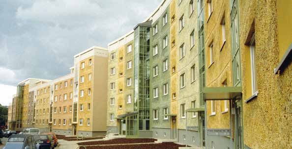
Gera: viste di un edificio residenziale Questo luogo è stato scelto da its wonderful landscape. The luxu- con il mondo circostante (...)”2. In his wide garden, a good-hu- stabili, molti dei quali affiancano fixed-term collaborators, many
prima e dopo l’intervento di v.Garnier,
che ne illustra la “rinascita” attraverso v.Garnier per il bellissimo pae- riant nature is the primary source Nell’ampio giardino, in un’atmo- mored v.Garnier shows us the v.Garnier sin dagli inizi della sua of whom have been working with
l’utilizzo dei “Plattenbau” (lastre di saggio. La natura rigogliosa è la of inspiration for his projects: hills sfera conviviale, ci mostra i ma- stone materials, distinctive of this carriera. v.Garnier since the beginning of
cemento prefabbricato). Premio per le fonte principale di ispirazione dei with vineyards and fields of wheat teriali lapidei tipici della zona ed region, employed in the house I numerosi progetti in corso sono his career.
facciate tedesche, 2003.
suoi progetti: colline con vigneti e form the perfect backdrop for the utilizzati nella ristrutturazione, restoration, which he personally prevalentemente edifici industria- The numerous on-going projects
Gera: views of a residential building campi di grano creano una corni- Organische Farbgestaltung (the curata nei particolari da lui stes- took care of, even in the slight- li, tra gli altri in USA (Alabama), revolve mainly around industrial
before and after v.Garnier’s
intervention, which focused on the ce ideale per la organische Farb- organic chromatic creation); in this so e ben integrata nel paesaggio est detail, perfectly integrating Russia, Cina, Messico, Italia (Ter- buildings, among which there
“rebirth” through the employment of gestaltung (creazione cromati- perspective, the colour doesn’t circostante. Di fronte allo studio it in the surrounding landscape. ni) per ThyssenKrupp, mentre in are the ones in United States
“Plattenbau” (prefabricated concrete
panels). German Façade Award 2003. ca organica); il colore in questa try to achieve trendy effects but è possibile vedere lo specchio In front of the studio, there is the Germania per Ikea sta realizzan- (Alabama), Russia, China, Mexico,
prospettiva non cerca effetti alla wants to be perceived as a living d’acqua dove il maestro ha speri- stretch of water, where the artist do un grande stabilimento per la Italy (Terni) for ThyssenKrupp,
moda, ma vuole essere percepito and musical element, addressed, mentato per la prima volta la pro- experimented for the first time consegna merci. while in Germany, for Ikea, he is
come elemento vivo, musicale e in before anything else, to men. gettazione cromatica del rivesti- the chromatic design of the Pro- V.Garnier ci descrive alcune delle designing a huge warehouse for
primo luogo destinato all’uomo. “The human being is undoubt- mento ceramico Pro-architectura architettura tiles coating system sue numerose creazioni con di- goods delivery.
“L’essere umano è indiscutibilmen- edly a creature who, born from per Villeroy & Boch. Nello studio he designed for Villeroy & Boch. segni e modelli appesi alle pareti V.Garnier tells us about some of
te una creatura che, nata da un a completely natural landscape, di Hof Iben, fondato insieme a Currently, at his Hof Iben studio, dell’ampio studio: la resa croma- his many creations through the
paesaggio interamente naturale, is guided by colour perception in Rabea Hartmann, lavorano attual- founded along with Rabea Hart- tica delle diverse soluzioni viene designs and models hanging on
viene guidata dalla percezione del his/her sensorial relations with mente sua moglie, l’architetto Ka- mann, work his wife, the archi- realizzata a mano, a pennello con the walls of his big studio: the
colore nei suoi rapporti sensoriali the surrounding world (...)”2. trin Knettig, e sedici collaboratori tect Katrin Knettig and sixteen colori a tempera in modo da ot- chromatic rendition of the differ-
46 COLORE COLORE 47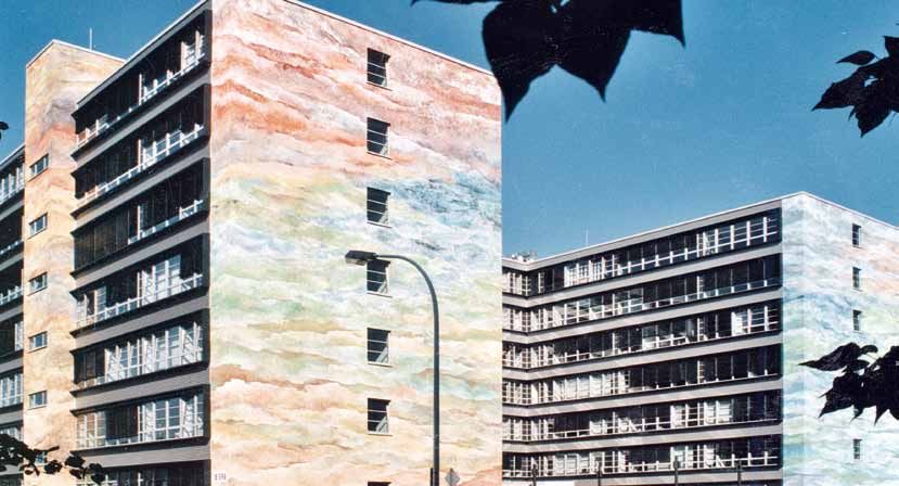
Friedrich Ernst Von Garnier

                                                                                                                                                                                                        Lo specchio d’acqua realizzato con il rivestimento ceramico della collezione
                                                                                                                                                                                                        Pro-architectura progettata da v.Garnier per Villeroy & Boch, la scelta e la
                                                                                                                                                                                                        composizione delle nuances ricorda il movimento e i cromatismi dell’acqua.
                                                                                                                                                                                                        The stretch of water made with the tiles coating system of the collection
                                                                                                                                                                                                        Pro-architectura, designed by v.Garnier for Villeroy & Boch; the nuances selection
                                                                                                                                                                                                        and composition recall the water movements and colour emphasis.

Amburgo: complesso residenziale, la         tenere nuances realistiche, che         ent solutions is hand-made with       le costruzioni in cemento armato        ings made in reinforced concrete.     luogo: una sorta di “rinascita” del-       nique, revealed an expression,
progressione cromatica creata
sull’elemento orizzontale e il rapporto     solo successivamente vengono            a brush and tempera colours,          prefabbricato tipiche dell’ex DDR e     The prefabricated concrete build-     l’edificio. Il progetto ha ottenuto il     an identity and became visually
tra chiaro e scuro rendono più leggero      disegnate a computer.                   in order to achieve realistic nu-     i “cubi bianchi” con il tetto rosso,    ings, characteristic of the former    “premio per le facciate tedesche           recognizable to the inhabitants:
il volume architettonico.                   Negli impianti industriali realizza-    ances, which only later are then      delle infinite casette unifamiliari,    DDR and the “white cubes” with        nel 2003”.                                 a sort of “rebirth” for the building.
La Farbgestaltung è stata realizzata
con lastre di alluminio Alucobond           ti dalla ThyssenKrupp il maestro        designed on the computer.             presenti in ogni area urbana della      the red roof of the countless de-     Durante la piacevole conversazione         In 2003, the project achieved the
© dell’azienda Alcan Singen.                utilizza le palette cromatiche          In the industrial plants, designed    Germania.                               tached houses, which can be           il maestro ci mostra i numerosi arti-      “German Façades Award”.
Hamburg: residential complex; the           create da lui stesso, si tratta di      for ThyssenKrupp, the German          V.Garnier lamenta come questa           found in every urban area around      coli dedicati alle sue opere e le sue      During our lovely conversation,
chromatic progression, created on the       lamiera stampata in acciaio trat-       artist employed the chromatic         “enorme massa grigia” nasconda          Germany, are very widespread          pubblicazioni. In un libero scambio        v.Garnier shows us the many ar-
horizontal element, and the relationship
between light and dark colours convey       tata con una pellicola colorata         palettes he himself created: a        spesso a livello sociale depres-        and a real blot for the landscape.    di idee ed opinioni gli chiedo:            ticles written about his works and
a lighter perception of the architectural   tipo smalto (Coil – coating), de-       laminated sheet-steel treated         sione, vandalismo, abbandono,           V.Garnier complains on how this       “Quali sono oggi, secondo lei, le          his publications. While exchang-
volume. The Farbgestaltung was made         nominata ReflectionOne®. Per la         with a coloured film similar to       freddezza: “dove mancano emo-           “huge grey mass” often conceals,      tendenze nell’utilizzo del colore in       ing ideas and opinions, I ask him:
with Alucobond © aluminum panels
of the Alcan Singen company.                stessa azienda ha realizzato altre      enamel (Coil – coating), called Re-   zione e senso per il colore, la vita    on a social level, depression, van-   architettura?”                             “What do you think is the current
                                            due collezioni: ReflectionLume®         flectionOne®. For the same com-       non si può evolvere”.                   dalism, desolation and coldness:      “Troppo spesso viene impiegato             trend in the employment of colour
                                            e ReflectionCinc®, sperimentan-         pany, he also produced two other      A Gera, in Turingia, nell’ex Germa-     “where emotion and a sense for        come semplice attributo di moda,           in architecture?”
                                            do texture su diversi supporti me-      collections: ReflectionLume® and      nia dell’est, ha progettato le nuan-    colour are missing, life cannot       come belletto, con toni troppo ac-         “Too often, colour is employed as
                                            tallici colorati.                       ReflectionCinc®, experimenting        ces di una facciata di un edificio      evolve”.                              cesi, acuti, completamente slegati         a simple fashion accessory, as an
                                            Il percorso progettuale di v.Garnier,   texture on different coloured me-     residenziale costruito con pan-         In Gera, Thuringia, in the former     visivamente dal contesto; ritengo          embellishment with shades too
                                            personaggio complesso, poliedri-        tallic bearings.                      nelli prefabbricati in cemento. Il      East Germany, he designed the         che la sommatoria di troppi mes-           bright or too sharp, completely
                                            co ed impegnato anche sul piano         The design process of v.Garnier –     colore utilizzato non ha cercato di     nuances on the façade of a resi-      saggi cromatici crei per le perso-         disconnected from the context
                                            sociale nel divulgare le sue idee,      complex and versatile character,      camuffare la realtà tetra dell’edifi-   dential building, made with pre-      ne caos percettivo.                        on a visual level. I believe that
                                            diventa chiaro visitando i diver-       also committed to spreading his       cio, ma è stato steso con una tec-      fabricated concrete panels. The       Ci si trova sostanzialmente di             summing too many chromatic
                                            si luoghi della Germania dove il        ideas on a social level – becomes     nica mista lasciando in trasparen-      colour he employed didn’t try to      fronte a due atteggiamenti oppo-           messages creates a perceptive
                                            grigio, colore dominante di tante       apparent when traveling around        za la patina sottostante. Le lastre     disguise the gloomy reality of the    sti: da una parte l’assenza di cro-        chaos in people. Basically, we are
                                            costruzioni in cemento armato,          Germany where the urban land-         in cemento, così trattate hanno         construction but was applied with     maticità, ovvero il bianco, il nero,       facing two opposite positions: on
                                            caratterizza il paesaggio urbano        scape of historical and suburban      evidenziato un volto, un’identità       a mixed technique, exposing the       il grigio e l’argento, dall’altra colori   one side, the lack of chromaticity
                                            dei centri storici e delle periferie.   sites is dominated by grey, the       e sono state rese riconoscibili         underlying veneer. The concrete       “aggressivi” e troppo legati alla          – colours such as white, black,
                                            Sono numerosissime e deturpanti         distinctive colour of many build-     visivamente dagli abitanti del          slabs, treated with this tech-        moda, ad esempio il rosso acceso           grey and silver – and on the other

48 COLORE                                                                                                                                                                                                                                                                      COLORE 49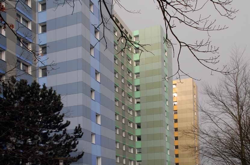
IL COLORE SECONDO / COLOUR ACCORDING TO [ 1 2 3 4 5 6 7 8 (9 + 10) 11 ]                                                                                                                                                                                                                          Friedrich Ernst Von Garnier

Da sinistra a destra: Mannheim - particolare del progetto colore della chiesa
evangelica St. Jakob
realizzata negli anni ’60 in cemento prefabbricato. Le diverse nuances così
distribuite danno l’idea di grandi raggi di luce che “illuminano” dall’alto il semplice
edificio.
Francoforte: complesso industriale della nota azienda chimica farmaceutica
Hoechst AG. Il colore progettato, attraverso diverse tecniche e materiali “ridisegna”
completamente l’aspetto di ciminiere, uffici, laboratori, hangar, silos, etc.
From left to right: Mannheim - detail of the colour project in the St. Jakob’s evangelic
church, designed in prefabricated concrete in the Sixties. The different nuances,
distributed in this way, convey the idea of large sunbeams “illuminating” from
above the rather simple building.
Frankfurt: industrial complex of the famous chemical and pharmaceutical Hoechst
AG company. The designed colour, through different techniques and materials,
completely “reshaped” the look of chimneys, offices, laboratories, hangars, silos.

o il blu (colore corporate image di           “bold” colours, too fashion-ori-             la policromia. Pensiamo ai “giochi      derstanding that polychromy is          le degli architetti. Nelle facoltà     concerning the architects’ profes-      Il Farbenkompass, tuttavia, non        composition.
molte aziende).                               ented, for example bright red or             di colore che risuonano creati dal-     necessary for man’s health and          universitarie di architettura, rac-    sional training. In the architec-       indica rapporti metrici, non è nep-    Nonetheless, the Farbenkompass
Una valutazione interessante si               blue (a corporate image colour               l’ambiente naturale, dove non esi-      wellbeing. Let’s think of “inter-       conta v.Garnier, l’insegnamento        ture faculties, v.Garnier tells us,     pure uno spazio tecnicamente           doesn’t indicate metric relations,
può fare per la nuance argento,               for many companies). I can give              ste uniformità, né monotonia”3.         plays of colours resounding as if       dedicato al colore risulta davvero     the colour subject is not taught        rappresentabile, bensì una cate-       nor is it a place which can be tech-
che definisco “il grigio degli snob”:         an interesting evaluation of the             Rivolgo un’ulteriore domanda al         created by the natural environ-         carente: la mancanza di cultura        in depth: the lack of a general         goria di ordinamento delle rela-       nically represented, but it works
l’argento su piccole superfici sem-           silver nuance, which I describe              maestro: “Come viene considerata        ment, where there is no uniform-        generale in materia è senz’altro       chromatic culture is surely re-         zioni e dei rapporti tra le diverse    as an order category for the rela-
bra aggiungere valore, ma esteso              as “the grey of snobbish people”:            la sua professione di color desi-       ity, nor dullness”3.                    una causa concreta del suo utiliz-     sponsible for the way colour is         nuances.                               tions and connections among dif-
su una grande superficie, a livello           silver on small surfaces seems               gner dagli architetti in Germania?”     I ask him another question: “How        zo, spesso, poco consapevole.          often employed inaccurately and         Secondo v.Garnier è essenziale         ferent nuances4.
di immagine, può dare l’idea di un            to add value, but if extended on             “Il mio lavoro può essere qual-         do architects in Germany regard         Il maestro spiega in sintesi: “il      unconsciously.                          saper osservare i colori e trovare     According to v.Garnier, it is essen-
elemento distruttivo di paesaggi              wider surfaces, as an image, can             che volta oggetto di polemiche,         your profession as a colour de-         colore è ecologia per gli occhi”,      “Colour is ecology for the eyes”,       nella composizione i rapporti ar-      tial to be able to observe colours
e città”.                                     convey the idea of a destructive             in quanto il mio percorso è con-        signer?”                                l’occhio umano crea interazioni,       as v.Garnier briefly puts it; the hu-   monici e le giuste relazioni.          and find the harmonic relations
A livello semantico e teorico                 element for landscapes and cities”.          trocorrente rispetto al mondo           “My job can sometimes be a little       relazioni di scambio tra il mondo      man eye creates interactions, ex-       Da questa prospettiva le conse-        and the right connections in the
v.Garnier differenzia due con-                On a semantic and theoretical per-           dell’architettura (nota dell’auto-      controvert, as my work opposes          esterno ed interno. “Una Farbig-       changing relations with the outer       guenze pratiche nel color design       combination.
cetti fondamentali Buntheit e                 spective, v.Garnier distinguishes            re v.Garnier ha opinioni talvolta       the general trend of the architec-      keit organica deve corrispondere       and inner world. “An organic Far-       organico sono numerose: i colori,      From this perspective, several are
Farbigkeit. Questi termini non si             two basic principles: Buntheit               lapidarie sugli architetti stessi).     tural world (author’s note: some-       a tre componenti principali del        bigkeit must coincide with three        spiega, possono essere pensati         the practical advantages in the
possono banalmente tradurre                   and Farbigkeit. These terms                  Posso dire che in generale esiste       times v.Garnier can be quite critical   paesaggio: la terra, l’elemento        major landscape components:             come i suoni nella musica, mu-         organic color design: colours, the
in italiano: il colorare gli edifici          cannot be trivially translated in            una sorta di antagonismo tra il         when he talks about architects).        della crescita vegetale e la lumi-     the territory, the element of veg-      tano sempre in relazione al con-       artist explains, resemble sounds
con nuances troppo aggressive,                English: Buntheit indicates col-             color designer e l’architetto. In re-   In general, I can say that there’s      nosità dell’acqua e del cielo”.        etable growth and the water and         testo, al materiale utilizzato, alle   in music, constantly evolving ac-
e compositivamente lontane dai                ouring buildings with nuances                lazione alla scelta del colore, nel-    a kind of antagonism between            I criteri per una progettazione or-    sky luminosity”.                        distanze tra di loro, alle “atmo-      cording to the context, the mate-
colori dell’ambiente naturale si              too aggressive and structurally              l’ambito degli architetti, l’aspetto    the color designer and the archi-       ganica si relazionano a diverse        The criteria for an organic de-         sfere”, alle armonie; comunque         rial used, the distance among
ascrive al termine Buntheit, men-             disconnected from the landscape              più preoccupante è che si sente         tect. Concerning the selection of       aspetti, ad esempio alla polarità      sign are connected to different         sia, al centro di questo “spettro      them, the “ambience” and the
tre Farbigkeit nell’ambito orga-              natural colours, while Farbigkeit,           ancora troppo spesso la solita do-      colour, in architecture, the most       del colore.                            aspects, for example, to colour         orchestrato”5 di suoni-colori, si      harmonies; however that may be,
nico risulta essere l’espressione             in the organic context, stands               manda: il colore è una questione        disturbing fact is that too often       Il riferimento è al Farbenkompass      polarity, which involves the            trova l’essere umano con le sue        at the heart of this “orchestrated
contraria e trova il riferimento              for the opposite expression and              di gusto? Il gusto ovviamente è         we still hear the same question:        (bussola del colore), dove sono        Farbenkompass (the colour com-          percezioni.                            spectrum”5 of sound/colour, there
principale al mondo della natura.             is strictly linked to the world of           un parametro del tutto inaffidabile     does colour depend upon taste?          presenti sei direzioni su tre assi     pass), where there are six direc-       Nella realizzazione a Dortmund,        is the human being with his/her
Un rimando a questo concetto è il             nature.                                      e non può essere definito espres-       Taste, no doubt, is a completely        perpendicolari tra loro. Abbiamo       tions on three axis perpendicular       il cromatismo verde-blu è stato        perceptions.
cromatismo della pittura impres-              A reference to this concept is the           sione di maturità, di competenza        unreliable parameter and cannot         in sequenza nell’asse verticale il     to each other. In sequence, we          utilizzato ampiamente; l’enorme        In the Dortmund project, the
sionista, a livello percettivo ricco          emphasis on colour employed in               nella formazione professionale”.        be described as an expression of        chiaro-scuro, negli assi orizzonta-    have, on the vertical axis, the         edificio industriale non viene         chromatic emphasis was widely
di movimento e trasparenza.                   the impressionist painting, full of          Domande come queste eviden-             maturity and competence in the          li il caldo-freddo e attivo-passivo,   light and dark shades, on the           occultato rispetto al paesaggio,       placed on green-blue shades; the
Organische Farbigkeit significa               movement and transparency on                 ziano una problematica, presente        professional training”.                 queste polarità devono essere          horizontal axis the hot-cold and        ma gli viene conferita una nuova       enormous industrial building is
capire che per la salute e il be-             a perceptive level.                          anche in Germania, ovvero quella        Such questions highlight an is-         sempre presenti in una composi-        active-passive ones; these polari-      immagine, quella che il maestro        not concealed in the landscape,
nessere dell’uomo è necessaria                Organische Farbigkeit means un-              della formazione professiona-           sue, present also in Germany,           zione4.                                ties must always be present in a        definisce una “orgogliosa identità     but it’s given a new image, which

50 COLORE                                                                                                                                                                                                                                                                                                                 COLORE 51
IL COLORE SECONDO / COLOUR ACCORDING TO [ 1 2 3 4 5 6 7 8 9 10 (11)]

Hof Iben, presso Fuerfeld in Germania:
studio e residenza del maestro Friedrich
Ernst v.Garnier.
Hof Iben, in Fuerfeld, Germany:
the artist Friedrich Ernst v.Garnier’s
home/studio.
                                                        dell’edificio industriale” attraver-      v.Garnier describes as “a proud
                                                        so un sapiente “gioco” tra l’evi-         identity of the industrial building”
                                                        denziare e il nascondere dei colori       through a skilful “interplay” of
                                                        distribuiti ritmicamente.                 highlighting and concealing col-
                                                                                                  ours, rhythmically distributed.
                                                        Il “gigantesco” edificio di Stral-
                                                        sund è un magnifico esempio del-          The “gigantic” building in Stral-
                                                        l’utilizzo del colore come potente        sund is a spectacular example of
                                                        e risolutivo mezzo per integrare          how colour can be used as a pow-
                                                        un volume edilizio nel paesaggio          erful and decisive way to inte-
                                                        urbano e naturale: il verde dei           grate a construction in the urban
                                                        corpi bassi crea uno sfondo visivo        and natural landscape: the green
                                                        sulla città, mentre l’hangar si erge      on the lower volumes creates
                                                        “leggero” grazie al rapporto “mu-         a visible backdrop on the city,
                                                        sicale” tra le superfici blu scuro        while the hangar appears to be
                                                        dei due volumi sporgenti, a soste-        “light-weight” thanks to the “mu-
                                                        gno percettivo dell’edificio e l’az-      sical” relation among the navy
                                                        zurro chiaro al centro che “libera”       blue surfaces of the two project-
                                                        lo spazio davanti al paesaggio tra        ing volumes, which sustain on a
                                                        cielo e mare.                             perceptive level the building, and
                                                                                                  the light blue at the center which
                                                        A conclusione dell’illuminante            “frees” the space in front of the
                                                        incontro con Friedrich Ernst              landscape between sky and sea.
                                                        v.Garnier e la moglie, preziosa
Note / Notes
                                                        coordinatrice dello studio di Hof         Once the enlightening encounter
1. Cfr. v.Garnier Friedrich Ernst, in:                  Iben, risulta evidente come un            with Friedrich Ernst v.Garnier and
Organische Architektur. Aktuelle Beiträge,              breve articolo sulla sua poderosa         his wife, invaluable coordinator
Teil 1, Berlin, September, 2004, p. 36.
2. Cfr. v.Garnier Friedrich Ernst, Meine
                                                        opera non possa essere che un             of the Hof Iben studio, is over, it
farbigere Welt. Ein ganz unsachliches                   semplice accenno alla complessi-          becomes apparent how a brief ar-
Sachbuch, Verlag Matthias Ess, 1996, p.30.              tà del personaggio ed alla sua filo-      ticle on his mighty work can just
3. Cfr. v.Garnier Friedrich Ernst, Meine
farbigere Welt. Ein ganz unsachliches                   sofia sul colore, ossia Organische        scratch the surface of his com-
Sachbuch, Verlag Matthias Ess, 1996.                    Farbgestaltung.                           plex character and his colour phi-
4. Cfr. Martin Benad, Architekturfarben.                La notorietà ed il successo da lui        losophy, that is the Organische
Lehre der Farbgestaltung nach Friedrich
Ernst v.Garnier, Verlag der Anton Siegl                 raggiunti a livello internazionale,       Farbgestaltung.
Fachbuchhandlung, 2007, p.105-121.                      sono l’espressione di una com-            The fame and success he
5. Cfr. Tornquist Jorrit, Colore e Luce. Teoria         petenza interdisciplinare che trae        achieved all over the world ex-
e pratica, Istituto del colore, Milano, 1999.
                                                        ispirazione da diversi campi del          press an interdisciplinary compe-
                                                        sapere. Il colore come arte, scien-       tence which draws its inspiration
                                                        za, tecnica, psicologia e linguag-        from different branches of knowl-
Bibliografia / Bibliography                             gio, è tra gli aspetti fondanti della     edge. Colour as art, science, tech-
v.Garnier Friedrich Ernst, Meine farbigere              sua attività di artista poliedrico;       nique, psychology and language,
Welt. Ein ganz unsachliches Sachbuch,                   il suo percorso progettuale come          is one of the fundamental aspects
Verlag Matthias Ess, 1996.                              pioniere ha un preciso obiettivo,         of his artistic and versatile work;
v.Garnier Friedrich Ernst, Meine farbigere              per così dire, una “missione”:            his pioneering design experience
Welt. Ein ganz unsachliches Sachbuch,
Meine Organischen Farbigkeiten, Verlag                  rendere il mondo più colorato, più        has a precise objective, a sort of
Matthias Ess, 2007.                                     vivo, più vicino all’uomo, (M)eine        “mission”: make the world more
v.Garnier Friedrich Ernst, Meine farbigere              farbigere Welt appunto.                   colourful, more alive and closer to
Welt. Ein ganz unsachliches Sachbuch,                                                             man; precisely (M)eine farbigere
Meine Menschliche Arbeitslandschaften,                  Si ringrazia Friedrich Ernst v.Garnier
Verlag Matthias Ess, 2007.                              Studio fuer Farbdesign im Staedtebau di
                                                                                                  Welt.
                                                        Hof Iben per aver gentilmente concesso
                                                        l’utilizzo delle immagini fotografiche    We would like to thank Mr. Friedrich
                                                        delle sue opere come color designer.      Ernst v.Garnier Studio fuer Farbdesign
                                                                                                  im Staedtebau of Hof Iben for kindly al-
                                                                                                  lowing us to use the photographs of his
                                                                                                  color design works.

52 COLORE                                                                                                                                                                COLORE 53

                                                                                                                                             Luigi Moro - “La bambola”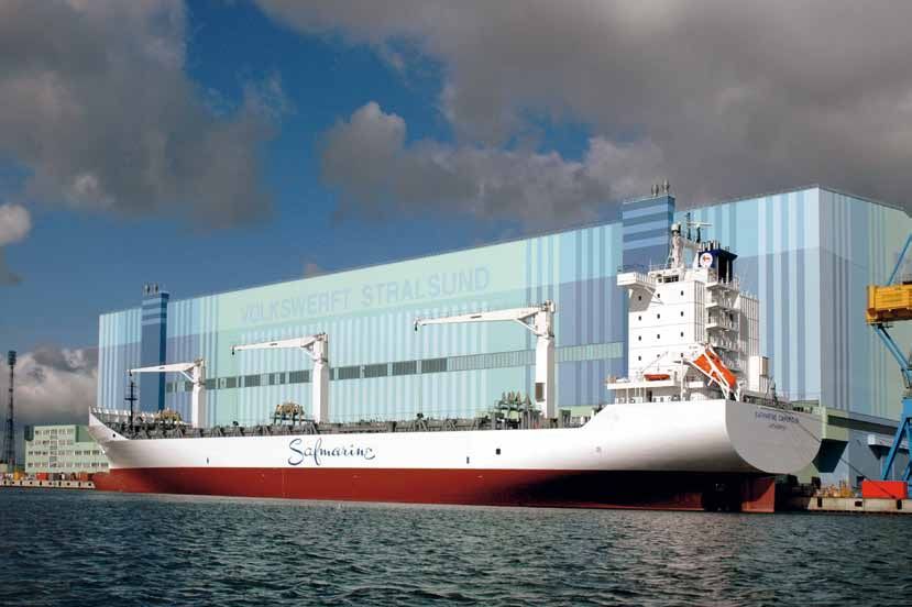
Puoi anche leggere