Il disegno che supera linguaggi e distanze. La missione archeologica italiana di AskGate
←
→
Trascrizione del contenuto della pagina
Se il tuo browser non visualizza correttamente la pagina, ti preghiamo di leggere il contenuto della pagina quaggiù
42° Convegno Internazionale
                                                                                              dei Docenti delle Discipline della Rappresentazione
                                                                                                   Congresso della Unione Italiana per il Disegno

                              Il disegno che supera linguaggi e distanze.
                              La missione archeologica italiana di AskGate
                              Cecilia Luschi

                              Abstract

                              Dopo una breve riflessione sul climax di questo ultimo anno e mezzo, il lavoro descrive come l’e-
                              spressività del disegno declinato secondo le sue aggettivazioni di grafico, simbolico, ideogrammatico,
                              abbia consentito il proseguimento di una attività di ricerca. Si tratta infatti della missione italiana
                              in Israele, ad Ashkelon, che nella emergenza ha sperimentato la reale capacità del disegno come
                              linguaggio universale, ponendo attenzione alle particolarità espressive delle due culture, italiana e
                              israeliana. Lo scrivere in versi opposti e con caratteri profondamenti diversi, sono stati fra gli altri gli
                              ostacoli comunicativi più incisivi ma che il disegno ha brillantemente risolto. Ecco che la distanza ha
                              fatto lavorare il gruppo di ricerca in prima istanza a definire codici visivi che fossero eloquenti, asciutti,
                              eleganti e iconici. Un lavoro che è stato pianificato come un vero e proprio progetto grafico, e rigore
                              metodologico e che ha prodotto una serie di “tutorial” per lo svolgimento delle fasi operative in
                              situ (ad Ashkelon) con una parte del gruppo di ricerca lontano migliaia di chilometri. Ne è derivata
                              una produzione a stampa di pieghevoli pensata in termini di colore, logo, composizione, e formato.
                              Una esperienza che ha dimostrato come il disegno sia riuscito a superare linguaggi diversi e grandi
                              distanze.

                              Parole chiave
                              progetto visivo, comunicazione, grafica, tutorial, Askgate.

Meeting on line operativo
organizzato dal gruppo
DIDA con il gruppo di
Ashkelon che avrebbe
poi eseguito le fasi di le-
vata degli elementi scelti.

                                                                                                          doi.org/10.3280/oa-693.96
                                                                    1709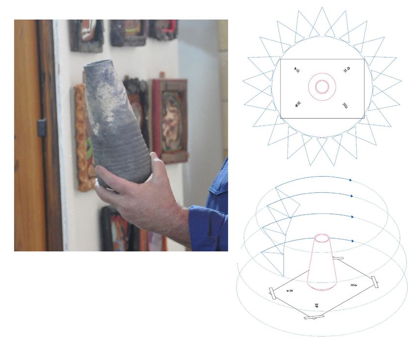
Introduzione
Quello che è avvenuto nell’ultimo anno e mezzo è una sorta di caduta all’interno di un
vortice fatto di alterità abitata da un senso di mancanza, senza capire profondamente da
dove potesse provenire un simile malessere. La routine ci ammazza! Quante volte abbiamo
pronunciato queste parole o abbiamo pensato che lo stare a casa avrebbe, in qualche modo,
migliorato la nostra qualità di vita, nel rompere ritmi convulsi. Affrontato il disagio telematico,
per entrare a far parte del modo evoluto e decantato della τέχνη (tecnè), penso che tutti
si siano cimentati nel dimostrare una qualche perizia ed un saper fare, con i vari protocolli
operativi, che tutte le possibili connessioni da remoto richiedevano.
Vorrei quindi riflettere su quell’aggettivo remoto, che fornisce, in maniera pertinente, il sen-
so della questione che si stava innescando e che ad oggi perdura.
Remoto è qualcosa di lontano nello spazio e nel tempo, ed anzi il tempo, in questo parti-
colare frangente, induce a sperimentare il concetto di tempo relativo; non è solo questione
di fisica, bastava essere più amici della sapienza e forse, lo avremmo capito anche senza le
faticose dimostrazioni scientifiche di Einstein.
Le lezioni, infatti, si possono registrare in un tempo e ciascuno, le può ascoltare nel suo tem-
po. La successiva riflessione, quindi, può suggerire che il tempo non è cosa oggettiva quando
diviene personale e dunque, è illusoria percezione che di fatto non esiste.
Sembra che il senso del tempo non si inneschi in una solitaria esperienza se non nel lungo
succedersi del buio e della luce (tempo nictemerale).
Rimane la questione del termine remoto, nel senso di spazio; esso invece persiste, si avverte.
La lontananza è separazione, distacco e drammatica assenza.
In siffatto turbinio di sensazioni e di tentativi di razionalizzare gli avvenimenti, il dovere, l’officio
latino, e l’abitudine al ritmo della vita, si sono dislocati in una dimensione atemporale e senza
soluzione di continuità. Gli eventi, per così dire, pianificati da altri comparivano sul ‘calendar’ e
non sull’agenda personale, dove tu potevi incastrarli con gli altri eventi cari e privati. Un palin-
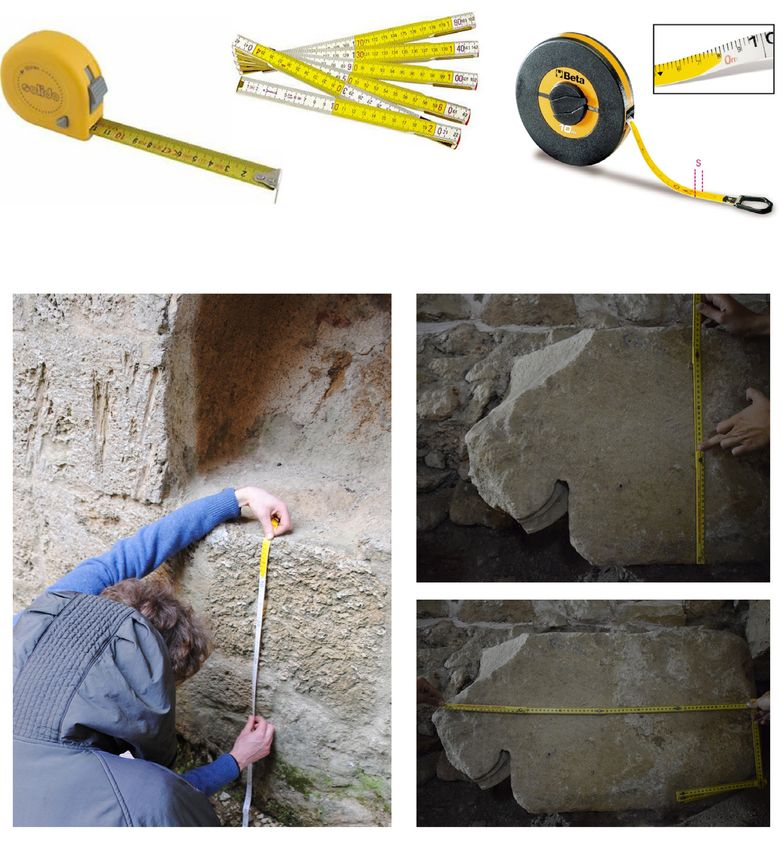
Fig. 1. Strumenti base da
reperire per le misurazio-
ni dirette.
1710
sesto estremamente confusionario, dove i giorni della settimana, senza un nome, scompari-
                               vano; una agenda vissuta con la passività di chi deve rincorre le questioni, preso dall’affanno,
                               senza un lucido pensiero volto a cosa dovesse essere fatto. Quanti di noi si sono ritrovati
                               davanti al computer una giornata intera senza aver realmente fatto nulla?
                               Ed eccole Meet, cloud, webex, classroom, chat, calendar, drive, parole estranee ad una quoti-
                               dianità di lontana consuetudine. Nella consapevolezza della parzialità comunicativa che tali
                               strumenti hanno come caratteristica intrinseca si doveva comunque portare avanti ricerche
                               e lezioni.
                               L’illusione della ‘connessione’, data da questi surrogati della connessione vera, hanno mostra-
                               to tutti i loro limiti e tutti i loro inganni. Come uscirne in modo dignitoso e come si possa
                               fornire sempre, un esempio di come la criticità di una persona, in senso intellettuale, vada
                               preservata?
                               Si capisce che il punto di vista offerto può non essere condiviso, ma per chi non si convince
                               che il progresso tecnologico equivale ad un progresso intellettuale, la questione da dirimere
                               è proprio il modus operandi, ed è faticoso tradurre la ricchezza immateriale di una lezione
                               frontale o di una ricerca fatta in situ. Già, dovremmo, in vero, preservare quel Cultural He-
                               ritage immateriale, di cui oggi tutti parliamo, ma partendo dalle basi, ovvero là dove si cerca
                               di frequentare la cultura.
                               E dunque, nel bel mezzo della pianificazione della missione di AskGate [1], con tutti i pro-
                               blemi logistici appianati e con il cronoprogramma messo a punto dal gruppo misto italo
                               israeliano, di circa 23 componenti, scoppia la problematica COVID 19 con la chiusura totale.
                               Non solo dovevamo evitare le feste religiose italiane ed ebraiche ma, soprattutto, le fasi di
                               chiusura che, per l’appunto, si sono rivelata alternate fra Italia e Israele.

                               AskGate – I Tutorial della missione archeologica italo israeliana 2020

                               Ashkelon nota agli europei come l’antica Ascalona, attualmente è una città israeliana con-
                               siderata dagli stessi israeliani una pericolosa periferia, tanto da escluderla dai classici tour
                               turistici offerti a pacchetti chiusi a tutto il mondo, anche se dista una sessantina di chilometri
                               da Tel Aviv.

Fig. 2. Messa a punto degli
steps di lavoro.

Fig. 3. Schema per l’eidoti-
po e come si inseriscono
le informazioni mensorie
all’interno del disegno.

                                                                 1711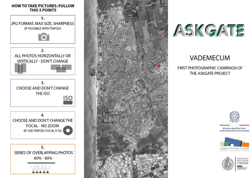
La verità è che pesa sull’area non solo la sua prossimità da Gaza e dalla contesa striscia, ma
                                ormai possiamo iniziare a sospettare che si tratti di un retaggio storico culturale, antico di
                                tremila anni, dove il popolo dei Filistei si trovava in grande antagonismo con gli altri popoli
                                confinanti.
                                Filisteo, significa popolo proveniente dal mare, ed elesse la biblica Ashkelon, come baricen-
                                tro primario della propria pentapoli.
                                Le varie epoche ci hanno lasciato in eredità numerosi strati di storia, oggi ancora leggibili
                                all’interno del sito archeologico di Ashkelon antica [Luschi, Vezzi, Stefanini 2021]
                                In questo quadro complesso dove, a partire dalla fine dell’Ottocento, si sono susseguiti scavi
                                e studi storici, si inserisce la missione archeologica italiana che è diretta da un architetto e
                                non da un archeologo.
                                Quindi la prima distanza concettuale, si concretizza nei profili coinvolti nel team di ricerca.
                                La missione ha proposto una analisi poco usata dal punto di vista archeologico ma che si
                                confà ad interpretazioni e teorizzazioni riguardo il metodo di studio dei dati reperiti.
                                L’organizzazione prevedeva, come ovvio, di realizzare le fasi di levata del dato in loco, ad
                                Ashkelon, insieme alla parte israeliana che con gli storici ed archeologi supportava l’attività.
                                Nel momento in cui si è concretizzata l’impossibilità di andare fisicamente sul sito, sembrava
                                che non si potessero più portare avanti le attività previste. Dopo un momento di spaesa-
                                mento, si è pensato di cambiare il protocollo attuativo dell’attività di reperimento dati e
                                quindi di proseguire con lo studio di Ashkelon da remoto.
                                Il vantaggio è stato di avere gli israeliani sul posto anche se i loro profili non erano partico-
                                larmente idonei a realizzare le fasi di levata come noi architetti.
                                Questa ultima affermazione deriva dal fatto di aver notato che, almeno in Israele, le univer-
                                sità di architettura non propongono mai né corsi di Disegno né di rilievo, come bagaglio
                                culturale autonomo. Spesso il rilievo, che non ha una precisa traduzione in inglese, come
                                pure la parola disegno, è visto come mero tecnicismo atto a sviluppare abilità nel gestire

Fig. 4. Specifica per la
miglior acquisizione
fotografica relativa all’ele-
mento edilizio conico in
cotto, proveniente dalla
manifattura di Gaza e che
è impiegato nelle volte
a crociera del vestibolo
della Moschea ottomana,
che si trova nell’antico
quartiere ottomano di
Ashkelon.

                                                                  1712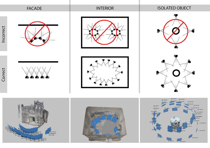
software o macchine, ma senza un vero apporto scientifico. La sezione italiana quindi ha ela-
                             borato una strategia di comunicazione che aveva la finalità di sopperire a questo gap e nel
                             contempo, offrire uno accrescimento della conoscenza metodologica al gruppo israeliano.
                             Approfittando delle varie piattaforme di comunicazione offerte dall’ateneo fiorentino, si è
                             costituito un gruppo di ricerca, come se fosse una classe di studio, approntata sulla piatta-
                             forma di Google, con connesso drive di scambio della documentazione.
                             Successivamente, stilato un calendario, si è organizzata una serie di incontri video, tramite
                             condivisione fra cellulare e computer, per permettere a noi italiani di controllare le fasi del
                             lavoro in situ realizzate dagli israeliani.
                             Il risultato è stato estremamente produttivo ed entusiasmante, vi era solo una questione
                             ancora da mettere a punto: la lingua.
                             Come è difficile crederlo ma non tutti gli israeliani parlano l’inglese, e dunque era arduo,
                             in mancanza della proverbiale comunicazione gestuale di noi italiani, riuscire a chiarire que-
                             stioni delicate per la campagna fotografica o per la realizzazione di un eidotipo.
                             La soluzione è stata trovata sviluppando dei veri e propri Tutorial disegnati e dalla grafica
                             estremamente eloquente, che passo passo, hanno reso comprensibile il metodo di esegui-
                             re le varie operazioni.
                             La stesura dei vari tutorial, come possiamo comprendere, non è stata né immediata né
                             facile.
                             Intanto sono state scelte operazioni base, che potessero permettere a chi stava in Italia di
                             controllare i dati man mano che venivano raccolti, e poi iniziare una fase di postproduzione
                             con un buon controllo metrico.

Fig. 5. Come impostare
il rilievo fotografico a
seconda dell’oggetto,
in questa particolare
immagine si è già iniziato
a distribuire le immagini
secondo la tripartizione
del pieghevole.

                                                              1713
Il secondo problema è stato di individuare una grafica non travisabile, che esprimesse con-
                              cetti precisi in un segno asciutto e chiaro.
                              La terza questione era la portabilità, ovvero trovare un formato di impaginato che non fosse
                              ingombrante, ma pratico al punto di portarlo sul sito durante la campagna di levata.
                              L’ultima questione affrontata, ma non meno importante, è stata quella dei colori e del logo;
                              può infatti sembrare banale, ma i colori dovevano permettere un buon contrasto e una vi-
                              sibilità chiara anche a pieno sole, cosa che per esempio non succede per i visori dei cellulari
                              o per i colori in gamma cromatica con aranci e rossi [Pinotti, Somaini 2009].
                              È stato usato un corpus di icone, simboli e diagrammi, per semplificare concetti complessi
                              [Falcidieno 2010] relativi alle inquadrature e alla corretta sovrapposizione dei fotogram-
                              mi, necessari per una campagna fotografica, atta a poter essere impiegata in una fase di
                              post-produzione.
                              L’aspetto che completa il protocollo di lavoro, è consistito nell’approntare una stazione
                              grafica, dedicata esattamente alla elaborazione dei modelli tridimensionali, accessibile da
                              remoto in modo tale che tutti, israeliani e italiani, ciascuno dalle proprie postazioni, grazie
                              ad un codice di accesso, hanno potuto processare i modelli seguendo il lavoro insieme. Si è
                              ottenuto una fluidità di lavoro, con confronti continui come in una sorta di ‘bottega’ rinasci-
                              mentale trasferita su piattaforma immateriale.
                              L’impiego di questa strategia organizzativa, come abbiamo detto, ha dato la possibilità di
                              pensare a come comunicare concetti e metodi, escludendo la condivisione di una lingua
                              parlata e non avendo l’opportunità di un contatto diretto né con il collega israeliano, né con
                              l’oggetto della ricerca stessa.
                              Si è quindi pensato di rivolgersi alle regole fondamentali della grafica pubblicitaria, atta-
                              gliandole alle contingenze ed agli obiettivi del programma di ricerca, affrontando una vera
                              e propria progettazione grafica che è diventata parte integrante dei prodotti della ricerca.
                              La progettazione visiva deve pianificare la comunicazione di una risposta ad un bisogno
                              precostituito, e di conseguenza ha in primis la necessità di individuare un target di persone a
                              cui rivolgersi [Samara 2010] In questo caso il target era costituito da un gruppo di persone
                              culturalmente eterogenee per formazione e neofite per il tipo di operatività da eseguire.
                              Il passo successivo è costituito dallo studio approfondito dell’oggetto della progettazione
                              per chiarire i limiti ed i confini di un design valevole; nel caso particolare non era un oggetto
                              quello che doveva essere investito dalla progettazione grafica, ma una serie di azioni, che
                              acquisiscono senso solo in un preciso ordine e solo se ciascuna azione si relaziona con la
                              sua precedente e contemporaneamente con la sua successiva.
                              La considerazione appena fatta conduce verso l’adozione di una grafica a spot, cioè di tipo
                              narrativo-figurativo-simbolica che pur essendo paratattica, evoca azioni conseguenti e con-
                              trollate [Panzeri 2013].

Fig. 6. Logo della missione
e studio dell’impaginato
del pieghevole.

                                                               1714
Fig. 7. Pieghevole finale,
recto.

                             L’ulteriore valutazione da fare riguarda il come si sarebbe dovuto utilizzare il tutorial, de-
                             clinandolo secondo: la leggibilità delle immagini, la loro corretta successione ed il tipo di
                             supporto.
                             Si è optato per un supporto cartaceo, ripiegato in tre, lo standard del pieghevole, stampato
                             a fronte retro e dislocando i tematismi secondo gruppi di tre ideogrammi per partizione
                             di foglio. La questione potrebbe sembrare poco importante se non fosse che gli israeliani
                             si orientano nella lettura da destra a sinistra e che la loro manualità quindi sarebbe stata
                             ridotta se si fosse seguito una composizione di pagina di tipo europeo. Per meglio spiegarsi, il
                             pieghevole offre in una colonna di spazio tutto il cronoprogramma operativo, ciascuna delle
                             sei colonne doveva ospitare una unica casistica.
                             Ovvio che la preparazione del materiale di comunicazione, coordinato nella grafica e nella
                             gradazione cromatica ha impegnato il gruppo in un vero e proprio studio della comunica-
                             zione e di sviluppo della relazione intellettuale, fra un mondo destrorso e uno sinistrorso, ne
                             è derivato che lo schema assiale, offerto dal pieghevole, mediava perfettamente le posizioni
                             in un felice connubio fra funzionalità e chiarezza.
                             Il formato del pieghevole, inoltre, risultava più rigido e piccolo e dunque, più pratico da por-
                             tare in tasca e da consultare con una sola mano, riducendo i disagi dell’attività all’aperto, fra
                             vento e mancanza di appoggi. Le scritte che corredano icone e ideogrammi, sono asciutte e
                             essenziali, ma comunque rafforzate dall’icone rappresentate il soggetto posto all’attenzione
                             Ecco che con semplici disegni associati a ideogrammi evocativi dell’azione, si è pianificata
                             una comunicazione visiva, dislocata nel tempo e nello spazio, in cui tutto concorreva al risul-
                             tato del reperimento del dato con metodologia semplificata ma corretta.

Fig. 8. Pieghevole finale,
verso.

                                                               1715
Conclusioni

L’esperienza appena descritta, che è scaturita da una azione di mitigazione dei rischi, relativi
alla missione archeologica AskGate, si è tradotta in una occasione, per affrontare tematiche
della comunicazione e della rappresentazione, con una diretta applicazione ed una verifica
immediata sull’efficacia di quanto messo a punto.
Gli israeliani hanno acquisito l’importanza di coordinare l’azione operativa sino nei partico-
lari e della efficacia del dato comunicativo. Il programma della ricerca ha raggiunto l’obiettivo
della esecuzione delle fasi di campagna, eseguita dagli israeliani, sotto la guida video degli
italiani. Tutte le spiegazioni essenziali, per chiudere un lavoro con semplicità e fluidità, erano
comunque nelle mani dei colleghi israeliani che sul sito, tutorial alla mano hanno eseguito
un ottimo lavoro, entusiasti di fare qualcosa che mai uno storico avrebbe mai pensato di
poter fare. Vorrei concludere dicendo che le discussioni più accese all’interno del gruppo
sono state quelle riguardo la gradevolezza dell’immagine e la sua eleganza, che gli israeliani
hanno riconosciuto come stile italiano, e davanti alla statua della Nike Alata severiana della
basilica di Ashkelon, che ci guardava dall’alto dei suoi quasi duemila anni, ci siamo commossi.

Note

[1] AskGate è un progetto di ricerca internazionale all›interno del Dottorato offerto dal Dipartimento di Architettura
DIDA: «Architettura, progetto, conoscenza e salvaguardia del Patrimonio Culturale”. Nel 2020 e nel 2021 Askgate ottiene
il riconoscimento istituzionale del Ministero degli Affari Esteri italiano e il progetto è finanziato dai fondi del Decreto «Cura
Italia» e MAECI nel 2021. Direttore della Missione Cecilia Luschi.

Riferimenti bibliografici

Falcidieno ML. (2010). Comunicazione-rappresentazione. Testo, immagine, segno grafico. Firenze: Alinea Editrice.

Falcinelli R. (2013). Nuove iconologie e visual design. Milano: Progetto Grafico AIAP.

Luschi C., Stefanini B., Vezzi A. (2021). Form and Architectural Culture of The Ashkelon Ancient City. In Evolution Journal of
Life Sciences and Society, pp. 74-83. Tirana: Official Publication of the Catholic University “Our Lady of Good Counsel”.

Panzeri M. (2013). La grafica è un’opinione Tecnologia e società. Milano: Ledizioni.

Pinotti A., Somaini A. (2009). Teorie dell’immagine, Il dibattito contemporaneo. Milano: Raffaello Cortina Editore.

Samara T. (2010). Elementi di grafica. Forma visiva e comunicazione. Modena: Logos.

Autore
Cecilia Luschi, Università degli Studi di Firenze, cecilia.luschi@unifi.it

Per citare questo capitolo: Luschi Cecilia (2021). Il disegno che supera linguaggi e distanze. La missione archeologica italiana di AskGate/The design
transcending languages and distances. The Italian archaeological mission of AskGate. In Arena A., Arena M., Mediati M., Raffa P. (a cura di). Connettere.
Un disegno per annodare e tessere. Linguaggi Distanze Tecnologie. Atti del 42° Convegno Internazionale dei Docenti delle Discipline della Rappresentazi-
one/Connecting. Drawing for weaving relationship. Languages Distances Technologies. Proceedings of the 42th International Conference of Representation
Disciplines Teachers. Milano: FrancoAngeli, pp. 1709-1724.

Copyright © 2021 by FrancoAngeli s.r.l. Milano, Italy                                                                           Isbn 9788835125891

                                                     1716
42th International Conference
of Representation Disciplines Teachers
Congress of Unione Italiana per il Disegno
The Design Transcending Languages
and Distances. The Italian Archaeological
Mission of AskGate
Cecilia Luschi
Abstract
After a brief reflection on the climax of the last year and a half, the work describes how the expres-
siveness of the drawing declined according to its adjectives of graphic, symbolic, ideogrammatic, has
allowed the continuation of a research activity. It is the Italian mission in Israel, in Ashkelon exactly,
which in the emergency experienced the real capacity of design as a universal language, paying
attention to the expressive peculiarities of the two cultures, Italian and Israeli. Writing in opposite
verses and with profoundly different characters, were among others the most incisive communica-
tion obstacles but that the design brilliantly solved. Here distance made the research teamwork in
the first instance to define visual codes that were eloquent, wipe, elegant and iconic. A work has
been planned as a real graphic project, and methodological rigor and that has produced a series of
“tutorials” for carrying out the operational phases in situ (in Ashkelon) with a part of the research
group thousands of kilometers away. The result is a printed production of leaflets designed in terms
of color, logo, composition, and format. An experience that has shown how drawing has managed to
overcome different languages and great distances.
Keywords
visual project, communication, graphics, tutorials, AskGate.
Online meeting organized
by the DIDA group with
the Ashkelon group who
would then go to work in
the field.
doi.org/10.3280/oa-693.96
1717Introduction
What has happened in the last year and a half is a kind of fall within a vortex made of other-
ness inhabited by a sense of lack, without deeply understanding where such a malaise could
have come from. Routine kills us! How many times have we spoken these words or thought
that staying at home would, in some way, improve our quality of life, in breaking convulsive
rhythms. Faced with telematic discomfort, to become part of the evolved and decanted way
of τέχνη (tecnè), I think that everyone has tried to demonstrate some expertise and know-
how, with the various operational protocols, that all possible connections remotely require.
I would therefore like to reflect on that remote adjective, which provides, in a relevant way,
the meaning of the issue that was being triggered and which continues to this day.
Remote is something far away in space and time, and indeed time, at this particular juncture,
induces us to experiment with the concept of relative time; it is not only a matter of physics,
it was enough to be more friends of wisdom and perhaps, we would have understood it
even without Einstein’s laborious scientific demonstrations.
The lessons can be recorded in a time and everyone can listen to them in their time. The
subsequent reflection, therefore, may suggest that the tempo is not an objective thing when
it becomes personal and therefore, it is illusory perception that does not actually exist.
It seems that the sense of tempo does not get involved in a lonely experience other than
in the long happening of darkness and light (nictemeral time).
There remains the question of the term remote, in the sense of space; and if it persists, it is
felt. Remoteness is separation, detachment, and dramatic absence.
In such a whirlwind of sensations and attempts to rationalize events, duty, Latin officio, and
habit at the pace of life, have found themselves in a timeless and seamless dimension. The
events, so to speak, planned by others appeared on the ‘calendar’ and not on the personal
agenda, where you could frame them with other dear and private events. An extremely
confusing schedule –where the days of the week– without a name disappeared; an agenda
Fig. 1. Basic tools to be
found for direct measu-
rements.
1718lived on with the passivity of those who have to chase the issues –taken by breathlessness–
without a lucid or thought for what should be done. How many of us found ourselves
in front of the computer a whole day without really doing anything?
And here are Meet, cloud, WebEx, classroom, chat, calendar, drive, words foreign to a daily
life of distant custom. In the awareness of the communicative partiality that these tools have
as an intrinsic characteristic, however, research and lessons had to be carried out.
The illusion of ‘connection’, given by these surrogates of the real connection, showed all
their limitations and all their deceptions. How can we get out of it in a dignified way and
how can we always provide –an example of how a person’s criticality, in an intellectual sen-
se– should be preserved?
It is understood that the point of view offered may not be shared, but for those who are
not convinced that technological progress is equivalent to intellectual progress, the question
to be designed is precisely the modus operandi, and it is difficult to translate the immaterial
richness of a frontal lesson or research done in situ. Yes, we should, in fact, preserve that
intangible Cultural Heritage, which we all talk about today, but starting from the basics, that
is, where we try to attend culture.
And so, in the middle of the planning of Ashkgate’s mission [1], with all the logistical pro-
blems smoothed out and with the chrono program developed by the mixed Italian-Israeli
group, of about 23 components, the COVID 19 problem breaks out with the total closure.
Not only did we have to avoid the Italian and Jewish holidays, above all, the closing phases
that, precisely, turned out to be alternate between Italy and Israel.
AskGate – The Tutorials of the Italian Israeli Archaeological Mission 2020
Ashkelon known to Europeans as the ancient Ashkelon, is currently an Israeli city considered
by Israelis themselves a dangerous suburb, so much so that it excludes it from the classic
tourist tours offered to packages closed to the whole world, although it is about six y kilo-
meters from Tel Aviv.
The truth is that it weighs on the area not only its proximity from Gaza and the disputed
strip, but we can now begin to suspect that it is a cultural historical heritage, three thousand
Fig. 2. Fine-tuning of the
work steps.
Fig. 3. Diagram for the
eidotype and how the
monthly information is
inserted into the drawing.
1719years old, where the Filistei people were in great antagonism with the other neighboring
peoples.
Philistia, means people from the sea, and elected the biblical Ashkelon, as the primary center
of gravity of their pentapolis.
The various eras have bequeathed to us numerous layers of history, today still legible within
the archaeological site of ancient Ashkelon. [Luschi, Vezzi, Stefanini 2021]
In this complex framework where, since the end of the nineteenth century, excavations
and historical studies have followed, the Italian archaeological mission that is directed by an
architect and not by an archaeologist.
Then the first conceptual distance, is realized in the profiles involved in the research team.
The mission proposed an analysis that is little used from an archaeological point of view but
that conflicts with interpretations and theorizations regarding the method of studying the
data found.
The organization envisaged, of course, to carry out the phases of data collection on site, in
Ashkelon, together with the Israeli part that with historians and archaeologists supported
the activity.
At the time when it became apparent that it was impossible to physically go to the site, it
seemed that the planned activities could no longer be carried out. After a moment of di-
sorientation, it was thought to change the protocol implementing the data retrieval activity
and then to continue with Ashkelon’s study remotely.
The advantage was to have the Israelis on the spot even if their profiles were not particu-
larly suitable for carrying out the steps of rise like us architects.
This last statement stems from the fact that it has noticed that, at least in Israel, architectural
universities never offer either drawing or relevant courses, as an autonomous cultural back-
ground. Often the relief, which does not have a precise translation into English, as well as the
word drawing, is seen as mere technicality designed to develop skills in managing software
Fig. 4. Specific for the best
photographic acquisition
of the conical brick
building element, coming
from the Gaza factory
and which is used in
the cross vaults of the
vestibule of the Ottoman
Mosque, located in the
ancient Ottoman quarter
of Ashkelon.
1720or machines, but without a real scientific contribution. The Italian section then developed a
communication strategy that was intended to make up for this gap and at the same time
offer an increase in methodological knowledge to the Israeli group.
Taking advantage of the various communication platforms offered by the University of Flo-
rence, a research group was set up, as if it were a study class, prepared on the google pla-
tform, with connected documentation exchange drive.
Subsequently, a series of video meetings were organized, through sharing between mobile
phones and computers, to allow us Italians to control the phases of in situ work carried out
by the Israelis.
The result was extremely productive and exciting, there was only one issue still to be de-
veloped: language.
How difficult is believes it, but not all Israelis speak English, and therefore it was difficult, in
the absence of the proverbial sign communication of us Italians, to be able to clarify issues
delicate for the photographic campaign or for the realization of an eidotype.
The solution was found by developing real tutorials designed and with extremely eloquent
graphics, which step by step, made understandable the method of performing the various
operations.
The writing of the various ‘tutorials’, as we can understand, was neither immediate nor easy.
Meanwhile, basic operations were chosen, which could allow those in Italy to control the
data as they were collected, and then start a postproduction phase with good metric control.
The second problem was to identify a non-travisble graphic design, which expressed precise
concepts in a dry and clear sign.
Fig. 5. How to set
up the photographic
survey according to the
object, in this particular
image we have already
begun to distribute the
images according to the
tripartite division of the
leaflet.
1721The third issue was portability, which was to find a paginated format that was not cumber-
some, but practical to the point of bringing it to the site during the campaign.
The last issue addressed, but no less important, was that of colors and logo; it may seem
trivial, but the colors had to allow good contrast and clear visibility even in full sun, which for
example does not happen for mobile phone headsets or for colors in the color range with
oranges and reds [Pinotti, Somaini 2009].
The corpus of icons, symbols and diagrams has been used to simplify complex concepts
[Falcidieno 2010] relating to the shots and correct overlap of the frames, necessary for a
photographic campaign, which can be used in a post-production phase.
The aspect that completes the working protocol, consisted in the preparation of a graphic
station, dedicated exactly to the elaboration of three-dimensional models, accessible re-
motely in such a way that everyone, Israelis and Italians, each from their own workstations,
thanks to an access code, were able to process the models following the work together. A
fluidity of work has been obtained, with continuous comparisons as in a sort of Renaissance
‘workshop’ transferred to an intangible platform.
The use of this strategy organization, as we have said, has given us the opportunity to think
about how to communicate concepts and methods, excluding the sharing of a spoken lan-
guage and not having the opportunity for direct contact either with our Israeli colleague or
with the subject of the research itself.
It was therefore decided to turn to the fundamental rules of advertising graphics, adapting
them to the contingencies and objectives of the research program, facing a real graphic
design that has become an integral part of the research products.
Visual design must plan the communication of a response to a pre-established need, and
consequently has the first need to identify a target of people to turn to [Samara 2010] In
this case the target was a group of culturally heterogeneous people for training and newbies
for the type of operation to be performed.
The next step is the in-depth study of the object of the design to clarify the limits and boun-
daries of a valid design; in the particular case it was not an object that was to be invested
by graphic design, but a series of actions, which acquire meaning only in a precise order and
only if each action relates to its previous and at the same time to its subsequent one.
The consideration just made leads towards the adoption of a spot graphic, that is, narrati-
ve-figurative-symbolic that, although paratactic, evokes consequent and controlled actions
[Panzeri 2013].
The further evaluation to be made concerns how the tutorial should have been used, de-
clining it according to: the legibility of the images, their correct succession and the type of
support.
Fig. 6. Logo of the mission
and study of the layout of
the leaflet.
1722Fig. 7. Final leaflet, front.
We opted for a paper medium, folded into three, the standard of folding, printed on the
back side and dislocating the thematizes according to groups of three ideograms per sheet
partition. The issue might seem unimportant matter if it were not for the fact that the Isra-
elis are oriented in reading from right to left and that their dexterity would therefore have
been reduced if a European-type page composition had been followed. To explain itself,
the leaflet offers in a column of space the entire operational time schedule, each of the six
columns had to host a single case.
It is obvious that the preparation of the communication material, coordinated in graphics
and chromatic gradation, has engaged the group in a real study of communication and de-
velopment of the intellectual relationship, between a right-handed and a sinister world, it
has resulted that the axial scheme, offered by the leaflet, perfectly mediated the positions in
a happy combination of functionality and clarity.
The folding format was also more stiff or small and therefore more practical to carry in
your pocket and to be consulted with one hand, reducing the discomfort of outdoor acti-
vity, between wind and lack of supports. The writings that accompany icons and ideograms,
are dry and essential, but still strengthened by the icon represented the subject brought to
attention
Here, with simple drawings associated with evocative ideograms of the action, a visual com-
munication was planned, located in time and space, in which everything contributed to the
result of finding the data with simplified but correct methodology.
Fig. 8. Final leaflet, verso.
1723Conclusions
The experience described above, which resulted from a risk mitigation action, related to the
archaeologists ‘mission and at AskGate, resulted in an occasion, to address issues of commu-
nication and representation, with a direct application and an immediate verification of the
effectiveness of what has been developed.
The Israelis have acquired the importance of coordinating operational action down to the
point of detail and the effectiveness of the communication data. The research programmed
has achieved the objective of carrying out the campaign phases, carried outby the Israelis,
under the video guidance of the Italians. All the essential explanations, to close a job with
simplicity and fluidity, were still in the hands of Israeli colleagues who on the site, tutorials
in hand performed a great job, excited to do something that never a historian would have
thought he could do. I would like to conclude by saying that the most heated discussions
within the group were those about the pleasantness of the image and its elegance, which
the Israelis recognized as Italian style, and in front of the statue of the Nike Alata Severiana
of Ashkelon basilica, which looked at us from the top of its almost two thousand years, we
were moved.
Notes
[1] AskGate is an international research project within the PhD offered by the DIDA Department of Architecture: “Architectu-
re, project, knowledge and preservation of cultural heritage” . In 2020 and 2021 Askgate obtained the institutional recognition of
the Italian Ministry of Foreign Affairs and the project is financed by the funds of the Decree “Cura Italia” and by MAECI in
2021. Director of mission Cecilia Luschi.
References
Falcidieno ML. (2010). Comunicazione-rappresentazione. Testo, immagine, segno grafico. Firenze: Alinea Editrice.
Falcinelli R. (2013). Nuove iconologie e visual design. Milano: Progetto Grafico AIAP.
Luschi C., Stefanini B., Vezzi A. (2021). Form and Architectural Culture of The Ashkelon Ancient City. In Evolution Journal of
Life Sciences and Society, pp. 74-83. Tirana: Official Publication of the Catholic University “Our Lady of Good Counsel”.
Panzeri M. (2013). La grafica è un’opinione Tecnologia e società. Milano: Ledizioni.
Pinotti A., Somaini A. (2009). Teorie dell’immagine, Il dibattito contemporaneo. Milano: Raffaello Cortina Editore.
Samara T. (2010). Elementi di grafica. Forma visiva e comunicazione. Modena: Logos.
Author
Cecilia Luschi, Università degli Studi di Firenze, cecilia.luschi@unifi.it
To cite this chapter: Luschi Cecilia (2021). Il disegno che supera linguaggi e distanze. La missione archeologica italiana di AskGate/The design tran-
scending languages and distances. The Italian archaeological mission of AskGate. In Arena A., Arena M., Mediati M., Raffa P. (a cura di). Connettere. Un
disegno per annodare e tessere. Linguaggi Distanze Tecnologie. Atti del 42° Convegno Internazionale dei Docenti delle Discipline della Rappresentazione/
Connecting. Drawing for weaving relationship. Languages Distances Technologies. Proceedings of the 42th International Conference of Representation
Disciplines Teachers. Milano: FrancoAngeli, pp. 1709-1724.
Copyright © 2021 by FrancoAngeli s.r.l. Milano, Italy Isbn 9788835125891
1724Puoi anche leggere