ART JOURNAL CAMPARI GALLERY - 14#
←
→
Trascrizione del contenuto della pagina
Se il tuo browser non visualizza correttamente la pagina, ti preghiamo di leggere il contenuto della pagina quaggiù

ART
JOURNAL
               CAMPARI GALLERY
                            # 14
CAMPARI; IL GIOCO DELLE LETTERE | CAMPARI; THE GAME OF LETTERS
                     Di / By Serena Spinelli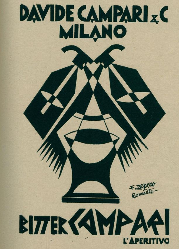
Come si scrive “Campari”? In 7 lettere, 3
sillabe e più di 100 variazioni tipografiche che si
rincorrono felicemente lungo tutto l’arco storico
temporale della sua brillante comunicazione.
Supponiamo di poter arrestare per pochi istanti
questa corsa nel tempo, precisamente alle ore
10.41 del 1° novembre, 1964. Ebbene, il carattere
eclettico, ludico e cinetico delle lettere che
compongono la parola Campari si convoglierebbe
allora nel famoso manifesto di Bruno Munari.
In quell’attimo la città di Milano inaugurava
il primigenio viaggio della linea metropolitana
e Campari ne celebrava lo spirito innovativo
con un’opera d’arte pensata per essere vista
in movimento. “Declinazione grafica del nome
Campari” fu così il primo manifesto pubblicitario
affisso lungo le banchine della metropolitana,
simbolo innovativo del profondo legame tra lo
storico marchio ed il dinamismo della città.
Per la sua importanza storica l’opera originale
è parte della collezione del MOMA di New York,
sezione Architecture & Design, ed è stata esposta
nelle sale del Museo Newyorkese in svariate
mostre. Nella progettazione di questo capolavoro
dal sapore POP che sottolinea la connessione tra
la prima linea del metrò (detta “la Rossa”) e il Bitter
Campari, il genio di Munari si pose un traguardo
non-traguardo: creare una combinazione grafica
di lettere senza alcuna punteggiatura interna,
una carrellata di lettering colorati che potessero
scorrere all’infinito senza perdere mai la forza della
propria essenza semantica. In effetti, il manifesto
fu stampato in un unico formato ma era progettato
per essere accostato a sé stesso per un numero
infinito di volte senza mancare mai di coesione
cognitiva.
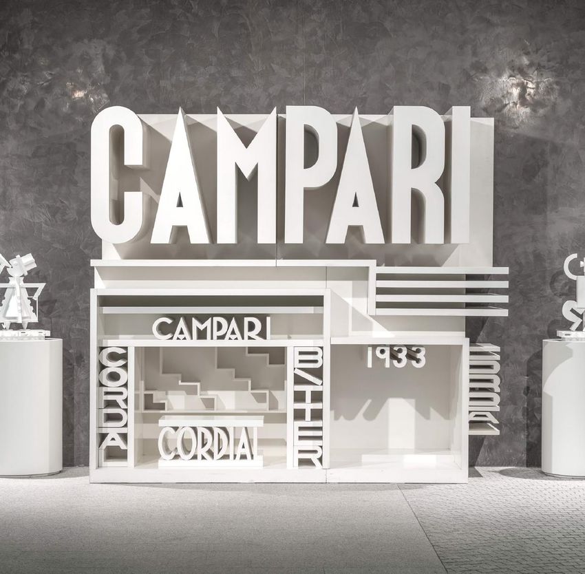
Copertina/Cover: Padiglione Campari, 1980,
ph Francesco Radino, Archivio /Archive Galleria Campari
Declinazione grafica del nome Campari /
Graphic declination of the name Campari,
Bruno Munari, 1964, Archivio / Archive Galleria Campari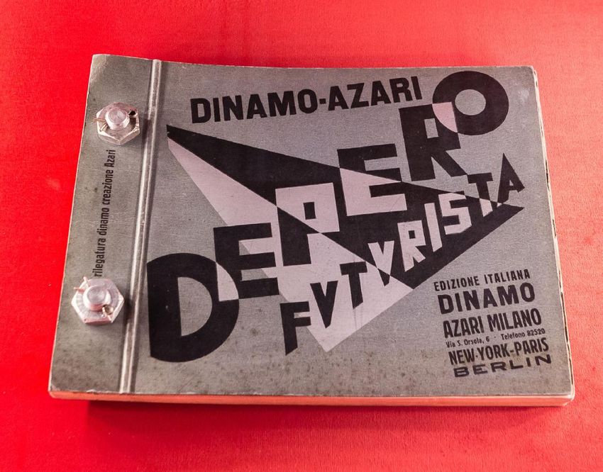
How do you write “Campari”? In 7        representing an innovative symbol of
letters, 3 syllables and more than 100      the historic brand’s profound ties to the
typographic variations happily running      city’s dynamism.
through the entire historical spectrum of
its brilliant communication.                    Because of its historical importance,
                                            the original work is part of the collection
    Suppose we could freeze frame this      of the MOMA in New York, Architecture
race across time for a few instants,        & Design section, and has been
precisely at 10.41 of November 1st, 1964.   exhibited in the halls of the New York
Well, the eclectic, playful and kinetic     Museum in various exhibitions. During
character of the letters composing the      the design process of this POP flavoured
word Campari would align themselves         masterpiece underlining the connection
within the famous poster by Bruno           between Bitter Campari and the first
Munari.                                     line of the metro (known as “the red
    At that precise moment the city of      line”), Munari set himself an ingenious
Milan was inaugurating the primal           open-ended objective. The goal was to
trip of the first metro line and Campari    create a graphical combination of letters
celebrated its innovative spirit with       which could be repeated an infinite
a work of art designed to be seen in        number of times and never lose their
movement.                                   semantic essence. In fact, the poster was
    “Graphic variation of the name          printed in a single format, but it could
Campari” was the first advertising          be posted side by side in a continuous
poster to be affixed along the              flow without ever lacking in cognitive
underground platforms, thus                 cohesion.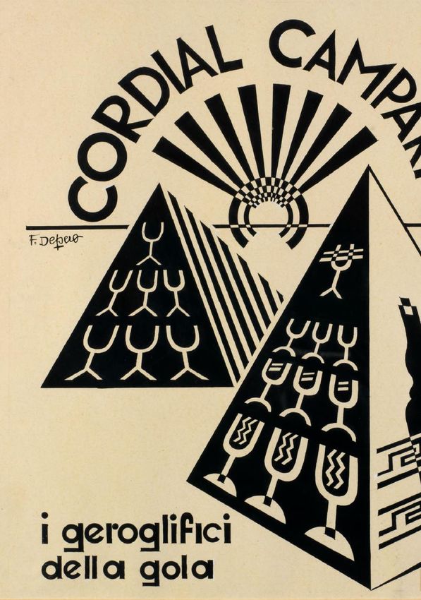
La grafica dinamica e coinvolgente di questo
collage di lettere mimava il movimento scorrevole
delle carrozze straripanti di cittadini animati dal
nuovo fermento della modernità. La direzione
delle lettere combaciava con il senso di marcia
del treno e con l’orizzontalità dei finestrini,
permettendo dunque al fruitore di provare questa
nuova esperienza di velocità e di percepire in
simultanea la passione rossa dell’azienda. Questa
giocosa ripetizione del logotipo Campari attraverso
ordinamenti prospettici sempre nuovi, segmentati
e ricomposti in mille modi, era anche il frutto
del lavoro pluridecennale di Munari sui limiti
della leggibilità. Come constatò l’artista stesso il
manifesto raggiunge la sua efficacia d’informazione
anche se visto parzialmente, anche se intravisto
attraverso un gruppo di persone, persino se visto di
corsa dalla vettura del metrò.

   L’idea di una frammentazione tipografica del
testo, il concetto di dinamizzare lettere e parole
per rispecchiare la nuova velocità della vita è, in
prima analisi, di matrice Futurista. Il fondatore di
questa importante avanguardia italiana, Tommaso
Marinetti, intuì precocemente che le nuove forme
di comunicazione e di trasporto, avrebbero influito
sensibilmente sulla psiche umana. La cultura delle
informazioni doveva dunque muoversi di pari passo
con questa accelerazione. Da giovanissimo artista
Munari assimila perfettamente le fondamenta di
questo pensiero, cogliendo a pieno le potenzialità
del manifesto che T. Marinetti scrisse nel 1913
sulla distruzione della sintassi e la rivoluzione
tipografica.

              “Non voglio suggerire un’idea o delle sensazioni
           con grazia e leziosaggine, voglio afferrarle
           brutalmente e scagliarle in pieno petto al lettore” “…
           Noi useremo tre o quattro colori diversi d’inchiostro,
           e anche 20 caratteri tipografici diversi, se occorra…
           Corsivo per una serie di sensazioni simili e veloci,
           grassetto tondo per le onomatopee violente. Questa
           rivoluzione tipografica mi permette d’imprimere alle
           parole tutte le velocità, degli astri, delle nuvole, degli
           aeroplani, dei treni, delle molecole, degli atomi …”
The graphic quality of this letter collage was
dynamic and very engaging. It mimicked the swift
movement of the carriages bulging with citizens
animated by this new buzz of modernity. The
direction of the letters matched the direction of
the train along the tracks and the horizontality of
the carriage windows. From within, the travellers
were able to experience the new velocity and
simultaneously perceive the company’s red passion.
This whimsical repetition of the Campari logotype
with its ever-changing perspectival orders and its
myriad segmentations and recompositions was also
the fruit of Munari’s multidecade long work on the
limits of legibility. As the artist himself ascertained
the poster achieves its informative efficacy even
when partially obscured, even when glimpsed at
through a crowd, and especially when seen from the
speeding carriage of the underground train.

    The idea of a typographic fragmentation of
the text and the concept of dynamizing letters
and words to reflect life’s new velocity ultimately
descends from a Futurist matrix. As the founder
of this important Italian avant-garde, Tommaso
Marinetti precociously sensed that new forms
of communication and transportation would
sensibly influence the human psyche. The culture
of information would thus have to move in step
with this acceleration. As a very young artist
Munari perfectly assimilated the foundations of
this philosophy and fully grasped the potential
of the manifesto written by Marinetti in 1913 on
the destruction of syntax and the typographic
revolution.

               “I don’t want to evoke an idea or a sensation
            with these traditionalist charms or affectations, I
            want to seize them roughly and hurl them straight
            in the reader’s face” …in an average page we will
            use three or four different colours of ink and even
            twenty diverse fonts. For example, Italic for a series
            of similar and rapid sensations, Boldface for violent
            onomatopoeia etc…this typographical revolution
            allows me to impose on words every kind of speed
            – that of the stars, the clouds, the airplanes, the
            trains, the molecules, the atoms…”
La portata di questa rivoluzione              The weight of this revolution
e la felice applicazione dei suoi            and the felicitous application of
precetti nella comunicazione                 its principles to the advertising
pubblicitaria fu compresa a pieno            domain was also fully understood
anche da Davide Campari, il quale            by Davide Campari, who had
fu sempre estremamente ricettivo             always been extremely receptive to
alle sperimentazioni. Non sorprende          experimentation. Not surprisingly
dunque che il punto di massima               his association with Fortunato
convergenza tra l’innovativa sensibilità     Depero marks the point of
del Futurismo e la grafica Campari           maximum convergence between the
si dovette attuare nel suo sodalizio         innovative sensibility of Futurism
con Fortunato Depero. Durante quel           and Campari graphics. During
vigoroso decennio (1926-1936) di stretta     that vigorous decade (1926-1936) of
collaborazione tra Davide e Fortunato        close collaboration between Davide
lo stile della comunicazione Campari         and Fortunato, Campari’s style of
fu assolutamente all’avanguardia ed il       communication was absolutely avant-
gioco delle lettere si moltiplicò in ogni    garde, and the game of letters was
direzione.                                   multiplied in every direction.

   La prima inconfondibile traccia di           The first unmistakeable trace of
questo gioco assolutamente seminale          this seminal game for Italian graphic
per la grafica italiana si trova nel libro   art may be found in the book Depero
Depero Futurista, noto come il “libro        Futurista, knokn as “bolted book” by
imbullonato” di Depero. L’audace             Depero. The audacious publication
pubblicazione del 1927 fu sostenuta          from 1927 was economically subsidized
economicamente dalla Campari* ed un          by Campari and a single fleeting
solo fugace sguardo ai suoi contenuti,       glance at is contents (presently
esposti oggi tra le mura multimediali        exhibited within the multimedia space
della Galleria Campari, può causare il       of the Campari Gallery) can cause the
fatale innamoramento del visitatore.         visitor to fall fatally in love.

Libro imbullonato / Bolted book, Fortunato Depero,
1927, Archivio / Archive Galleria Campari
Libro imbullonato / Bolted book, Fortunato Depero,
1927, Archivio / Archive Galleria Campari
L’occhio è immediatamente attirato            The eye is immediately attracted
dall’originale legatura ideata dall’editore   to the original binding invented by the
futurista Fedele Azari: al bando colla        Futurist editor Fedele Azari: glue and
e filo, entrano in scena due grossi           thread were banned, and two great
bulloni che trapassano tutto il libro.        metal bolts hold the entire book together
Un chiaro riferimento all’amore per la        instead. This is a clear reference to the
meccanica e l’industria, così tipico della    love of industry and mechanics which
poetica futurista. Con consueta ironia        is so typical of Futurist poetics. With
Depero lo definì un libro meccanico,          his habitual irony Depero defined the
inclassificabile, pericoloso, poiché          book as mechanical, unclassifiable, and
poteva essere “lanciato verso il nemico       dangerous since it could be “hurled at
come un proiettile”. Metaforicamente          the enemy like a bullet”. Metaphorically
parlando il proiettile partì da Milano,       speaking the projectile was launched
raggiunse la Germania della Bauhaus e         from Milan, reached the Bauhaus in
orbitò sugli Stati Uniti per arrivare sino    Germany and orbited over the United
ai giorni nostri, creando uno scompiglio      States and returned to the present day
ed un rinnovamento che non cessa              where the kind of havoc and renewal
di avere ripercussioni sulla grafica          it created still has repercussions on
contemporanea.                                contemporary graphic design.

   Il testo del libro imbullonato è               The text of the bolted book is
impresso su vari tipi di carta: sottile,      printed on various types of paper: thin,
grossa, bianca e di vari colori, con          thick, both white and multi-coloured,
pagine che si aprono a raggiera. Esso         with pages that open up like mobile
rappresenta il primo vero libro-oggetto       rays. It represents the first true object-
dal design accattivante nella storia          book with a captivating design in the
dell’editoria. Le parole impaginate con       history of publishing. The lay out is
lettere di vari formati, fonts e colori       animated by letters of different formats,
conferiscono un nuovo ruolo alla              fonts and colours which bestow a new
tipografia ed è qui che il testo diventa      role upon typography; this is where
immagine per la prima volta. È una            text becomes image for the first time
sfida alla tradizionale indipendenza          and the traditional independence of
di questi due concetti poiché le              these two elements is challenged. As
lettere assumono anche delle valenze          the letters acquire aesthetic value,
estetiche, diventano parcelle di una          they become the tesserae of a more
immagine più complessa, si fondono            complex image which fuses together
nella mente dell’osservatore. Proprio         within the mind of the viewer. This is
come nella futura opera “metropolitana”       exactly what happens in the future
di Munari dove le lettere variopinte          “metropolitan” work of Munari where
giocano tra di loro sullo sfondo rosso        the multi-coloured letters play upon
della superficie animata; nell’istante        the red background of the animated
stesso in cui vengono lette si                surface; as soon as they are read
trasformano in immagini. Un’immagine          they also become image. The image
che non è astratta né figurativa ma che       is neither abstract nor figurative but
con sublime forza espressiva proiettò il      through its sublime expressive power
viaggiatore nel sotterraneo tunnel del        it projects the traveller through the
futuro assieme alla Campari.                  underground tunnel of the Future along
                                              with Campari.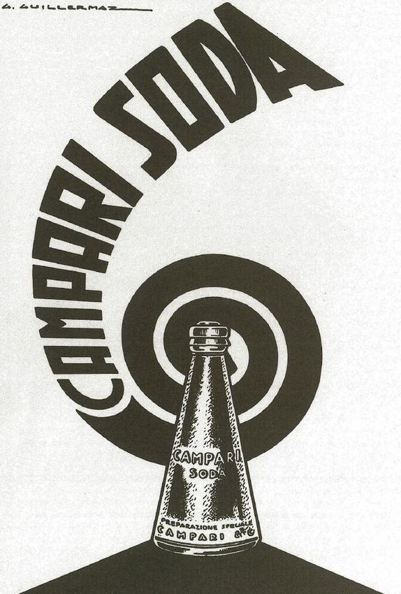
Se volgiamo lo sguardo ancora una              If we observe the 1927 book once
volta al libro del 1927 noteremo che           more, we will notice that the sentences
le frasi scorrono in varie direzioni           run in various directions- horizontal,
- orizzontale, verticale, diagonale,           vertical, diagonal, at right angles, in
ad angolo retto, in forma circolare,           circles, squares, and even triangles
quadrata, triangolare e lo sguardo del         whilst the eyes of the reader are pressed
lettore viene sollecitato a seguire. La        to follow suit. The physicality of the
fisicità di chi legge si attiva, testa e       reader is activated, mind and body
corpo si piegano per seguire il flusso         bend to follow the flux of the brazen
delle lettere spavalde. Applicato              letters. This concept was worth gold in
in seguito alla grafica commerciale            its subsequent application to Campari’s
della Campari questo concetto valse            commercial graphic design and the
come l’oro e gli slogan catturarono            slogans more readily captured the
maggiormente l’attenzione del                  attention of the distracted passer-by
passante o del lettore distratto.              or reader. The expressive power of the
La forza espressiva delle parole fu            words was doubled just as Marinetti had
raddoppiata così come insegnava il             thought and this was most effectively
pensiero Marinettiano di cui Depero è          put in practice by Depero.
tutt’oggi l’interprete più efficace.               With these revolutions the Futurists
    Con queste rivoluzioni i Futuristi         were not merely aiming to stimulate
non miravano a sollecitare l’estro di          the creativity of an elite. On the
una élite ma intendevano fondere               contrary, they fully intended to reach
l’arte con il quotidiano, puntando a           a mass audience by merging art with
raggiungere un’audience di massa.              day-to-day life. This also explains
Ragione per cui Depero sposò                   why Depero married the cause of
l’arte pubblicitaria e ne proclamò             advertising art and proclaimed its
l’importanza in una seconda                    importance in a second amazing
mirabolante pubblicazione ideata               publication conceived specifically
appositamente per Campari nel 1931:            for Campari in 1931: Numero Unico
Numero Unico Futurista Campari.                Futurista Campari.

         “il cartello è l’immagine simbolica                “the poster is the symbolic image
      di un prodotto, è la geniale trovata              of a product, it is the ingenious plastic
      plastica e pittorica per esaltarlo ed             and pictorial idea which will exalt
      interessarlo. Esaltando con il genio              it. By extolling with our genius our
      i nostri prodotti, le nostre imprese              products and our industries, that is
      cioè i fattori primi della nostra                 the primary factors of our life, we
      vita, non facciamo che dell’arte                  will only make the purest and truest
      purissima e verissima, moderna. L’arte            form of modern art. Advertising art is
      pubblicitaria è fatalmente necessaria-            fatally necessary- fatally courageous”.
      arte fatalmente audace.”
Il Numero Unico contiene una raccolta di circa settanta bozzetti pubblicitari creati dall’artista Trentino per la società milanese, rifinitissime composizioni in bianco e nero dove le lettere che piroettano felici con le immagini stimolano ancora l’intelletto dell’osservatore, fanno la gioia di chi si avvicina al mondo Campari, ieri come oggi. The Numero Unico features a collection of about seventy advertising sketches created for the Milanese brand by the artist from Trentino, refined compositions in black and white where the letters dance happily with the images still stimulate the intellect of the observer, bringing joy of those who approach the Campari world, then as now. Numero Unico Futurista Campari, Fortunato Depero, 1931, Archivio/Archive Galleria Campari
In Paesaggio quasi tipografico le lettere
contenute nelle parole “Cordial Campari”
s’iscrivono tra le fronde delle palme, ondeggiano
nel respiro del mare fondendosi con la natura
rigogliosa della pagina.

   In “an almost typographical landscape” the
letters contained within the words “Cordial
Campari” are graphically planted within the
fronds of the palm trees. They sway within the
breath of the sea and fuse into the luxuriant
nature of the page.

Paesaggio quasi tipografico, Fortunato Depero, 1930-31,
Archivio / Archive Galleria Campari
Le lettere del “Cordial” rimbalzano poi leggere
e festose nello spazio della china intitolata
Palestra tipografica. Sono maneggiate con brio
dalle maiuscole del nome Campari, a sua volta
trasformato in tanti giocolieri che pompano i loro
muscoli con gli attrezzi dell’alfabeto.

   The letters in “Cordial” then bounce lightly and
joyfully within the space of the ink drawing entitled
Typographic Gym. They are handled with verve by
the capital letters of the name Campari, which in
their turn have morphed into jugglers pumping their
muscles with alphabet weights.

Palestra tipografica, Fortunato Depero, 1931, Archivio /
Archive Galleria Campari
La scena si fa più esotica e si veste
di archeologia nell’opera dal titolo I
geroglifici della gola. Questa volta
è l’immagine che diventa testo in
una declinazione di tratti e caratteri
sempre altamente trasformista. Ed
ecco che bottiglie e calici stilizzati
assumono il valore di una scrittura
archetipica che campeggia sulle
piramidi.

    The scene becomes more exotic and
dons an archaeological atmosphere
in the work entitled “the hieroglyphs
of the palate”. This time it’s the
image which becomes text within
a metamorphosis of marks and
characters which is always surprising.
Watch closely as bottles and chalices
adorning the pyramids are endowed
with the value of an archetypal
scripture!

I geroglifici della gola, Fortunato Depero, 1931,
Archivio/Archive Galleria Campari
Dall’antico Egitto ai grattacieli all’unisono con le forme figurative, di New York il passo è breve e nel composizioni slanciate ed originali che Numero Unico figurano anche svariate nel complesso si distanziavano dalla composizioni dove il potente logotipo scena pubblicitaria dell’epoca dove gli Campari è simbolo della metropoli. stanchi retaggi del Liberty erano ancora Nel caso specifico il progetto di Davide percepibili. era associare l’immagine di Campari L’architettura, o meglio l’architettura alla modernità urbana d’oltreoceano delle lettere, si materializza poi in tutto il e Depero era perfetto per questa suo plasticismo nel 1933, quando Depero missione. In questo periodo l’estro disegna un padiglione pubblicitario dell’artista si congiunge spesso ai testi di utilizzando le lettere come materiale Giovanni Gerbino che scrive invocazioni di costruzione. Il nome del marchio pubblicitarie con la stessa forza dei e dei prodotti costituisce la base di manifesti Marinettiani: “grattacieli una solida e geometrica struttura, un potenti, vertigini celesti …raggianti calici Tempio moderno, per abitare e vivere il di cordialsole…” Parole che crescono Campari, abitare la vita nell’arte.
Certain compositions from
the Numero Unico fly directly
from the ancient pyramids to the
skyscrapers of New York where
the powerful Campari logotype
becomes a symbol of the
metropolis. In this case Davide’s
project was to associate the
image of Campari to the urban
modernity overseas. Depero
was the perfect man for this
mission and in those years his
artistic flair will often be joined
to the advertising invocations
of Giovanni Gerbino who wrote
with the same force of Marinetti’s
manifestos: “potent skyscrapers,
celestial vertigo…radiant chalices
of cordialsun…” Words that
are amplified along with their
figurative forms, streamlined
and original compositions which
generally distanced themselves
from the contemporary
advertising scene where the tired
legacy of the Liberty style was
still perceptible.
    Speaking of architecture,         Cordial Campari, Fortunato Depero, 1929, Archivio /
                                      Archive Galleria Campari
in 1933 Depero designs an
                                      Bozzetto di Padiglione per la ditta Davide Campari
advertising pavilion where the        e C., Fortunato Depero, 1933, Archivio / Archive
letters are the real bricks of a      Galleria Campari

solid geometric construction. An
architecture of letters therefore
materializes itself in all its
plasticism; the names of the
brand and its products generate
a modern temple to house and
live Campari, to house life within
art.
Il progetto non venne realizzato ma
Padiglione Campari, 1980, ph Francesco Radino,
Archivio / Archive Galleria Campari possiamo osservarne i lati più visionari
Grafica pubblicitaria Campari / Advertising sketch, nella bianca ricostruzione in scala situata
George Guillermaz, 1925 c. nella grande Lobby degli Headquarters di
Grafica pubblicitaria Campari / Advertising sketch, Campari Group il cui progetto è firmato
1930s, George Guillermaz
Mario Botta, dove i rimandi tra passato e
futuro si esprimono in armonia.
The project never came to fruition, but we
can observe its visionary impact in the life
size model situated within the great Lobby
of the Campari Headquarters, whose project
is signed by Mario Botta, where the echo of
past and future is harmoniously expressed.La parola Campari non solo Così come la raffinata dama in cui i vari stili della scrittura si
può costituire il cemento di settecentesca con l’elegante abito piegano a forma di baffo e basette
una struttura architettonica ma e la vaporosa parrucca costruiti nel Toreador, in naso ed orecchie
con le sue lettere si può anche con le lettere delle parole nel Brasileiro.
rappresentare un gentiluomo Cordial Campari, sapientemente
con frac, cilindro e bastone nella combinate tra loro dall’artista G. Gli effigiati sfilano in questa
grafica dell’artista Gregory, anni Guillermaz nel disegno ‘Dama’ immaginifica passerella vestendo
‘20, che realizza l’intera figura con degli anni ’30. In quegli anni le lettere come dei cappelli, dal
preziosi dettagli, interamente resi lo stesso artista applica le sue Fez turco all’ampia Sugegasa
attraverso l’abile combinazione contorsioni grafiche ad una serie giapponese i caratteri dei prodotti
delle lettere che prendono che associa Bitter e Cordial ai rinomati giocano a travestirsi in
forma, si allungano, si adagiano, costumi tradizionali di alcuni mille modi. Si appoggiano sulle
si accorciano, disegnando una paesi allora poco conosciuti. teste dei personaggi sfiorando
silhouette molto glamour. Sono piccoli ritratti giocosi e con estro e leggerezza le menti
“letterizzati” quelli di Guillermaz del pubblico.
As the round gentleman As well as the refined be letter-filled to the brim; various
(1920-25 circa) by G. Guillermaz eighteenth-century lady with writing styles are moulded into the
smartly attests, the word Campari the elegant dress and the fluffy moustache of the Toreador, or into
may constitute the concrete of wig built with the letters of the the nose and ears of the Brazilian.
an architectural structure, but words Cordial Campari, skillfully
its letters can also compose, for combined with each other by the The sitters appear to strut along
example, a gentleman with tails, artist G. Guillermaz in the design an imaginary catwalk wearing
cylinder and stick as the graphic of the 1930s. In those years the their letters like hats, from the
rapresentation by Gregory in the same artist applies his graphic Turkish fez to the ample Japanese
1920s. He realizes the entire figure contortions to a series which sugegasa the letters of the famous
with precious details, entirely pairs Bitter and Cordial with the Campari products play a varied
rendered through the skillful traditional costumes of a few game of masquerade. Thus poised
combination of letters that shape, foreign countries with an exotic on the heads of the characters the
stretch, lie, shorten, drawing a very appeal. These small and playful letters lightly stroked the minds of
glamour silhouette. portraits by Guillermaz appear to the public with their inspiration.Tra le due guerre la pubblicità alludere alla tipica base in ebano di Campari è talmente eclettica ed al un prezioso pezzo di modernariato. passo con i tempi che insieme alle lettere vediamo scherzare anche le Nel 1935 questa base nera si frecce! Questi fondamentali segni tramuta in vassoio per servire grafici che oggi si usano con grande le eleganti lettere del Cordial, facilità nel contemporaneo graphic leggermente inclinate all’indietro, design non erano così consueti negli in ferma acrobazia sulle lunghe dita anni ruggenti. Eppure, l’artista Giorgio del cameriere. È una composizione Federico Dabovich li coniuga con essenziale ed emblematica maestria. Suo il bozzetto del 1928 dell’illustratore A. Zhelizh dove che vede protagonista la doppia comprendiamo subito che la forza freccia per indicare sinteticamente il del nome Campari è tutto ciò che legame univoco tra Davide Campari serve per immaginarne l’esperienza. Il e l’aperitivo più amato dai milanesi. nome ci dice tutto, da solo basta per Innegabilmente chic il gioco delle esprimere le credenziali del liquore e lettere sulla diagonale dell’esile questo all’epoca è una costante della cannuccia nel calice. Slanciate e comunicazione. La reputazione è tale geometriche come una statuetta Art che il gioco delle lettere è sufficiente Déco son le forme della scritta “Bitter per evocare l’immagine ed il gusto del Campari” che si posano sulla spessa prodotto. linea nera, quest’ultima pare proprio
In the period between the two wars Campari
advertising is very eclectic and in step with
the times. It will not be surprising therefore to
see arrows joking around with the letters too!
These fundamental signs that are so common to
today’s contemporary graphic design were not
as ordinary during the roaring Twenties. Yet,
the artist Giorgio Federico Dabovich conjugates
them with mastery. In a drawing from 1928
the double arrow is the protagonist succinctly
indicating the unequivocal relationship between
Davide Campari and the beloved Milanese
aperitif. The play of letters along the diagonal of
the slender straw in the glass is undeniably chic.
The inscription “Bitter Campari“ is streamlined
and geometric and, like an imaginary period
statuette, it rests on a thick black line. The latter
is much like the typical ebony base of a precious
piece of Art Deco.

   In 1935 we witness the metamorphosis of
this black base into a serving tray upon which
the elegant letters of the word “Cordial” are
gently inclined, but firmly poised on the long
acrobatic fingers of the waiter. It’s a minimalist
but emblematic composition by the illustrator
A. Zhelizh wherein we immediately understand
that the power of the name Campari is all that
is needed to imagine the experience. The name
says it all, it sufficiently expresses the credentials
of the liquor, and this was a constant of Campari
communication. The reputation is such that the
game of letters alone perfectly evokes the image
and taste of the product.

Cordial Campari, A. Zhelizh, 1935 c, Archivio /
Archive Galleria Campari
In effetti un classico come il         è un suono, diventa una doppietta
Cordial aveva bisogno di ben               onomatopeica e questo concetto di
poche introduzioni ma nello stesso         rappresentazione grafico - uditiva
anno vediamo una composizione              ci riconduce a Marinetti il quale
propagandistica dove la danza delle        nel 1912 scrisse il libro Zang Tumb
lettere si presta ad una nuova musica;     Tumb per esprimere la sensazione
quella del nuovissimo Campari Soda,        dell’artiglieria durante la prima
il primo cocktail premiscelato della       guerra dei Balcani. Il famoso testo
storia. La forma del cono-calice           s’inserisce nel progetto più ampio di
rovesciato è firmata Depero, chi           sintetizzare la tradizionale sintassi e
altro poteva racchiudere un drink          si riallaccia alla già citata rivoluzione
rivoluzionario in un design di estrema     tipografica dei Futuristi. È importante
efficacia? Mentre l’opera grafica in       realizzare che oltre al dinamico
questione è di Guillermaz, un grande       aspetto estetico dei caratteri si
coreografo dell’alfabeto che in questo     voleva esercitare una semplificazione
caso seppe inserire la caratteristica      grammaticale della scrittura,
forma dell’innovativa bottiglietta         accorciare le distanze tra i vari
nell’insieme del testo-immagine. Le        concetti eliminando la punteggiatura
lettere qui sgorgano da una girandola      e limitando l’uso di aggettivi troppo
di vibrazioni sonore emesse dalla          determinanti. Essenzialmente questo
bottiglietta stessa, quasi fosse un        capovolgimento si traduceva nel
megafono che ci chiama a raccolta.         tema delle “parole in libertà”. Al
                                           bando le sfumature di linguaggio,
   I caratteri crescono                    l’ordine convenzionale delle frasi e la
progressivamente di taglia, si             lungaggine delle descrizioni. Ed ecco
estendono sul fondo bianco dello           che i sostantivi fluttuano sulla pagina
spazio per simulare l’eco sempre più       liberamente collegando tra loro
ampio di queste parole:                    cose distanti e sviluppando l’intuito
                                           del lettore già coscientemente

           RI SODA
                                           predisposto a correre, come il
CAMPA                                      Campari, con il suo tempo.

   A classic like Cordial Campari was      shape of the innovative bottle with the
not in need of many introductions but in   text/image. Here the letters pour forth
the same year we also see a promotional    from a pinwheel of sound vibrations
composition where the letters dance to a   emitted by the very bottle almost like a
different tune; the brand-new Campari      megaphone calling out to us. The letters
Soda, the first premixed cocktail in       progressively increase in size, they
history. The cone shaped (or overturned    extend towards the white space of the
chalice) bottle is signed by Depero. Who   page, simulating the ever-greater echo
else could have designed an effective      of these words:
container for such a revolutionary

                                                       RI SODA
drink? On the other hand, the drawing
in question is by Guillermaz, a great
choreographer of the alphabet who          CA  MPA
was able to fuse the characteristic        is a sound, becomes an onomatopoeic
Campari Soda, George Guillermaz, 1935,
Archivio / Archive Galleria Campari
coupling. This concept of an auditory/ different concepts by eliminating
graphic representation brings us back punctuation and limiting the use of overly
to Marinetti who in 1912 wrote the determinate adjectives. Essentially this
book Zang Tumb Tumb to express the overturning of tradition would translate
sensation of the artillery during the first to the theme of “words in freedom”. All
Balkan war. The notorious text was linguistic subtleties would be banished,
part of a larger project involving the and the conventional order of the phrases
simplification of traditional syntax and is would be overthrown. Nouns would
directly connected to the aforementioned now freely float on the page, making
typographic revolution of the Futurists. connections between previously distant
Aside from the dynamic aesthetic of the things, developing the intuition of the
characters it’s important to realize that readers who were already consciously
these thinkers wanted to synthesize the predisposed to run, like Campari, to the
grammatical structure of writing. Their rhythm of their time.
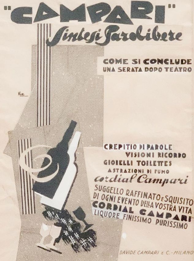
goal was to shorten distances betweenSintesi parolibere, Marcello Nizzoli, 1930, Archivio / Archive Galleria Campari
Le sintesi parolibere                   The synthesis of words in
sembrarono fatte appositamente          freedom seems specifically
per i ritmi incalzanti della            construed for the pressing rhythms
pubblicità e Davide Campari,            of publicity and Davide Campari,
sempre genialmente a capo del           (who was still the masterful
proprio “ufficio propaganda”,           director of the “propaganda
ne è perfettamente conscio.             office”) was perfectly conscious
Quando Marinetti scrive                 of this. When Marinetti writes “…
“Corrono infatti, fra il pubblico       the relationship between the
e il poeta i rapporti stessi che        public and the poet must be the
esistono tra due vecchi amici.          same as the rapport between two
Questi possono spiegarsi con            old friends. They are capable
una mezza parola, un gesto,             of explaining themselves with
un’occhiata. Ecco perché                a few words, a gesture, a wink.
l’immaginazione del poeta deve          Thus, the imagination of the
esprimersi senza fili conduttori,       poet must express itself without
per mezzo di parole essenziali in       strings, through essential
libertà…”al “poeta” basterebbe          words in freedom…” one need
sostituire il termine “industriale”     only substitute “poet” with
e la relazione tra Campari              “industrialist” and the relation
e l’efficace comunicazione              between Campari and the efficient
Futurista sarebbe chiara.               Futurist communication would be
                                        clearly established.
    Per applicare questi concetti
innovativi alle sue inserzioni             To apply these novel concepts
pubblicitarie Davide Campari            to his advertisements Davide
assolda il grande designer              Campari commissions the
Marcello Nizzoli che così tanto         great designer Marcello Nizzoli
impatto avrà in Italia sulla            whose impact on Italian poster
cartellonistica, la decorazione,        art, decoration, set design and
la scenografia ed in primis sul         especially industrial design would
design industriale. Nel 1926 egli       be exceptional in the years to
aveva già realizzato due celebri        come. In 1926 Nizzoli had already
manifesti in cui le bottiglie           produced two famous posters
di Bitter e Cordial sono le             where the bottles of Bitter and
protagoniste di una prospettiva         Cordial are the focus of a Cubist/
cubo-futurista. Pochi anni dopo         Futurist perspective. A few years
l’inventiva di Nizzoli si coniuga       later Nizzoli’s inventiveness is
perfettamente ai paroliberi di          perfectly matched to Emilio Grego’
Emilio Grego e nascono delle            s words in freedom. From this
composizioni freschissime dove          marriage of minds, a series of fresh
il gioco delle lettere si arricchisce   compositions are born, and the
di deliziose “situazioni Campari”       game of letters is enriched with
per ogni occasione.                     exquisite “Campari situations” for
                                        every occasion.
Amongst the most entertaining we may quote
How to conclude a congress where the words
chosen to evocate it are tinged by a subtle irony;
“banquet-speeches-boredom-applause”. The
corresponding letters are diagonally placed within
a merry go round of animated glasses. Suddenly
the Cordial bottle makes a speedy entrance from
the bottom right-hand corner and in the commotion
almost loses the Greek keys of its label. The neck is
pointed directly at the banquet; the symmetry of the
circle is quickly disrupted, freed from conventions,
and a more joyous route is indicated.
Moreover, in the special logotype above we may
notice that the word Campari is enclosed in inverted
commas, almost as if this were the equivalent of a
saying, the current expression of a new society.
The ad How to conclude an automobile trip is
equally stimulating; the sportive and bombastic
trajectory is indicated by a sinuous asphalt- black
line swirling energetically across the surfaces of
the page. Words bounce alongside the period
car: “dust-sun-burning thirst-cramps”, these are
the immediate signals of experienced sensations
and then everything comes to a halt with an
exclamation. Finally! Cordial Campari.
In most cases, it is not about extolling the
virtues of the product but rather about staging
the Campari lifestyle with letters and images in
movement, almost like the synopsis of a movie. The
world of celluloid was certainly amongst the most
important symbols of a technologically vivacious
epoch and Campari often suggested its allure on
many occasions.
One might say that like the seventh art, the
word Campari contains a cultural kaleidoscope of
sensations, experiences, ideals. In just seven letters
it can project a whole world of imagery upon the
mind of the observer.Sintesi parolibere, Marcello Nizzoli, 1930, Archivio /
Archive Galleria Campari
Tra i più divertenti possiamo racchiusa dalle virgolette come se non si tratta di esaltare le virtù
annoverare Come si conclude corrispondesse ormai ad un modo del prodotto ma di mettere
un congresso dove le parole di dire, espressione corrente di in scena il Campari life style
che lo evocano sono venate da una nuova società. attraverso lettere ed immagini
una sottile ironia: “banchetto- Altrettanto stimolante è in movimento, quasi fossero
discorsi- noia- applausi”. Le Come si conclude un viaggio la sintesi di un film. Il mondo
lettere corrispondenti si situano in automobile dove il tragitto della celluloide era certamente
in diagonale all’interno di un sportivo e roboante è indicato tra i simboli più importanti di
girotondo formato dai calici dalla sinuosa linea nera dell’asfalto un’epoca tecnologicamente vivace
animati. Quando arriva spedito che attraversa energicamente la e Campari ne suggeriva a pieno
il Cordial dall’angolo inferiore superficie del foglio. Le parole l’allure in molte occasioni.
destro, nella commozione perde rimbalzano accanto alla macchina Si può dire che proprio come
quasi le greche dell’etichetta e con d’epoca; “polvere- sole- arsura- la settima arte la parola Campari
il collo puntato verso il banchetto crampi” sono le immediate contiene un caleidoscopio
sbaraglia la simmetria del cerchio, segnalazioni delle sensazioni culturale di sensazioni,
libera dalle convenzioni ed provate e poi tutto si arresta con esperienze, ideali. In solo sette
indica la via più gioiosa. Inoltre, un’esclamazione. Finalmente! lettere può proiettare un mondo
nel particolare logotipo in alto Cordial Campari. intero di immagini nella mente
vediamo che la parola Campari è Nella maggior parte dei casi, dell’osservatore.L’analogia è ben espressa nel bellissimo
manifesto dal formato orizzontale (come quello
di uno schermo cinematografico) firmato Nicolaj
Diulgheroff (1930): la cinepresa inquadra il
Cordial Campari dall’alto mentre tra il calice e la
bottiglia color giallo oro scorrono veloci le lettere
che compongono il nome. Una scia di caratteri
si avviluppa attorno agli emissari del gusto
Campari come il magico nastro sulla bobina di
un proiettore, come lettere in gioco.
The analogy is well expressed in the beautiful
poster by Nicolas Diulgheroff (1930) formatted
horizontally like a movie screen. Here an
imaginary camera frames Cordial Campari from
above, and the letters that compose the name
flow swiftly between the chalice and golden
yellow bottle.
A trail of alphabetical characters winds itself
around the emissaries of Campari taste like the
magic ribbon on the reel of a projector, like letters
at play.
Cordial Campari, Nicolaj Diulgheroff, 1930,
Archivio / Archive Galleria Campari
Tutti i diritti sono riservati. E’ vietato l’utilizzo, la distribuzione e la risproduzione totale
o parziale dei contenuti inseriti nella presente pubblicazionePuoi anche leggere