CULTURA E SCIENZA DEL COLORE - BOA ...
←
→
Trascrizione del contenuto della pagina
Se il tuo browser non visualizza correttamente la pagina, ti preghiamo di leggere il contenuto della pagina quaggiù
CULTURA                      COLOR
                                                                     E SCIENZA                     CULTURE
                                                                   DEL COLORE                      AND SCIENCE
                                                                       Rivista dell’Associazione Italiana Colore
                                                                                  www.gruppodelcolore.it

                                                                                  DOI: 10.23738/CCSJ.I62016.00
rivista semestrale | half-yearly journal | DOI: 10.23738/CCSJ.00

                                                                                                                   06
                                                                                                                   16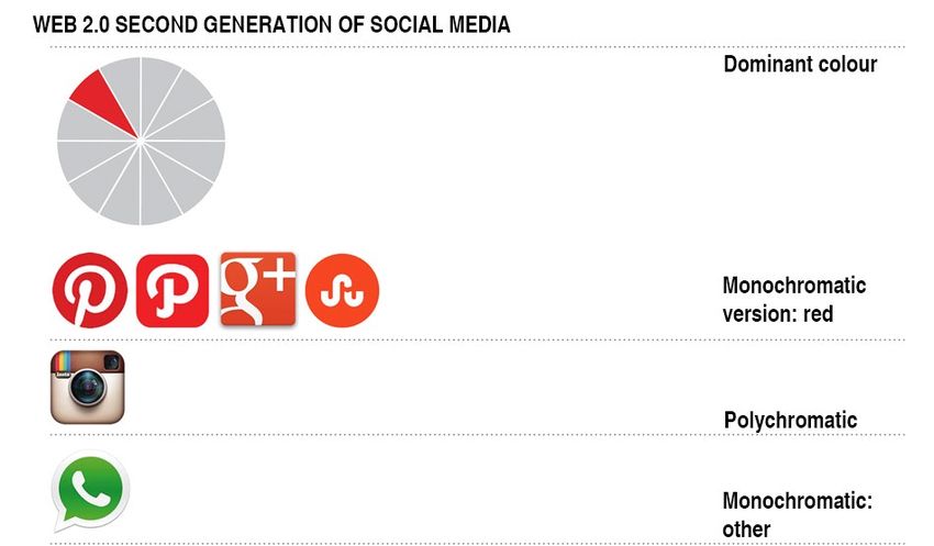
CULTURA E SCIENZA DEL COLORE                                                                               NUMERO 06 - NOVEMBRE 2016
COLOR CULTURE AND SCIENCE                                                                                  NUMBER 06 - NOVEMBER 2016
Rivista semestrale dell’Associazione Italiana Colore
http://jcolore.gruppodelcolore.it/
ISSN 2384-9568
DOI: 10.23738/CCSJ.00                                                                                      DOI: 10.23738/CCSJ.I62016.00
DIRETTORE RESPONSABILE | EDITOR-IN-CHIEF
Maurizio Rossi (Politecnico di Milano, IT)

REDAZIONE | ASSOCIATE EDITORS
Aldo Bottoli (B&B Colordesign, IT)
Daria Casciani (Politecnico di Milano, IT)
Davide Gadia | Deputy Editor (Università degli Studi di Milano, IT)
Marco Gaiani (Università di Bologna, IT)
Veronica Marchiafava (Associazione Italiana Colore, IT)
Silvia Piardi (Politecnico di Milano, IT)
Alessandro Rizzi (Università degli Studi di Milano, IT)
Francesca Valan (Studio Valan, IT)

EDITORIAL BOARD MEMBERS
John Barbur (City University London, UK)                                        Manuel Melgosa (Universidad de Granada, ES)
Berit Bergstrom (NCS Colour AB, SE)                                             Anna Grazia Mignani (IFAC-CNR, IT)
Giulio Bertagna (B&B Colordesign, IT)                                           Annie Mollard-Desfour (CNRS, FR)
Janet Best (Natific, UK)                                                        Maria Luisa Musso (Universidad de Buenos Aires, RA)
Aldo Bottoli (B&B Colordesign, IT)                                              Claudio Oleari (Università degli Studi di Parma, IT)
Patrick Callet (École Centrale Paris, FR)                                       Galina Paramei (Liverpool Hope University, UK)
Jean-Luc Capron (Université Catholique de Louvain, BE)                          Laurence Pauliac (Historienne de l’Art et de l’Architecture, Paris, FR)
Daria Casciani (Politecnico di Milano, IT)                                      Silvia Piardi (Politecnico di Milano, IT)
Osvaldo Da Pos (Università degli Studi di Padova, IT)                           Marcello Picollo (IFAC-CNR, IT)
Bepi De Mario (CRASMI, IT)                                                      Renata Pompas (AFOL Milano-Moda, IT)
Hélène DeClermont-Gallernade (Chanel Parfum beauté, FR)                         Boris Pretzel (Victoria & Albert Museum, UK)
Reiner Eschbach (Xerox, USA)                                                    Noel Richard (University of Poitiers, FR)
Alessandro Farini (INO-CNR, IT)                                                 Katia Ripamonti (Cambridge Research System, UK)
Christine Fernandez-Maloigne (University of Poitiers, FR)                       Alessandro Rizzi (Università degli Studi di Milano, IT)
Renato Figini (Konica-Minolta, EU)                                              Maurizio Rossi (Politecnico di Milano, IT)
Davide Gadia (Università degli Studi di Milano, IT)                             Jodi L. Sandford (Università di Perugia, IT)
Marco Gaiani (Università di Bologna, IT)                                        Raimondo Schettini (Università degli Studi di Milano Bicocca, IT)
Robert Hirschler (Serviço Nacional de Aprendizagem Industrial, BR)              Gabriele Simone (ST Microelectronics, IT)
Sandra Krasovec (Fashion Institute of Technology, USA)                          Andrea Siniscalco (Politecnico di Milano, IT)
Francisco Imai (Canon, USA)                                                     Ferenc Szabó (University of Pannonia, HU)
Lia Luzzatto (Color and colors, IT)                                             Mari UUsküla (Tallinn University, EE)
Kevin Mansfield (UCL, UK)                                                       Francesca Valan (Studio Valan, IT)
Veronica Marchiafava (Associazione Italiana Colore, IT)                         Ralf Weber (Technische Universität Dresden, DE)
Gabriel Marcu (Apple, USA)                                                      Alexander Wilkie (Charles University in Prague, CZ)
Anna Marotta (Politecnico di Torino, IT)

PEER REVIEW PROCESS
Tutti gli articoli inviati alla rivista “Cultura e Scienza del Colore - Color   All articles submitted to “Cultura e Scienza del Colore - Color Culture
Culture and Science” sono sottoposti ad un processo di revisione                and Science” journal are peer-reviewed according to the following
secondo la seguente procedura:                                                  procedure:
PRIMA REVISIONE                                                                 FIRST REVIEW
Gli associate editors valutano ogni articolo per determinare se il tema e       The Associate Editors evaluates each article in order to define if the
il contenuto sono di interesse per la rivista “Cultura e Scienza del Colore     topic and content is suitable for consideration by the “Cultura e Scienza
- Color Culture and Science”. Una volta valutati gli articoli, gli associate    del Colore - Color Culture and Science” journal. Once the article passes
editors selezionano una serie di revisori scegliendoli scegliendoli             the initial review, the Associate Editors select several referees in the
nell’editorial board in base all’esperienza degli stessi in un particolare      Editorial Board based on their expertise in the particular field or topic
settore disciplinare o tema.
                                                                                SECOND REVIEW
SECONDA REVISIONE                                                               Each article is reviewed by two or three referees under a double-blind
Ogni articolo è revisionato da due revisori in un processo in cui essi          peer review process where the authors and the reviewers are kept
stessi e gli autori sono mantenuti anonimi. Ai revisori è chiesto di valutare   anonymous. Referees are asked to evaluate the manuscript based
l’articolo considerando la sua originalità, la metodologia applicata e          on its originality, methodology and impact to research and relevance
l’impatto sulla ricerca o sulla pratica professionale. Dopo aver raccolto       to the professional practice. After collecting the referees’ reports, the
i commenti dei revisori, gli associate editors elaborano ed inviano al          Associate Editors makes a recommendation on the acceptability of the
direttore responsabile un giudizio riassuntivo sull’accettazione o meno         article to the Editor in Chief.
dell’articolo.

COLLABORATORI | CONTRIBUTORS
Valeria Biasi, Letizia Bollini, Paolo Bonaiuto, Alessio Cardaci, Tiziana
Cavaleri, Isabelle Clonier, Fabio Colonnese, Paola Croveri, Osvaldo da
Pos, Annamaria Giovagnoli, Chiara Gregoris, Michela Lecca, Giulia
Pellegri, Anna Piccirillo, Renata Pompas, Antonella Versaci                                   GRUPPO DEL COLORE
                                                                                              ASSOCIAZIONE ITALIANA COLORE
                                                                                                                                       CULTURA E SCIENZA DEL COLORE
EDITORE | PUBLISHER                                                                                                                       COLOR CULTURE AND SCIENCE
Gruppo del Colore – Associazione Italiana Colore                                                                                    Rivista dell’Associazione Italiana Colore
www.gruppodelcolore.it                                                                                                            Registrazione presso il Tribunale di Milano
Sede legale: Piazza Carlo Caneva, 4 - 20154 Milano (Italia)                                                                                         al n. 233 del 24.06.2014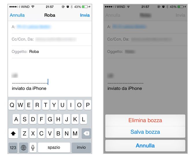
06                       SOMMARIO | SUMMARY

     ENGLISH | ITALIAN   Editorial                                                                                5
                         by Maurizio Rossi

                         Chromatic gradation as a symbolic and spatial device in the                              7
                         European context: Piero Bottoni’s Cromatismi architettonici
                         La gradazione cromatica come dispositivo simbolico e volumetrico nel contesto europeo:
                         i Cromatismi architettonici di Piero Bottoni
                         by Fabio Colonnese

                         The restoration of color in the French historic cities:                                  23
                         approaches, methods and experiences
                         Il restauro del colore delle città storiche francesi: approcci, metodi ed esperienze
                         by Antonella Versaci, Alessio Cardaci

                         Colour and light in communication of fabric façades                                      37
                         Il colore e la luce nella comunicazione delle facciate tessili
                         by Chiara Gregoris

             ENGLISH     Emotional Qualities of Colours Added to Humorous 47
                         Illustrations
                         by Valeria Biasi and Paolo Bonaiuto

                         Topos vs. Iris. Colour design in Web 3.0 mobile app and OS: 53
                         a critical review
                         by Letizia Bollini

                         Chromatic and decorative                        planning choices: geometry, 61
                         knowledge and survey
                         by Giulia Pellegri

                         Colorimetric and spectrophotometric analyses for an 71
                         ecoinnovative application of natural dyeing in textile
                         conservation
                         by Tiziana Cavaleri, Isabelle Clonier, Paola Croveri, Annamaria Giovagnoli, Anna
                         Piccirillo

              REVIEW     Food, colour and art                                                                     80
                         by Renata Pompas

            COLOUMN      Communications and Comments                                                              82
                         by Michela Lecca and Osvaldo da Pos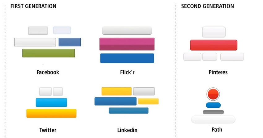
53

Topos vs. Iris.                                                                                                          Letizia Bollini
                                                                                                                        1

                                                                                                                        letizia.bollini@unimib.it

Colour design in Web 3.0 mobile app                                                                                     Dip. Di Psicologia, Università di
                                                                                                                        1

and OS: a critical review
                                                                                                                        Milano-Bicocca

ABSTRACT
The IT world – i.e. IBM or Intel just to mention some of the most popular and elderly
companies – seems to have always favoured some colour ranges identified –
among all the possible palettes – in blue/cyan variants and grey scale, making of
them a sort of chromatic commonplace. This choice apparently perpetuates itself
and become even more recurrent in the Web 2.0. Virtually all brands and interfaces
of social networks and sharing platforms first generation elected light blue not
to be a differentiating element rather of similarity. From the Facebook blue to the
Twitter or Vimeo cyan, colour seems not to be part of the visual language aimed
to distinguish the company corporate communication, on one hand, nor the user
experience of these platforms, on the other. If the physical impairment of Zuckerberg
– that made him choose a specific light blue visible also to people with a partial
colour blindness – has become almost a urban legend, is not so clear why other
brands and entrepreneurs decided a similar chromatic approach, not to say mimetic
and plagiarized. Conversely, the mobile Web 3.0 in its variations – for example
iOS7 – breaks this pattern opening up to a more wide variability of expression and
connotation. But in this re-appropriation of a key component of the visual language
does not apparently correspond consistent design awareness. However the lack of
constraints – instead of being a challenging opportunity to experiment knowingly
with new uses of chromatic codes and meanings – is letting forget the basics of the
colour language even in its most basic and semiotic consolidated design guidelines.
The paper suggests a critical review by the exemplification and comparison of the
major players in the Web 3.0 market referring both to the design of colour principles –
as part of the graphic culture and the user experience – and to the Web Accessibility
Initiative guidelines and to W3C standards.

KEYWORDS
Colour design, Visual language of colour, Colour in Web 3.0, Colour in social media,
Colour blindness accessibility

Received 20 January 2015; Revised 14 June 2016; Accepted 01 July 2016

CITATION: Bollini L. (2016) ‘Topos vs. Iris. Colour design in Web 3.0 mobile app and OS: a critical
review’, Cultura e Scienza del Colore - Color Culture and Science Journal, 06, pp. 53-59, DOI:
10.23738/ccsj.i62016.05

Letizia Bollini, ARTchitect. Assistant Professor at the Department of Psychology at the University of Milano-Bicocca.
Since 1995 she is dealing with multimodal, interface and interaction design, user experience, visual communication
and spatial representation as a researcher, a professor and a pro designer (with her design company extrasmall.it)

Cultura e Scienza del Colore - Color Culture and Science | 06 | 2016                                ISSN 2384-9568
54 DOI: 10.23738/ccsj.i62016.05 Bollini L.
1. INTRODUCTION charming blue.
According to the most established attribution of
The IT world —i.e. IBM or Intel just to mention meaning —at least in the western countries—
some of the most popular and elderly companies blue represents one of the most serious tint to
seems to have always favoured some colour choose and to use from the colour palette. It has
ranges identified —among all the possible a connection with the concept of calm, relax,
palettes— in the spectrum of blue to cyan and deepness, reliability, trust, solidity, security (for
grey-scale variants, making of them a sort of a deeper understanding of colours meaning
chromatic commonplace. This choice apparently see historical studies: Albers [1] and Itten
perpetuates itself and become even more [2]; in the field of digital design and internet
recurrent in the Web 2.0. Virtually all brands application: Zwick, Schmitz and Kuehl [3] and
and interfaces of the first-generation of social the experimental study conducted in 2007 by
networks and sharing platforms elected light the author an Greco [4]).
blue as tint dominant, using colours not as a IBM’s brand has become a milestone and a
differentiating asset, but rather as an element of sort of benchmark in technologies field to look
similarity. after. Intel itself —just to mention the most
From the Facebook blue to the Twitter or Vimeo remarkable entrepreneurship realities— has
cyan, colour seems not to be part of the visual chosen a bold blue as primary identity colour
language aimed to distinguish the company and magenta as a secondary one to create
corporate communication, nor the user a huge contrast. Fostering from electronic to
experience of these platforms. information technologies, that means growing
If the physical impairment of Zuckerberg —that on a scale of dematerialization, the Windows
made him choose a specific light blue visible operating system and its graphical user
also to people with a partial colour blindness— interface is linked to the duality of blue and grey.
has become almost a urban legend (although The same combination —although treated with
confirmed in several interviews), is not so clear a graceful balance among cyan, light grey and
why other brands and entrepreneurs decided a with— was used both in the web site and in part
similar chromatic approach, not to say mimetic of the iOS 7 action triggers and button [5].
and plagiarized. This combination —in the variant of a bright
Conversely, the mobile Web 3.0 in its variations blue tint and a dark neutral grey— was originally
—for example iOS7 or recent Material Design used also from the first generation of browsers’
Guideline for Android or social platform such HTML 1 visualization defaults, that means
as Pinterest— breaks this pattern opening up Netscape and successively Internet Explorer.
to a more wide variability of expression and This widely diffused colour combination has
connotation. But in this re-appropriation of a become a common place in which many brands,
key component of the visual language does design patterns, GUIs’ chromatic palette found a
not apparently correspond consistent design shared language. It seems to work consistently
awareness. according to the mental model already well
However the lack of constraints —instead of known by the users.
being a challenging opportunity to experiment Although just referring to link visualization,
knowingly with new uses of chromatic codes Jacob Nielsen himself recently abandoned the
and meanings— is letting forget the basics of thought that the chromatic pattern applied to the
the colour language even in its most fundamental interactive textual elements —electric blue/link,
and semiotic consolidated design guidelines. red/active-link and purple/visited-link— should
The paper suggests a critical review by the be used permanently as the only possible way to
exemplification and comparison of the major convey a correct affordance to people. A way to
players in the Web 3.0 market referring both to admit that colour meaning and mood, if correctly
the design of colour principles —as part of the used to highlight or put elements in evidence,
graphic culture and the user experience— and are stronger than standard —not designed—
to the Web specific standards solutions inherited by the software culture. In
the book Web usability [6] he was still strongly
2. FROM BRAND TO WEB: recommending to use electric blue and underline
A COMMON CHROMATIC PATH to mean ‘interactive link’ in the visual grammar of
web graphical interfaces. Although other authors
Mainly due to the involvement of one of the most strongly disagree with this position —Sofia
well-known US brand and graphic designer Postai [7] and Luisa Carrada [8] just to mention
—Paul Rand— and is remarkable experience, some of the Italian specialists —the assertion
IBM became one of the first companies to set of Nielsen and the massive use of this design
a standard in brand iconography in IT field pattern —Google abandoned it definitively no
bounding deeply in the corporate culture both more than a month ago in its search engine pages
the bold and strong slab font and the deep and results— tell us how it is still deeply embedded
ISSN 2384-9568 Cultura e Scienza del Colore - Color Culture and Science | 06 | 2016 | 53 - 59Topos vs. Iris. Colour design in Web 3.0 mobile app and OS: a critical review. 55
in the web user interface design. can interpret both from the mimetic point of view
– to be seen serious and professional also in off
3. THE WEB 2.0 CHROMATIC TOPOS line and formal work environment – and from
the strategic benchmark in the field of social
Also the second generation of Internet —that media becoming a neutral aggregator of the daily
means the so-called web 2.0— renewed and streaming produced in other platforms (Twitter,
consolidated this design chromatics topos. blogs, etc.) by users.
Almost all the sharing services and social
network identify both the brand primary colour 3.3. VIMEO: PROFESSIONAL VIDEOS
and the user interface chromatic pattern in a not On the other hand Vimeo made the return journey
so wide range of blue tint. to the light blue corporate tint, consistently
and widely used in the interface of the video
3.1. FACEBOOK channels. Its main and heavier competitor is
AND THE COLOUR ACCESSIBILITY Youtube the video streaming platform that
Although Facebook wasn’t the first social represent the second biggest site – after Google
network established in the ‘00s it has fast – in terms of traffic and views. Vimeo positioned
become the referring experience in the field. itself as and streaming aggregator where to
With is undoubted leadership in term of users, present in a selected, well organized and user-
power, services and innovation capabilities it is friendly framework, professional videos. The
setting most of the standard of the social web, bold, dynamic, young and energetic cyan link
among them also the chromatic palette adopted the platform to the other professional ones
as a reference for the other first generation of – i.e. LinkedIn – and differentiates it from the
social media design and usability. chaotic, not well chromatic identified language
The choice of the blue tint came out from a of Youtube – which logo is red and black. The
personal visual disability of the founder Mark blue meaning is clearly reinforcing the brand
Zuckerberg: taking an online test he realized declaring the professional vocation of the vlog
that he was red-green colour-blind. Blue is platform.
Facebook’s dominant colour, because – as he
said – 3.4. TWITTER: MICRO, SMART AND CYAN
Twitter is probably the most aggressive
“blue is the richest colour for me – I can see competitor of Facebook, not in terms of users or
all of blue.” [9] diffusion – it remains a niche in the field of social
networks, but represent the most specialised,
This remains the leitmotiv of all the many innovative and active place where sophisticated
evolution and revolution that Facebook improved digital users, influencers and gurus, meets,
along the years: it has always been pretty dialogs and share high valuable contents – but
monochromatic since from the beginning (2004) of language and user experience innovation.
so that the site remains as simple as possible. At In this sense twitter adapts to the chromatic
the time, a fairly plain site stood in stark contrast dominant topos, but at the same time is
to MySpace and other previously popular social characterized itself by the use of saturated
networks, as remarked by Amig Agarwal. [10] cyan. A colour that maintains the same values
It is also interesting to notice that Facebook of the range of the blue already in the by the
abandoned the classical duality of digital palette other social networks, but in a more dynamic,
– a brand/default colour and a contrast one to aggressive and fresh declination. The speed of
stress and put evidence on links, buttons and communication in 140 characters of the micro-
action triggers – to play just with blue the most blogging platform is associated with a variation
mute and transparent – according to Bonsiepe of stronger and sharper colour which makes the
definition [11] – of the social interfaces. interface more vivid, fast and smart.
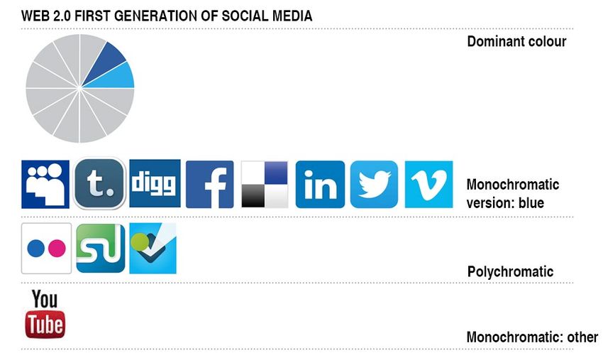
As is clear shown in Figure 1 – in which are
3.2. LINKEDIN: THE PROFESSIONAL TOUCH presented only brand to identify the dominant
Started in parallel with MySpace, surpassed hue of the entire graphical user interface and its
by Facebook LinkedIn found its own position in chromatic palette – the dominant colour of the
the field of the vertical and specialized social first generation of Web 2.0 is blue in its maby
network as the referring point of the professional various with rare exceptions. On the one hand
community a sort of online referenced public in combination with cool colours i.e. the range
curricula as preconized by Siegel in the late of green as adopted by Foursquare and the first
‘90s [12]. According to its positioning, vision version of Stumble Upon’s brand, on the other
and mission and to the other unwritten rules of hand juxtapose to the magenta in Flick’r. The
business field, also LinkedIn has chosen a light only exception to this is apparently YouTube,
blue surrounded by a wide with space and light belonging to the galaxy of services offered by
grey for its brand and GUI design. In this case we Google with matching red and black.
Cultura e Scienza del Colore - Color Culture and Science | 06 | 2016 | 53 - 59 ISSN 2384-956856 DOI: 10.23738/ccsj.i62016.05 Bollini L.
Figure 1 - Web 2.0 first generation of
social media: brand and UI colour.
From top to bottom: Dominant
colour; monochromatic version: blue;
polychromatic; monochromatic: other
4.THE SECOND GENERATION between the red and the neutrality of the layout
OF SOCIAL MEDIA: – plays its identity and user experience on a
FORCING THE COLOUR PALETTE system where the chromatic contrast creates
evidences, hierarchy and focus while ensuring
The second generation of social media force harmony and difference, pleasure and usability.
explicitly the design patterns also unbalancing Nevertheless the second generation of web 2.0
the previous blue dominant colour palette abandons the blue paradigm and the hegemony
towards the warm colours like saturated, bold, of the design patterns introduced by Facebook
hot red. The new ruling seems to express a freer it’s reduced to an even more stereotypical
and aggressive communication, on the one hand, choice of colour. As Figure 2 highlights the
but on the other it flattens even more on a unique differences among the brand – not to mention
hue. The chromatic revolution often proceeds in the obvious plagiarism between Path and
parallel with the re-branding of some services Pinterest iconography – are even more reduced.
and their positioning and systematization in
integrated communication ecosystem. It is 4.2. THE CHANGING LANGUAGE
the case of Google+ that to differentiate itself OF COLOUR IN INTERACTION
both the from previous platform launched The experiment proposed by Mark Hemeon [13]
with little success from Google and from the on the buttons of the main social networks and
main competitor Facebook. G+ opposes to the web platforms reveals a deeper aspects of the
deep, calm blue a saturated red (100% yellow chromatic language adopted in the interactive
and magenta) designing a user interface that aspects of web 2.0.
– in contrast to the neutral and transparent of If the first generation of Internet adopts a set
Facebook – is vivid, energetic and hard-hitting. of colours to indicate the different states of the
A similar operation is carried out also by Stumble interaction of a link or a button – i.e. link: blue,
Upon that leaves behind the brand bichromatic active link: red, visited link: purple – in Web 2.0,
cold and mute, for a one-color red logo more the semantic of colour becomes more complex.
effective and impacting. The UI project still involves a triad of colours
whose meaning is related to the hierarchy of
4.1. PINTEREST: RED PASSION operable actions. A primary colour is chosen to
Point of reference of this second generation is highlight the major action triggers according to
Pinterest. It represents an evolution and a mix the corporate palette and brand hue, another
between Flick’r and social interaction models in colour —often in contrast with the main one—
which many other platforms dynamics converge is used for the sub-actions, important but not
and merge together. essential. The third one is often a neutral or mute
So as Facebook is completely played on blue one and cover a wider range of interactions both
and white to ensure a large neutrality regard “negative” – for example undo an action – or
to contents, Pinterest also plays on the duality occasional utilities – such as the settings, or
of the corporate colour and a secondary hue profile customization etc. This tertiary colour is
component. But the effect is significantly often also used for the effect off or when a link or
different. If the first is likely to result not only a button is disabled because you cannot use the
in fact monochrome but also mono-tonus, the function on that page or because it corresponds
second one –relying on the significant contrast to the page where you are located.
ISSN 2384-9568 Cultura e Scienza del Colore - Color Culture and Science | 06 | 2016 | 53 - 59Topos vs. Iris. Colour design in Web 3.0 mobile app and OS: a critical review. 57
Figure 2 - Web 2.0 second generation
of social media: brand and UI colour.
From top to bottom: Dominant
colour; monochromatic version: red;
polychromatic; monochromatic: other
Figure 3 - An extract of “The Button
Test” conducted by Mark Hemeon on
social media UI
As you can see in Figure 3 the major players taking its own way— to refer to for developing
of the web 2.0 first generation are using the single and commercial applications’ interfaces.
blue as the main colour – i.e. the primary hue The iOS7 [4], in particular, is making a wide
of the corporate palette – a second contrasting use of colour both with explicit labels or text
colour often used as a secondary color in brand explaining the effect of each buttons/action
identity – the brand’s magenta in Flick’r or a trigger in an interface language that abandoned
complementary yellow in Twitter – and a light definitively a mimetic approach to simulate the
grey as a neutral identification of utilities. On real world, that means skeuomorphism, 3D and
the other hand, the second generation of social shadows effects and a large use of iconographic
media seems to reduce to a couple of hue – symbols.
highlight vs neutral – simplifying the chromatic The iOS7 seems to use for every system section
grammar of the graphical interface. colour, so for example the calendar uses red, the
cyan email and so on. On one hand, this implies
5. MOBILE OS: LOSING to use a different hue for each one, and secondly,
THE CHROMATIC GRAMMAR that the semiotics generally attributed to colours
such as red or green cannot be consistently
The third revolution in the web is represented by applied to this interfaces.
the introduction of mobile devices —this means Also the typical triad of internet – blue, red and
with the debut of iPhone in 2007 and of iPad in purple – or web 2.0 – seen in the in Hemeon’s
2010— and the consequent shift between the experiment – is abandoned in favour of a dual
world of desktop to the new mobile operating combination – for example red and cyan or red
systems and applications. and green – but without applying a steady and
In the transition to mobile operating system consistent way.
Apple has become the standard de facto —at The result is a chromatic language ambiguous
least for the Android world because Windows is and confusing in several screens where the
Cultura e Scienza del Colore - Color Culture and Science | 06 | 2016 | 53 - 59 ISSN 2384-956858 DOI: 10.23738/ccsj.i62016.05 Bollini L.
same message is presented in different colours icon.
without constant reference to a clear and shared Furthermore within the same screen (figure 4:
semiotics or meaning. set new alarm) 3 buttons with very different
So, for example, by comparing the screenshot functions – cancel, save and delete – are all
shown in Figures 4 and 5 we see the same three red a very strong and alarming colour
button/message “undo” presented both in red – a reserved to prohibitions, irreversible operations
warning message that I’m cancelling that means and permanent deletion of information.
an irreversible action – in the first case and in Vice versa in Figure 5 are the same colour is an
cyan – a much more less alertive message just action “active” – saving a draft – either “cancel”
referring to the reverse action typical to empty a – a passive one – the operation that allows to
filled form instead of sending it or the abortion of continue editing the text.
a task – in the second one. Finally in figure 5: new email message you may
At the same time, the button that should be notice that the button “undo” and “send” are both
off (Figure 4: timer) and then according to cyan. The colour design pattern contradicts
the grammar of colours in which the Internet the basics rules of usability and the mental
has accustomed us to “off” and neutral stands model that the user already have – embedded
evidenced by the use red applied to the timer in their experience reinforced in many field of
Figure 4 - The use of colours in iOS7:
timer and alert setting
Figure 5 - The use of colours in iOS7:
mail; create an email; delete an email
ISSN 2384-9568 Cultura e Scienza del Colore - Color Culture and Science | 06 | 2016 | 53 - 59Topos vs. Iris. Colour design in Web 3.0 mobile app and OS: a critical review. 59
experience, not only the web – that to opposite BIBLIOGRAPHY
behaviour of an action trigger, generally
corresponds also an opposite use of colours or, [1] J. Alber, “Interaction of Color” (revised edition), Yale
at least, of visual handling of each elements. University Press, Yale, 1975
[2] J. Itten, “The art of color: the subjective experience and
6. CONCLUSIONS objective rationale of color”, John Wiley & Sons Inc, 1993
[3] C. Zwick, B. Schmitz and K. Kuehl, “Digital colour for
The evolution of the internet brought to encode Internet and other media”, Ava, Crans-près-Céligny, 2003
and evolve a chromatic language that has
its roots on the one hand in the classic visual [4] L. Bollini and M. Greco, “Organizzare presentazioni
efficaci”, Hoepli, Milano, 2008
grammar, the other in the specific dynamics of
this medium of mass communication. Abandone [5] iOS Human Interface Guidelines
d the narrow range become a sort of a topos developer.apple.com/librar y/ios/documentation/
of the chromatic colour palette both corporate userexperience/conceptual/MobileHIG/index.html
and for user interface the experiments of the [6] J. Nielsen, “Designing Web usability”, Macmillan
second generation of web 2.0, however, it seems Computer publishing, 2000
difficult to diversify and find chromatic identity
more original. [7] S.Postai, “Siti che funzionano 2.0”, Apogeo, Milano,
2001
The search becomes even more uncertain and
somewhat more confusing – a babel rather than [8] L. Carrada, “Il mestiere di scrivere”, Apogeo, Milano,
a new found iris – the new frontiers opened by the 2008
worlds of the mobile web 3.0. User experience
[9] A. Vargas, “Facebook co-founder Mark Zuckerberg
& interface design should probably go back to opens up”, 20 September 2010, The New Yorker
the deep roots of the language of colour to their www.newyorker.com/reporting/2010/09/20/100920fa_
culturally established use and to the encoded fact_vargas?printable=true¤tPage=all
and conventionally attributed meanings.
[10] A. Agarwal, “Why is Facebook so Blue in color?”, 21
July 2012 www.labnol.org/internet/why-facebook-blue-
FUNDING in-color/17811/
[11] G. Bonsiepe, “Il ruolo del design”, in G. Anceschi (a
This research did not receive any specific grant cura di) “Il progetto delle interfacce”, Domus Academy
from funding agencies in the public, commercial, Edizioni, Milano, 1993
or not-for-profit sectors.
[12] D. Siegel, “Futurize your enterprise”, John Wiley &
Sons, 1999
CONFLICT OF INTEREST
[13] M. Hemeon: “The Button Test”, 10 February 2013
https://medium.com/design-ux/77eb4f9a439d
No financial or personal interest have affected
my objectivity, There are no potential conflicts
of interest including financial, personal or other
relationships with other people or organizations
within three years of beginning the submitted
work that could inappropriately influence, or be
perceived to influence my work.
Cultura e Scienza del Colore - Color Culture and Science | 06 | 2016 | 53 - 59 ISSN 2384-9568Puoi anche leggere