PERLE D'I TALIA 0 1 VOL - Antiche Fornaci D'Agostino
←
→
Trascrizione del contenuto della pagina
Se il tuo browser non visualizza correttamente la pagina, ti preghiamo di leggere il contenuto della pagina quaggiù
PE R L E D ’ I TA LIA
collezioni e progetti in gres smaltato
                                             VOL
                                             01

                                         July 2019
                                         EDITION
                                         Gres collections and projects
                                                          COLLECTION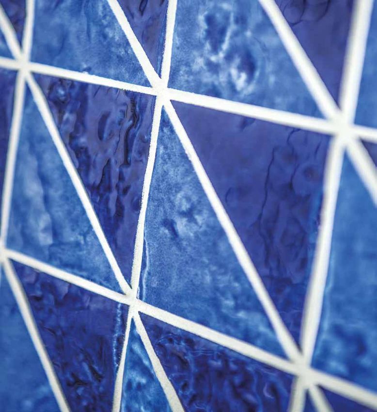
C O L L EZI O NE | PE R L E D’ I TA LIA
PE RLE D ’ I TA L IA
È una creazione di Antiche fornaci D’Agostino, che si ispira alle
località più rinomate della nostra penisola. Località di mare, la
dove il blu e il turchese incontrano l’azzurro del cielo e contrastano
con sabbie bianche e nere.
La collezione racchiude in sé quell’insieme di tradizioni, creatività,
ricercatezza di struttura, vetrosità dello smalto, calore e colori
propri della cultura mediterranea rendendola un messaggio
unico di stile, esprimendo tutti quei valori che da centinaia di
anni contraddistinguono la ceramica Italiana, quella vera, quella
che amiamo e ameremo per sempre, perchè ha il suo ruolo
nell’esclusiva arte del Made in Italy.
Perle d’Italia è proposta in otto colori e due formati, il 40x40 e il
20x20 (10mm) inoltre è implementata da forme triangolari a tinta
unita e bicolore, utilizzabili sia da pavimento che rivestimento.
Il grès con spessore 14 millimetri (40x40) e la gran quantità di
smalto vetroso la rendono unica nel panorama mondiale.
ENG | Perle d’Italia is a creation of Antiche Fornaci D’Agostino, which is inspired by the
most famous places of our peninsula. Seaside place, where the blue and the turquoise
meet the blue of the sky and contrast with white and black sands.
The collection embodies that combination of traditions, creativity, refinement of
structure, vitreous glaze, warmth and colors typical of the Mediterranean culture,
making it a unique message of style, expressing all those values that, for hundreds of
years, have distinguished the Italian ceramics, the true one, the one we love and love
forever, because it has its role in the exclusive art of the Made in Italy.
Perle d’Italia is available in eight colors and two modular sizes, the 40x40 and 20x20, it
is also implemented by a mosaic with triangular shapes in plain color and bicolor and it
can be used both for floor and wall. Grès with a thickness of 14 mm and a large quantity
of vitreous glaze make it unique in the world.
03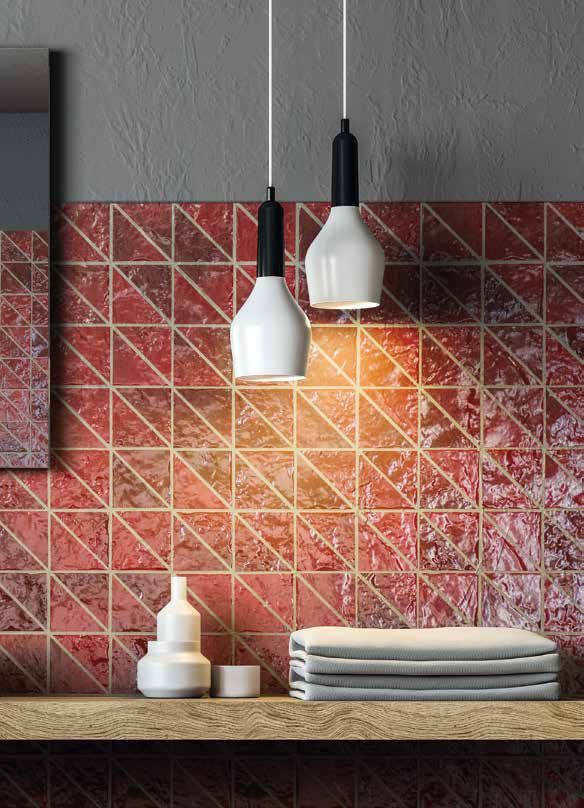
04
TOTAL
WHITE
08/09
Quando si parla di pavimenti e rivestimenti non
ha davvero rivali: il bianco veste le case di luce
ed eleganza.
BLACK &
WHITE
10/11
L’abbinamento Black & White è sinonimo di eleganza
e raffinatezza, di grande attualità, grazie al suo spirito
chic e moderno.
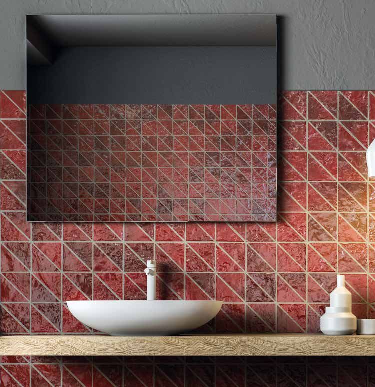
RED
PASSION
12/1 3
Panarea, il colore rosso della collezione, si ispira al corallo.
È potente e sensuale, crea un grande impatto visivo e,
sapientemente utilizzato, crea nell’ambiente risultati eccezionali.
AQ U A M A R I N E :
TRUE RELAXATION
1 4/1 5
Non potevano mancare nella collezione Perle
D’Italia, i colori tipici della nostra terra d’origine.
I colori del mare in tutte le sue sfumature.
ELBA,
BRIGHT AND JOYFUL
1 6/17 Gioioso e brillante, il turchese di Elba è il colore
dell’energia e della forza spirituale.
S K Y & SEA
1 8/1 9
Positano, blu intenso e Porto Cervo azzurro. Questi
profondi colori rappresentano simbolicamente il mare
e il cielo, spazi infiniti e silenziosi.
A NT IC H E F O R N AC I D ’AG O ST I N O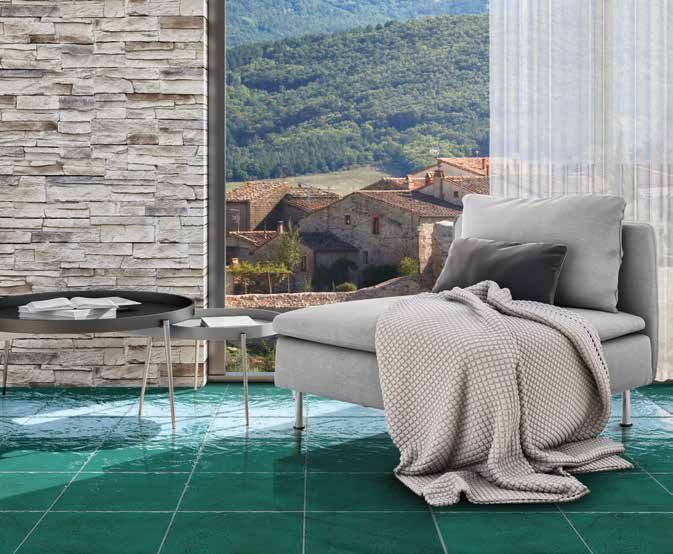
C O L L EZI O NE | PE R L E D’ I TA LIA

                                                 INDICE / INDEX
        BALANCE
        & ARMONY
                                                                                              20
        L’aspetto fortemente vetroso e trasparente del
        prodotto associato al colore indaco trasmette serenità,
        spazialità e purezza.

            L I V I N G NEAR THE SEA
21
            Realizzare una casa perfettamente coerente con l’ambiente
            che la circonda, presuppone anche la scelta di prodotti giusti
                                       per creare un’armonia d’insieme.

        LIVE
        WITH CLASS
                                                                                               22
        Luminoso e brillante è un colore
        importante e sofisticato, che ispira
        sicurezza, prosperità, rinascita.

                                                                         TECHNICAL
23/27                                                                   DATA SHEET

            REFERENCE
                                                                                   30/31
            Incastonato in una baia privata dall’acqua
            cristallina, Ischia Blu Resort sorge ad Ischia Porto, il
            luogo più centrale dell’isola.

                                    ANTICHE
                                    F ORNAC I
                                D’AGOSTINO:
32/33                      Salerno 1823: nasce Antiche Fornaci D’Agostino.

                                                                                                      05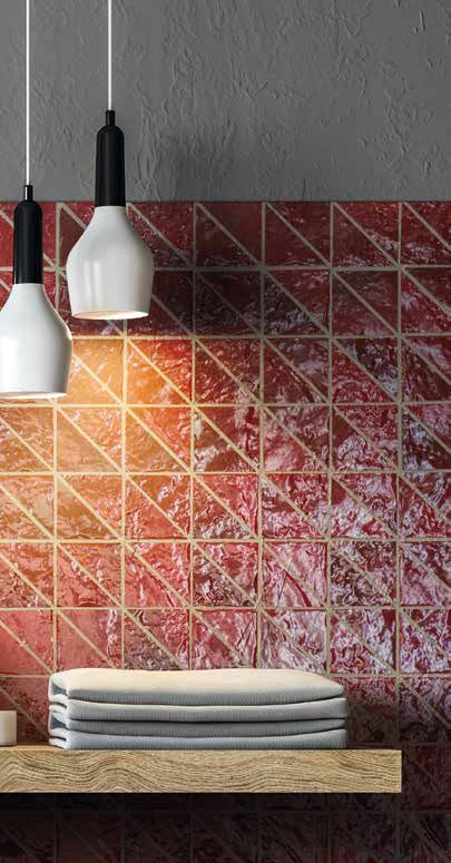
06

PASSI ON E
PE R LA M ATER IA
La potenza del vulcano
catturata in un colore,
ENG | PASSION FOR THE MATTER
The power of the volcano caught in a color.

     A NT IC H E F O R N AC I D ’AG O ST I N O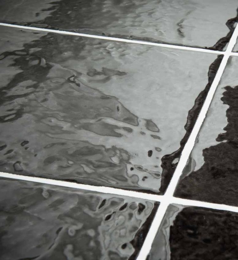
C O L L EZI O NE | PE R L E D’ I TA LIA

                                   07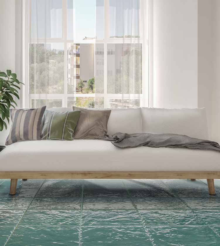
08

TOTAL W H I T E
Quando si parla di pavimenti e rivestimenti non ha davvero rivali: il bianco veste
le case di luce ed eleganza.

                                                        Pavimento | VIESTE 40X40 cm 16”X16”

Un vecchio adagio recita che il
“classico” non tramonta mai, nulla
di più vero. Uno degli elementi
più classici d’interior design, è un
colore: il bianco. Neutro, luminoso ed
elegante come nessun altro, lascia
aperte moltissime possibilità in
fatto di accostamenti, dona luce ed
ampiezza ad ogni spazio.
Il bianco Vieste della collezione
Perle      d’Italia  possiede      una
pregevole caratteristica cromatica,
è una tonalità calda resa ancor
più gradevole dalla profondità
dello smalto vetroso. Nell’arredo
sarà sufficiente abbinare piccoli
particolari nelle tonalità del grigio,
del sabbia e del verde salvia.
                                                          Pavimento | VIESTE 40X40 cm 16”X16”

     A NT IC H E F O R N AC I D ’AG O ST I N O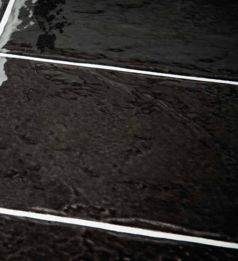
C O L L EZI O NE | PE R L E D’ I TA LIA

ENG | TOTAL WHITE: When we speak about floor and wall coverings it has no rivals: the white dresses houses with
light and elegance. An old saying goes that the “classic” never sets, nothing was more true. In terms of interior design,
one of the most classic elements is a color: white, neutral, bright and elegant as no other, creating many possibilities
open in combinations, giving light and width to any space. The white Vieste of the Perle d’Italia collection has a
valuable chromatic feature, it is a warm shade made even more pleasant by the depth of the vitreous glaze. In the
decor it will be enough to combine small details in shades of gray, sand and sage green.

 Rivestimento | VIESTE TRIANGOLI 40X40 cm 16”X16”

In cucina è stato realizzato un angolo senza tempo con          ENG | In the kitchen a timeless corner has been
un abbinamento che vede come protagonista il bianco             created with a combination that sees the white Vieste
Vieste a contrasto con il legno, a suggellare qualcosa          as a protagonist in contrast with the wood, to seal
di assolutamente classico e intramontabile.                     something absolutely classic and timeless.

                                                                                                                     09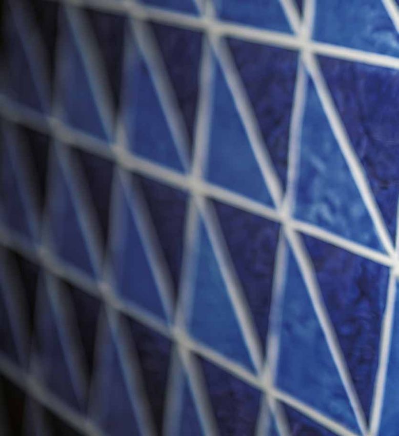
10

BLACK & W H I T E
L’abbinamento Black & White è sinonimo            Le pareti intonacate di bianco o
di eleganza e raffinatezza, di grande             piastrellate con Vieste, colore bianco
attualità, grazie al suo spirito chic e           della collezione, fanno da sfondo
moderno.                                          ideale a mobili neri. Al contrario le
                                                  pareti o i pavimenti piastrellati con
                                                  Maratea, colore nero della collezione,
                                                  sono un retroscena ideale ad arredi
                                                  completamente bianchi. Le pose a
                                                  dama di Vieste e Maratea su pavimenti
                                                  o porzioni di parete piastrellate
                                                  esaltano ancor di più le linee di design
                                                  dei complementi d’arredo bianchi.
                                                  I colori realizzati da Antiche Fornaci
                                                  D’Agostino ci regalano la possibilità di
                                                  realizzare ambienti ultra moderni o in
                                                  stile tradizionale, questo grazie al tono di
                                                  bianco caldo e al nero che tende al bruno
                                                  lava, allontanandosi così dal classico
                                                  effetto optical anni settanta, per una
                                                  proposta cromatica accattivante e in
                                                  linea con le nuove tendenze.

Ambiente bagno realizzato
con triangoli bicolore nella
combinazione Vieste/Maratea,
affiancati al rivestimento
20x20 Vieste. La stuccatura
di colore bianco tende a
neutralizzare il rivestimento
bianco e mette in risalto la
parte decorata.

ENG | Bathroom environment
made with a bicolor triangular
mosaic in the Vieste /
Maratea combination, on
the side of the mosaic the
covering is 20x20 Vieste,
the white stucco tends to
neutralize the white covering
and enhances the decorated
part.

      A NT IC H E F O R N AC I D ’AG O ST I N O
C O L L EZI O NE | PE R L E D’ I TA LIA
Ambiente bagno realizzato con 40x40 in posa a dama con Maratea e Vieste a pavimento, a rivestimento 20x20
Maratea. La stuccatura è stata eseguita con fuga bianca per esaltare la geometria a quadri su fondo nero Maratea.
ENG | Bathroom
environment realized with
40x40 in chess pose with
Maratea and Vieste on the
floor, with 20x20 Maratea
on the wall. The grouting
was performed with a
white joint to enhance the
squared geometry on a
black Maratea background.
ENG | The Black & White combination is synonymous of elegance and refinement, of great relevance, thanks to its
chic and modern spirit. The walls plastered in white or tiled with Vieste, the white color of this collection, are the
ideal background for black furniture. On the contrary, the walls or floors tiled with Maratea, the black color of this
collection, are an ideal background for completely white furnishings. The chess poses of Vieste and Maratea on floors
or portions of walls enhance the design lines of the white furnishing accessories.
The colors created by Antiche Fornaci D’Agostino give us the possibility of realizing ultra-modern or traditional-style
environments, thanks to the warm white tone and the black similar to brown lava, moving away from the classic
optical effect of the seventies, for a captivating chromatic proposal in line with new trends.
1112
ENG | Non potevano mancare nella collezione Perle D’Italia, i colori
tipici della nostra terra, i colori del mare in tutte le sue sfumature.
Portofino è il nome del color acquamarina, probabilmente uno
dei colori più soavi e rilassanti, gradevole e sopratutto con una
grande capacità di rendere l’ambiente una vera zona relax è un
colore ideale per trasferire in casa la raffinata eleganza di uno
stile personale, acquamarina trova spazio ovunque all’interno
della casa, dal bagno alla cucina passando per le zone giorno, in un
meraviglioso rimando alle dimore mediterranee, un colore capace
di trasportarci in riva al mare.
Realizzato con triangoli Panarea, la fuga è stuccata ENG | Realized with Panarea triangles mosaic, the joint
con colore grigio antracite, l’intonaco alla parete in tinta is filled with anthracite gray, the plaster on the wall in
con lo stucco delle piastrelle e la mensola del lavandino the same color as the tile stucco and the wooden sink
in legno, donano all’ambiente un’atmosfera magica shelf, give the room a magical atmosphere.
A NT IC H E F O R N AC I D ’AG O ST I N OC O L L EZI O NE | PE R L E D’ I TA LIA
RED
PASSION
Panarea, il colore rosso della collezione, si
ispira al corallo. È potente e sensuale, crea
un grande impatto visivo e, sapientemente
utilizzato, crea nell’ambiente risultati
eccezionali. Abbinare Panarea a stucchi e
colori dell’intonaco nelle tinte che spaziano
dal beige biscotto, al grigio ardesia scura
o ai verdi vibranti come la menta crea
contesti gradevoli e di sicuro effetto.
ENG | Panarea, the red color of this collection, is
inspired by the coral. It is powerful and sensual,
creates a great visual impact and, if wisely used,
creates exceptional results in the environment.
Combining Panarea with stuccoes and plaster
colors in shades ranging from the beige, to the
Rivestimento PANAREA MOSAICO 40X40 cm 16”X16”
gray as dark slate or to the vibrant greens like
mint creates pleasant and effective contexts.
1314
P or tofino è il nome del color acquamarina.
Probabilmente uno dei colori più soavi e rilassanti,
gradevole e soprattutto con una grande capacità
di rendere l’ambiente una vera zona relax. È il
colore ideale per trasferire in casa la raffinata
eleganza di uno stile personale. Portofino trova
spazio ovunque all’interno della casa, dal bagno
alla cucina passando per le zone giorno, in un
meraviglioso rimando alle dimore mediterranee,
un colore capace di trasportarci in riva al mare.
ENG | The typical colors of our land of origin could not be
missing from the Perle D’Italia collection. The colors of the sea
in all its nuances. Portofino is the name of the aquamarine
color, probably one of the lightest and most relaxing colors,
pleasant and above all with a great capacity to make the
environment a true relax area. It is the ideal color to transfer
the refined elegance of a personal style into our home.
Portofino finds space everywhere inside the house, from the
bathroom to the kitchen, passing through the living areas, in a
wonderful reference to the Mediterranean dwellings, a color
that can bring us to the sea.
A NT IC H E F O R N AC I D ’AG O ST I N OC O L L EZI O NE | PE R L E D’ I TA LIA
AQ U A M A R I N E :
TRUE RELAX
Non potevano mancare nella collezione Perle D’Italia, i colori
tipici della nostra terra d’origine.
I colori del mare in tutte le sue sfumature.
Pavimento | PORTOFINO 40X40 cm 16”X16”
1516
Per l’ambiente bagno un abbinamento che ENG | For the bathroom a combination that
coniuga due colori: Elba e Portofino. Un combines two colors Elba and Por tofino. In a
affascinante gioco di profondità marine diverse fascinating game of different sea depths, the
che rievoca la naturale percezione dell’elemento natural perception of the water element is
acqua. Un contesto fresco ed energizzante. evoked in a fresh and energizing context.
Pavimento e Rivestimento | PORTOFINO-ELBA TRIANGOLI 40X40 cm 16”X16” | Pavimento | ELBA 40X40 cm 16”X16”
A NT IC H E F O R N AC I D ’AG O ST I N OC O L L EZI O NE | PE R L E D’ I TA LIA
ELBA, BRIGHT AND JOYFUL
Gioioso e brillante, il turchese di Elba è il colore dell’energia e della forza spirituale.
Spiccatamente eccentrico e molto versatile, nella sua eleganza ben si coniuga a colori
e materiali d’arredo fra i più disparati, inserendosi tanto nella zona giorno quanto nella
zona notte. Elba è un concentrato di sottili equilibri artigianali che hanno creato questo
meraviglioso turchese. La brillantezza dello smalto e la sua profonda vetrosità sono a
testimoniare quanta maestria c’è nel prodotto di Antiche Fornaci D’Agostino, sintesi di
grande esperienza e cultura ceramica.
ENG | Joyful and bright, the turquoise of Elba is the color of energy and spiritual strength. Extremely
eccentric and very versatile, which in its elegance blends with the most disparate colors and furnishings,
fitting in both the living area and the sleeping area. Elba is a concentrate of light artisan balance that has
created this wonderful turquoise. The brilliance of the glaze and its deep vitreous aspect demonstrate the
mastery of the product of Antiche Fornaci D’Agostino, synthesis of great experience and ceramic culture.
Pavimento | ELBA - VIESTE 20X20 cm 8”X8”
Elba, partner perfetto del bianco e di tutte le tinte che ENG | Elba, the perfect partner for white and all light
dal color crema si spingono verso il beige o tendono colors ranging from cream to beige or light grays. Elba’s
verso i grigi chiari. Il turchese di Elba abbinato al bianco turquoise combined with Vieste’s white is a certainty
di Vieste è una certezza. Regala una soluzione infallibile that offers an infallible and balanced solution, full of
ed equilibrata, ricca di raffinata energia. refined energy.
1718
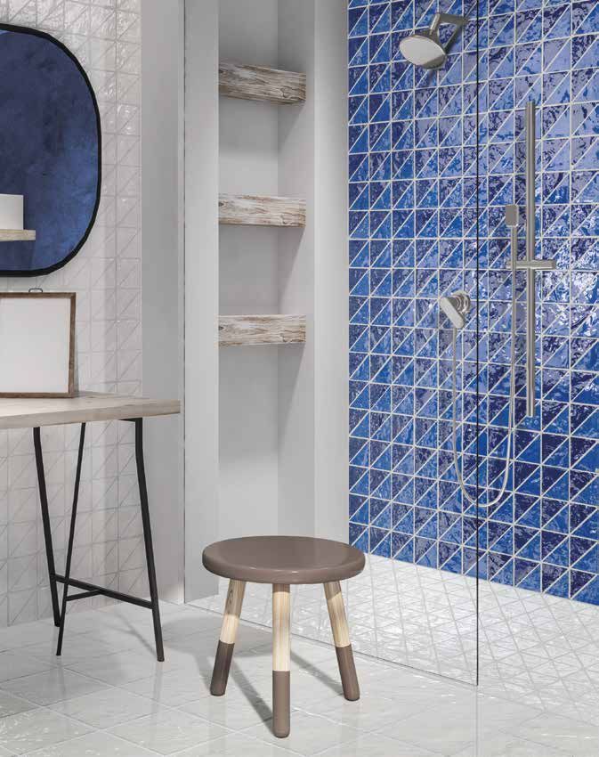
SKY & SEA
Positano, blu intenso. e Porto Cervo azzurro. Questi profondi colori rappresentano
simbolicamente il mare e il cielo, spazi infiniti e silenziosi. Colori che rappresentano l’energia
fredda utile a stimolare la concentrazione e la creatività, conferendo agli ambienti affidabilità
e sicurezza. Sono da sempre emblema di sinfonia, di proporzione ed equilibrio, ecco perchè
sempre più spesso sono protagonisti nelle nostre case.
ENG | Positano, deep blue and PortoCervo light blue. These deep colors symbolically represent the sea and
the sky, infinite and silent spaces. Colors that represent the cold energy useful to stimulate concentration
and creativity, give the environments reliability and safety. They have always been the symbol of symphony,
of proportion and balance, that’s why they are more often protagonists in our homes.
L’utilizzo del bianco Vieste nel pavimento,
abbinato al triangolo di Vieste e di Porto Cervo/
Positano, stuccati con colore bianco, rendono
l’ambiente molto luminoso, contribuendo a dare
una dimensione più allargata dello spazio bagno
E NG | The use of white Vieste on the floor,
combined with the triangular mosaic of Vieste
and the triangular mosaic of Por toC er vo
/ Positano, stuccoed with white, make the
environment ver y bright, creating a more
extended dimension of the bathroom space.
A NT IC H E F O R N AC I D ’AG O ST I N OC O L L EZI O NE | PE R L E D’ I TA LIA
Pavimento | VIESTE 20X20 cm 8”X8” ! VIESTE TRIANGOLI 40X40 cm 16”X16”
Rivestimento | VIESTE TRIANGOLI 40X40 cm 16”X16” | POSITANO - PORTO CERVO TRIANGOLI 40X40 cm 16”X16”
19
Pavimento PANAREA MOSAICO 40X40 cm 16”X16”20
BALANCE & ARMONY
Porto Cervo 40x40 e Porto Cervo triangoli, E NG | Por toC er vo 40x40 and Por tocer vo mosaic
stuccati con colore bianco abbinati al legno triangles, stuccoed with white color combined
naturale degli arredi e al bianco delle pareti, with the natural wood of the furnishings and
rappresentano la scelta giusta che conferisce the white of the walls, represent the right
all’ambiente una perfetta armonia cromatica. choice that gives the room a perfect chromatic
L’aspetto fortemente vetroso e trasparente harmony. The strongly glassy and transparent
del prodotto associato al colore indaco appearance of the product linked to the indigo
trasmette serenità, spazialità e purezza. color transmits serenity, spatiality and purity,
Particolarmente indicato anche per contesti par ticularly suitable also for rustic-modern
rustico-moderni di città. city contexts.
A NT IC H E F O R N AC I D ’AG O ST I N OC O L L EZI O NE | PE R L E D’ I TA LIA
LIVING
NEAR THE
SEA
Positano 40x40 posato a pavimento in riva
al mare, in un contesto abitativo, creato
su misura per ospitare una ceramica
trasparente come l’acqua che lo circonda;
una “vera ceramica Salernitana”.
E NG | Positano 40x40 laid on the floor by
the sea, in a living environment, created for
a transparent ceramic like the water that
surrounds it; a “real ceramic from S alerno”
2122
LIVE WITH CLASS
Il verde di Porto Venere ha la caratteristica E NG | The green of Por to Venere has the
sfumatura di una delle più belle pietre characteristic shade of one of the most
preziose (lo smeraldo) e apporta un tocco beautiful precious stones (the emerald) and
di glam agli interni, conferendo un effetto di brings a touch of glam to the interiors, giving
grande eleganza. an effect of great elegance.
Luminoso e brillante è un colore importante Bright and brilliant it is an impor tant and
e sofisticato, che ispira sicurezza, prosperità, sophisticated color, which inspires security,
rinascita. prosperity, rebir th.
Porto Venere è facile da abbinare sposandolo Por to Venere can be easily combined, with
con basi neutre: le tinte naturali del legno, del neutral bases: the natural colors of wood,
bianco, del nero, del grigio e del beige. white, black, gray and beige.
Pavimento | PORTO VENERE 40X40 cm 16”X16”
Scenari diversi: paesaggi marini, collinari o ENG | Different settings: seascape, hill or
metropolitani. Non importa dove, Perle d’Italia metropolitan landscapes. No matter where, Perle
trasmette sempre emozioni in ogni contesto. d’Italia always transmits emotions in any context.
A NT IC H E F O R N AC I D ’AG O ST I N OC O L L EZI O NE | PE R L E D’ I TA LIA
PORTO VENERE | 40X40 cm 16”X16”
PORTO VENERE TRIANGOLI | 40X40 cm 16”X16” PORTO VENERE - MARATEA TRIANGOLI | 40X40 cm 16”X16”
PORTO VENERE | 20X20 cm 8”X8”
2324
PORTOCERVO | 40X40 cm 16”X16” POSITANO | 40X40 cm 16”X16”
PORTOCERVO TRIANGOLI | 40X40 cm 16”X16” POSITANO - PORTOCERVO TRIANGOLI | 40X40 cm 16”X16”
PORTOCERVO | 20X20 cm 8”X8” POSITANO | 20X20 cm 8”X8”
A NT IC H E F O R N AC I D ’AG O ST I N OC O L L EZI O NE | PE R L E D’ I TA LIA
ELBA | 40X40 cm 16”X16” PORTOFINO | 40X40 cm 16”X16”
ELBA TRIANGOLI | 40X40 cm 16”X16” PORTOFINO - ELBA TRIANGOLI | 40X40 cm 16”X16”
ELBA | 20X20 cm 8”X8” PORTOFINO | 20X20 cm 8”X8”
2526
VIESTE | 40X40 cm 16”X16” MARATEA | 40X40 cm 16”X16”
VIESTE TRIANGOLI | 40X40 cm 16”X16” MARATEA - VIESTE TRIANGOLI | 40X40 cm 16”X16”
VIESTE | 20X20 cm 8”X8” MARATEA | 20X20 cm 8”X8”
A NT IC H E F O R N AC I D ’AG O ST I N OC O L L EZI O NE | PE R L E D’ I TA LIA
PANAREA | 40X40 cm 16”X16”
PANAREA TRIANGOLI | 40X40 cm 16”X16” PANAREA- MARATEA TRIANGOLI | 40X40 cm 16”X16”
PANAREA | 20X20 cm 8”X8”
2728
LA F OR Z A
DEL C OLOR E
Perle d’Italia, splendore italiano.
Colore deciso e trasparenza del vetro per il massimo
della potenzialità ceramica, rievocano la terra del
sole, l’incanto e la suggestione di una tradizione
centenaria.
ENG | THE POWER OF COLOR:
Perle d’Italia, Italian splendour. Strong color and transparency of the glass
for the maximum of the ceramic potentiality, evoke the land of the sun,
the charm and the suggestion of a centuries-old tradition.
A NT IC H E F O R N AC I D ’AG O ST I N OC O L L EZI O NE | PE R L E D’ I TA LIA
2930
REFERENCE
Incastonato in una baia privata dall’acqua cristallina, Ischia Blu Resort sorge ad Ischia
Porto, il luogo più centrale dell’isola.
S ituato in un’area tranquilla, ma centrale,
il residence Ischia Blu Resort vanta
un’eccezionale posizione. Il porto di Ischia,
con la sua caratteristica “rive droite” si trova
infatti a pochi passi dal Resort, mentre il
Corso Vittoria Colonna, l’elegante via dello
shopping di Ischia Porto, è a circa 10 minuti
a piedi.
L’intervento di ristrutturazione relativo
ai tre appartamenti “superior” ed alcune
zone comuni, rievoca e enfatizza gli accenti
dell’architettura “mediterranea” tipica
dell’isola.
Il progetto, curato dallo studio Civetti-
Barile architetti associati, spazia dalla
ristrutturazione e distribuzione degli spazi,
alla caratterizzazione degli stessi mediante
l’utilizzo di elementi architettonici come,
archi moreschi, colonne, mosaici e l’utilizzo di
A NT IC H E F O R N AC I D ’AG O ST I N OC O L L EZI O NE | PE R L E D’ I TA LIA
close to the Resort, while Corso Vittoria
Colonna, the elegant shopping street of
Ischia Porto, is about 10 minutes away on
foot.
The renovation of the three “superior”
apartments and some common areas,
recalls and emphasizes the accents of the
“Mediterranean” architecture typical of the
island.
materiali tipici della tradizione mediterranea locale, creando The project, curated by the Civetti-Barile
un’immagine coordinata che percorre tutto il progetto, associated architects studio, goes from the
e in particolar modo per quanto riguarda l’aspetto più restructuring and distribution of the spaces,
propriamente decorativo dei rivestimenti, dei pavimenti e degli to their characterization through the use
arredi. of architectural elements such as, Moorish
Elementi decorati tipicamente marini, sono ricorrenti sia arches, columns, mosaics and the use of
nei pavimenti e rivestimenti dei bagni, che negli arredi, per materials typical of the local Mediterranean
sottolineare la splendida “location” adagiata sul mare. tradition , creating a coordinated image
La pavimentazione interna è stata realizzata con piastrelle in that passes throughout the project and
grés della Antiche Fornaci D’Agostino. especially considering the decorative aspect
of the coverings, floors and furnishings.
La collezione scelta per le stanze è Perle d’Italia, colore
Typically decorated marine elements
Positano dall’intensa tonalità di blu che fa risaltare lo stile
are recurrent both in floors and walls of
marino che si è voluto dare alla struttura, accentuato da
the bathrooms and in the furnishings, to
interventi in palladiana realizzata sempre con lo stesso
emphasize the splendid “location” laid on
prodotto, ma di colore bianco.
the sea. The internal floor was made of tiles
Nei bagni, particolare cura è data al rivestimento, dove giochi di in grès of the Antiche Fornaci D’Agostino.
palladiana bianca e blu (sempre della collezione Perle d’Italia di The collection chosen for the rooms is Perle
Antiche Fornaci D’Agostino) enfatizzano lo stile mediterraneo d’Italia, the Positano color with an intense
voluto dai progettisti. shade of blue that brings out the marine style,
selected for this structure, accentuated
by some Palladian interventions, always
realized with the same product, but in white.
In the bathrooms, a par ticular care
is given to the wall, where plays of
white and blue Palladian (always of
ENG | Set in a private bay with crystal water, Ischia Blu
Resort is located in Ischia Porto, the most central place on the Perle d’Italia C ollection by Antiche
the island. Located in a quiet but central area, the Ischia Fornaci D’A gostino) emphasize the
Blu Resort residence boasts an exceptional location. The Mediterranean style requested by the
harbour of Ischia, with its characteristic “rive droite” is so designers.
3132
A STORY BETWEEN
TRADITION AND INNOVATION
S a l e r n o 1 8 2 3 : n a s c e A nt i c h e F o r n a c i D ’ A g o s t i n o .
Nasce e si sviluppa in un
comprensorio di grande fascino e di
antica tradizione ceramica.
Generazioni di artigiani, che con
ingegnosità diedero vita a forme,
crearono decorazioni e colori, che
fanno parte della nostra cultura.
Un’eredità culturale importante da cui
non si può prescindere, un patrimonio
di conoscenze tecniche, di sapienza
creativa da cui, ieri come oggi, Antiche
Fornaci D’Agostino attinge a piene
mani.
Non basta avere una storia per avere un’identità. Interpretiamo il passato senza chiuderci in
esso e ricerchiamo nell’armonia tra tradizione e innovazione un nostro spazio creativo.
Il calore e la passione delle antiche produzioni ceramiche rivivono nelle nostre collezioni,
A NT IC H E F O R N AC I D ’AG O ST I N OC O L L EZI O NE | PE R L E D’ I TA LIA
riproponendo quelle irregolarità libere, quelle sfumature incerte, quelle luci ed ombre, quelle
trasparenze inaspettate. Fondere la memoria storica con l’abitare il proprio tempo, la creatività
e la sapienza ceramica con il progetto, la modularità e la ricchezza di cromie con i gusti e le
tendenze contemporanee all’esigenza progettuale dell’arredare moderno.
Le nostre collezioni sono progetti con una forte personalità distintiva, mai banali ed esplicitamente
legati ad una eredità culturale senza confronto e caratterizzati da un’autonoma forza creativa.
Nell’ unità produttiva, realizzata nel 2011, produciamo grès con l’ausilio di moderne tecnologie
avvalendoci dell’esperienza di tecnici ed operatori di grande capacità, per garantire quella
qualità di prodotto, che da sempre è riconosciuta ad Antiche Fornaci D’Agostino.
ENG | Salerno 1823: Antiche Fornaci D’Agostino design. Our collections are projects with a strong
was born. distinctive personality, never banal and explicitly
It arises and grows in a very enchanting district linked to a cultural heritage without comparison
with a century-old tradition in ceramics. and characterized by an autonomous creative
Generations of craftsmen who, with their power.
ingeniousness, livened up to shapes, creating In the production department, realized in 2011,
decorations and colors that are part of our we produce grès with the help of modern
culture. An important cultural heritage it can’t technologies, making use of the experience of
leave aside, a heritage of technical knowledge, technicians and operators of great capacity, to
of creative wisdom Antiche Fornaci D’Agostino guarantee that product quality, which has always
draws on, in the past as well as nowadays. But been recognized by Antiche Fornaci D’Agostino.
having a history is not enough to have its own
identity. We interpret the past, without closing
ourselves in it and we look for the harmony of
tradition and innovation our creative space.
The warmth and the passion of past ceramic
productions live again in our collections,
reproposing those free irregularities. those
uncertain shades, those lights and shadows,
unexpected transparencies. Melting the
historical memory with living in one’s time, the
creativity and the ceramic knowledge with the
project, the modularity and the plenty of colors
with the tastes and the contemporary trends to
the planning requirements of the modern interior
3334
CA RATTERI STIC HE TECNIC HE
VALORE PRESCRITTO
PERLE PERLE
CARATTERISTICHE TECNICHE NORMA UNI EN 14411 - BI b
D’ITALIA D’ITALIA
TECHNICAL DATAS STANDARD REQUIRED VALUE
40X40 CM 20X20 CM
UNI EN 14411 - BI b
spessore 14mm 10mm
10545.2 ±5%
thickness ±5% ±5%
assorbimento d’acqua
10545.3 0,5% - 3% 0,5% - 3% 0,5% - 3%
water absorption
resistenza alla flessione
10545.4 30 N/mm² 44 N/mm² 40 N/mm²
bending strength
sforzo di rottura (S)
10545.4 1100 N 3200 N 3000 N
breaking strength (S)
resistenza agli sbalzi termici Resistente
10545.9
frost resistance Resistant
resistenza alle macchie Conforme Conforme
10545.14 CLASSE 3 MINIMO
stain resistance conform conform
resistenza ai prodotti chimici di uso domestico e additivi per
Conforme Conforme
piscina 10545.13 GB MINIMO
conform conform
resistance to household chemicals and swimming-pool addictives.
resistenza all’attacco acido e basico (escluso HF e suoi derivati) Secondo la classificazione del fabbricante Conforme Conforme
10545.13
acid and alkali resistance (excluding HF and its derivates) As per the producer’s internal classification conform conform
PE SI E IMBA LLI
SPESSORE BOX MQ KG
CM PZ MQ KG
THICKNESS PALLET PALLET PALLET
Perle d’Italia 40 14 mm 40x40 MQ 6 0,96 24 60 57,6 1440
Perle d’Italia 20 10 mm 20x20 MQ 25 1 17,50 80 80 1400
FOGLIO
Perle d’Italia Triangoli 10 10 mm PZ 6 0,96 16,800 - - -
40x40
Perle d’Italia Battiscopa 14 mm 7,5X40 PZ 24 9,60 ML 19 - - -
VARIAZIONE DI STONALIZZAZIONE
V1 V2 V3 V4
Aspetto uniforme Lieve variazione Moderata variazione Forte stonalizzazione
Uniform appearance Slight variation Moderate variations Substantial variations
A NT IC H E F O R N AC I D ’AG O ST I N OANTICHE FORNACI D’AGOSTINO S.R.L. Via Nazi onale, 63 – 8401 5 Noc era S uperi ore (SA) – I TA LY Tel.: +39 089 4 81746 - Fax: +39 089 4 81 840 e-mail: uff.c ommerciale@forna cidagostino.it - www.forna cidagostino.it
Puoi anche leggere