HONG KONG PALERMO FLUID CITIES - Edited by Maurizio Carta Manuela Catania Barbara Lino Dario Russo - Core
←
→
Trascrizione del contenuto della pagina
Se il tuo browser non visualizza correttamente la pagina, ti preghiamo di leggere il contenuto della pagina quaggiù
HONG KONG
PALERMO
FLUID CITIES
Edited by
Maurizio Carta
Manuela Catania
Barbara Lino
Dario Russo

_2   _SICILIAINFORMA_NUMERO SPECIALE_                                                                                                  3_

                                                                     Sommario

     ISBN 978-88-99934-90-3 (print)                              4    THE NEW SILK ROAD OF IDEAS
     ISBN 978-88-99934-95-8 (online)                                    Fabrizio Micari | Rector of the University of Palermo
     February 2018                                               8    THE FLUID CITY | Porosity and fluidity as projective tools
                                                                        Maurizio Carta
     Copyright © International Workshop
     Hong Kong-Palermo | Fluid Cities                           20    PALERMO FLUID CITY IN THE POETICS OF FRANCESCO FERLA
     University of Palermo—Raffles Institute Hong Kong

     Copyright © New Digital Frontiers srl
                                                                22    URBAN IMAGE | From logo to brand
     Edited by                                                          Dario Russo
     Maurizio Carta
     Manuela Catania                                            34    INHABITANTS OF LIGHTS
     Barbara Lino
     Dario Russo
                                                                         Manuela Catania

     Editorial staff
                                                                46    METAPHORS, HYBRIDISATION AND SOCIAL SPACE
     Jessica Smeralda Oliva                                             Barbara Lino
     Federica Scaffidi
     Luca Turrisi                                               54    SENSITIVE ARCHITECTURES | On the lasting role of the ephemeral
                                                                         Alberto Caruso
     Peer review
     The texts are submitted to a double-blind review           60    FLUID PHOTOGRAPHY | Da Niepce agli hashtags
     Graphic project                                                     Filippo Maria Nicoletti
     Atelier790 | Palermo
                                                                66    THE FLUID CITY | Urban strategies for contemporary city
     Layout                                                              Federica Scaffidi
     SV | 110eLAB
                                                                72    THE PAVILION AND THE EXHIBITION PROJECT
     Editor in chief                                                     Luca Torrisi
     Carla Condorelli
                                                                78    URBAN SYNAPSES, FLUID CONNECTIONS
     Publisher
     Palermo University Press                                            Jessica Smeralda Oliva
     Viale delle Scienze | Building 16 (ARCA) | 90128 Palermo
     www.unipapress.it                                          84    Projets PA
     Cover
     LM | 110eLAB, Fluid Market, 2017                           96    Projets HK
     Sicilia InForma | Notizie sul design insulare
     Special edition | february 2018 | Year V
     Registration n. 13 of 19 October 2015
     at the Registry of the Court of Palermo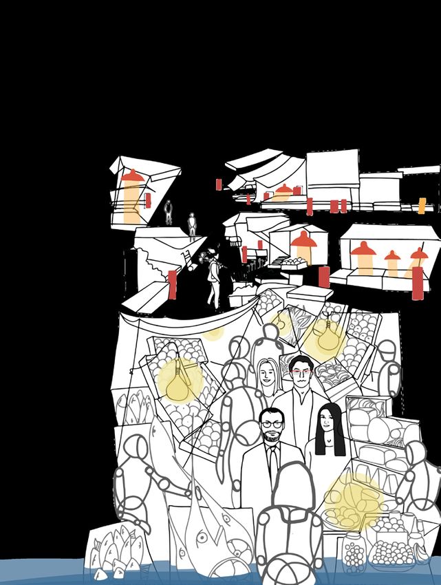
_4   _SICILIAINFORMA_NUMERO SPECIALE_                                                                                               _HONG KONG-PALERMO | FLUID CITIES_             5_

     The New Silk Road
     of Ideas

     Being a modern university does not mean simply carrying out with rigor and              It is important that the students of the workshop have grasped the importance
     commitment the role of an educational and research agency, but increasingly             of the challenge of opening the Steri Complex to the neighboring Butera Palace,
     requires the need to open up to the city, the region and the world. It means            towards the Kalsa district and the Foro Italico park, finding innovative solutions
     extending our relationships by letting people and ideas navigate the long               for the reconquest of its urban relationship with the sea. The projects proposed
     networks of knowledge, comparison and collaboration. For this reason the                by the students show the dream of crossing walls, courtyards, hallways
     University of Palermo is decisively increasing its activity of internationalization     and manufactures following the story of the centuries of urban history that
     and of openness to the inputs that come from the society of widespread                  characterize the Steri Complex. The University of Palermo, therefore, becomes
     knowledge in which we are immersed. In the liquid society also the university           a narrative interface between tangible and intangible heritage, an urban place
     must change its mission, capturing the transformations of the contemporary,             where the citizen is educated, informed, trained and made aware of his belonging
     renewing the modalities of cultural and social relationship, more co-operative          to a community. Palermo, therefore, becomes an educational city able to
     and cosmopolitan. In this challenge for the renewal of the deepest meaning of           encourage exploration and experimentation, to promote innovation, change and
     the universities the International Workshop Hong Kong-Palermo promoted by               accessibility, offering continuous challenges to knowledge, participation and
     professors Maurizio Carta and Dario Russo of the Department of Architecture             development.
     together with the colleagues of the prestigious Raffles Institute in Hong Kong is         I am convinced that this is also the deep meaning of "Palermo University City", the
     an important step also because it inaugurates an innovative teaching mode in            vision that characterizes my rectoral mandate from the beginning and which is
     which groups of students and tutors of different cultures meet together on the           reflected in the projects of the students of the Fluid Cities workshop exposed and
     same topic, mutually enriching their visions and techniques, crossing a new Silk        explained in this book.
     Road between Asia and Europe in which ideas and projects flow.
     Palermo and Hong Kong, like all the coastal cities, are special places where                                        Fabrizio Micari
     the fluidity of the sea penetrates deeply through welcoming and vibrant ports,                                      Rector of the University of Palermo
     starting transformations of their waterfront able to produce important urban
     innovations, inaugurating new lines of research, demonstrating the opportunities
     offered by the relationship between historical identity and development visions.
     Two far and different cities like Palermo and Hong Kong, located in different
     planetary and cultural hemispheres, are both daughters of a carnal relationship
     with the water that is transformed into openness, cosmopolitanism and meaning
     for the creativity that has always characterized the coastal towns, open to
     diversity and capable of transforming it into wealth and beauty.
     For Palermo, the choice to return to see the sea and live it is a major challenge for
     its future, because for too long the separation of the port system has undermined
     the transversal city-sea relations. The University of Palermo, the main cultural
     engine of the city, has long worked to reconnect the city with its eponymous
     port and its fishing villages through grafts, clutches and new interfaces, new
     marinas and seaside parks, but also rediscovering its urban beaches subtracted
     from decay. A relationship that sees the opening of the Steri towards the sea a
     fundamental step that the University of Palermo is pursuing in a decisive way to
     help restore the sea to the city.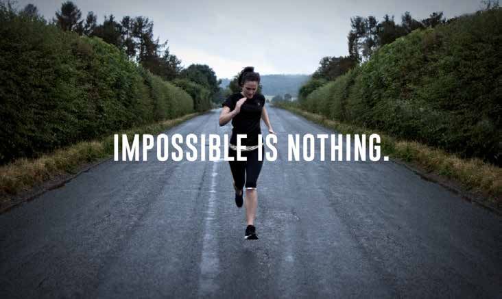
_6   _SICILIAINFORMA_NUMERO SPECIALE_                                                                                                _HONG KONG-PALERMO | FLUID CITIES_               7_

     La nuova via della seta
     delle idee

     Essere una università moderna non significa limitarsi a svolgere con rigore e           È importante che gli studenti del workshop abbiano colto l’importanza della
     impegno il ruolo di agenzia educativa e di ricerca, ma richiede sempre di più           sfida di aprire il Complesso Monumentale dello Steri verso il limitrofo Palazzo
     la necessità di aprirsi alla città, al territorio e al mondo. Significa estendere       Butera, verso la Kalsa e il Foro Italico, trovando soluzioni innovative per la
     le proprie relazioni facendo navigare le persone e le idee lungo le reti lunghe         riconquista della sua relazione urbana con il mare. I progetti proposti dagli
     della conoscenza, del confronto, della collaborazione. Per questo l’Università di       allievi mostrano il sogno di attraversare mura, cortili, androni e manifatture
     Palermo sta incrementando con decisione la sua attività di internazionalizzazione       seguendo il racconto dei secoli di storia urbana che caratterizzano il Complesso
     e di apertura agli stimoli che provengono dalla società della conoscenza diffusa         dello Steri. L’Università di Palermo, quindi, diventa una interfaccia narrativa tra
     in cui siamo immersi. Nella società liquida anche l’università deve cambiare la         patrimonio tangibile e intangibile, luogo urbano in cui il cittadino viene educato,
     sua missione, cogliendo le trasformazioni della contemporaneità, rinnovando             informato, formato e reso consapevole della sua appartenenza ad una comunità.
     le modalità di rapporto con il mondo, più cooperative e cosmopolite. In                 Palermo, quindi, si fa città educativa capace di incoraggiare l’esplorazione e
     questa sfida per il rinnovo del senso più profondo delle università il Workshop         la sperimentazione, di promuovere l’innovazione, il mutamento e l’accglienza,
     Internazionale Hong Kong-Palermo promosso dai professori Maurizio Carta e               offrendo continue sfide alla conoscenza, alla partecipazione e allo sviluppo.
     Dario Russo del Dipartimento di Architettura insieme alle colleghe del prestigioso      Sono convinto che anche questo è il significato profondo di “Palermo Città
     Raffles Institute di Hong Kong è un passo importante anche perché inaugura una            Universitaria”, la visione che caratterizza fin dall’inizio il mio mandato rettorale e
     modalità didattica innovativa in cui gruppi di studenti e tutor di diverse culture si   che trova splendida concretizzazione nei progetti degli allievi del workshop Fluid
     confrontano insieme su un medesimo tema, arricchendo reciprocamente le loro             Cities esposti e spiegati in questo libro.
     visioni e tecniche, attraversando una nuova Via della Seta tra Asia e Europa in cui
     scorrano idee e progetti.                                                                                             Fabrizio Micari
     Palermo e Hong Kong, come tutte le città di mare, sono luoghi speciali in cui                                         Rettore dell’Università degli Studi di Palermo
     la liquidità del mare penetra a fondo attraverso porti accoglienti e vibranti,
     avviando trasformazioni dei loro waterfront hanno prodotto importanti
     innovazioni urbane, inaugurando nuove linee di ricerca, dimostrando le
     opportunità offerte dalla relazione tra l’identità storica e le tensioni di sviluppo.
     Due città lontane e diverse come Palermo e Hong Kong, situate in emisferi
     planetari e culturali differenti, sono entrambe figlie di un rapporto carnale con
     l’acqua che si trasforma in apertura, cosmopolitismo e senso per la creatività
     che da sempre caratterizza le città di mare, aperte alla diversità e capaci di
     trasformarla in ricchezza.
     Per Palermo la scelta di tornare a guardare il mare e a viverlo è una sfida capitale
     per il suo futuro, perché per troppo tempo la separazione del sistema portuale
     ha scardinato le relazioni trasversali città-mare. L’Università di Palermo,
     motore culturale della città, da tempo lavora a riconnettere la città con il suo
     porto eponimo e con le sue borgate marinare tramite innesti, ammorsamenti e
     nuove interfacce, nuovi porti turistici e parchi a mare, ma anche ritrovando le
     sue spiagge urbane sottratte al degrado. Un rapporto che vede nell’apertura
     dello Steri verso il mare un passo fondamentale che l’Università di Palermo sta
     portando avanti in maniera decisa per contribuire a ridare il mare alla città.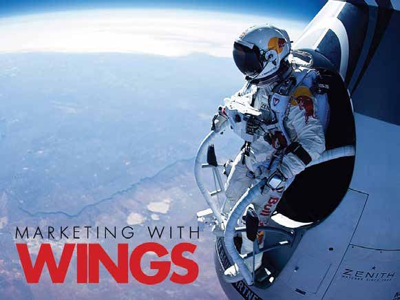
_ 22    _SICILIAINFORMA_NUMERO SPECIALE_                                                                                                                                                        _HONG KONG-PALERMO | FLUID CITIES_                                           23 _

                                                                                                                                                                                                                                                 Peter Behrens, logo AEG, 1908.
                                                                                                                                                                                                                                                 Peter Behrens, Berhrenscrift or
                                                                                                                                                                                                                                                 typeface Behrens Antiqua, 1908.

       i URBAN
                                                                                                                                                                                                                                                 Xanti Shawinsky (Studio
                                                                                                                                                                                                                                                 Boggeri), cover for the Calenday
                                                                                                                                                                                                                                                 Olivetti 1935.

       IMAGE
        From Logo to Brand

                 Dario Russo
                               ?
        Between January and March 2017 a group of stu-           Da gennaio a marzo dello scorso anno un gruppo di         of artificial person, which has an existence, rights,     tipo di organizzazione progettata con precisi obiettivi
        dents from Hong Kong (Ruffles Institute of Design)         studenti di Hong Kong (Ruffles Institute of Design) e       and duties independent of its particular members.         e attività. Essa è legalmente una specie di persona
        and Palermo (Department of Architecture) worked          Palermo (Dipartimento di Architettura) hanno preso        […] The usual sense today is that of a commercial         artificiale, con una sua esistenza, diritti e doveri,
        on intercontinental project1. Aim of this project was    parte a un workshop universitario per lavorare su un      corporation, but much the same holds true for gov-        indipendente dai suoi singoli membri […]. In genere,
        to design a pavilion, in which some shared features      progetto intercontinentale1. Obiettivo del progetto è     ernmental, public service, educational, military and      il termine si riferisce a un’azienda commerciale ma
        of Palermo and Hong Kong were highlighted despite        la realizzazione di un padiglione tale da incorporare     professional corporations»3.                              la cosa riguarda anche le organizzazioni politiche,
        their geographical and cultural distance. Along with     alcune caratteristiche che condividono nonostante         Since the work conducted by Peter Behrens in the          pubbliche, didattiche, militari e professionali»3.
        traditional markets, folklore and street food, light     la loro distanza geografica e culturale. Per sviluppa-    years between 1907 and 1914 for AEG4, the corporate       Storicamente, a partire dalle operazioni condotte
        and water have been chosen as the key-elements to        re il progetto, si è puntato su la luce e l'acqua quali   image has been based on a simple and powerful             da Peter Behrens per l’AEG tra il 1907 e il 19144, la
        develop this project. As communication designer,         elementi chiave, insieme ai mercati tradizionali, al      communicative triad: logo, thypeface character and        corporate image è stata imperniata su una triade
        what I consider being the most interesting aspect        folklore e allo street food. Da buon designer della       chromatic range. Once that these three elements           comunicativa tanto basica quanto potente: il mar-
        of this project is the corporate image. Due to the       comunicazione, ciò che considero l’aspetto più inte-      had been defined, it was possible to shape sever-         chio, in primis, il carattere tipografico (istituzionale)
        important role that the concept of corporate image       ressante di questa operazione è la corporate image.       al communicative items related to the company,            e la gamma cromatica. Definiti questi tre punti di
                                                                                                                                                                                                                                                 Notes
        has played in this project, it is necessary to explain   Considerato l’importante ruolo che il concetto di         such as signboards, catalogues, products, post-           riferimento grafici, è stato possibile configurare
                                                                                                                                                                                                                                                 1. The project was supervised
        its meaning and implications.                            corporate image ha giocato nel progetto, è necessa-       ers, gadgets. In this respect, AEG was extremely          conseguentemente ogni artefatto comunicativo                by Dr. Manuela Catania (HK), Dr.
        About that, a classical definition of corporate image    rio spiegarne il significato e le implicazioni.           successful in providing a sense of dazzling electricity   associabile dall’azienda: dall’insegna commerciale al       Maurizio Carta, Dr. Barbara Lino
                                                                                                                                                                                                                                                 and Dr. Dario Russo.
        has been provided by F.H.K. Henrion and A. Parkin:       A tal proposito, una classica definizione di corpo-       through its hexagonal logotype, typographic charac-       catalogo, dall’oggetto d’uso al poster fino ai gadget.
                                                                                                                                                                                                                                                 2. F.H.K. Henrion e A. Parkin,
        «A corporate image is the totality of pictures or        rate image è stata offerta da H.F.K. Henrion e A.          ter Behrens Antiqua and a combination of dark-green       Memorabili, a proposito dell’AEG, restano: il logotipo      Design Coordinator and
                                                                                                                                                                                                                                                 Corporate Image, Studio
        ideas or reputations of a corporation in the minds of    Parkin: «una corporate image è la totalità delle          and gold-yellow.                                          esagonale, il carattere tipografico Behrens Antiqua e       Vista | Reinhold Pubblishing
        the people who come into contact with it»2. As the       immagini, delle idee, delle opinioni su un’azienda        Similarly, in the first half of the Twentieth Century     la coppia di verde-scuro e giallo-oro, per dare il sen-     Corporation, London | New York
                                                                                                                                                                                                                                                 1967, p. 7.
        authors clarify: «A corporation is understood […] as     che si formano nella mente di coloro che entrano in       Olivetti became famous not only for its innovative        so, anzi la fascinazione della folgorante elettricità,
                                                                                                                                                                                                                                                 3. F.H.K. Henrion e A. Parkin,
        any correctly constituted organization with definite     contatto con essa»2. Come chiarificano gli autori:        typewriters and advanced technical products, but          che era allora una forma di energia molto innovativa.       cit., p. 7.
        aims and activities. A corporation is in law a kind      «Per azienda [corporation] s’intende […] qualsiasi        also for its peculiar logo, which had been changed        Allo stesso modo, nella prima metà del secolo, la           4. German company.
_ 24 _SICILIAINFORMA_NUMERO SPECIALE_ _HONG KONG-PALERMO | FLUID CITIES_ 25 _
Paul Rand, IBM logo, 1956. Fiorucci's logo and advertising,
Paul Rand, Eye-Bee-M poster, Nineties.
1981. Fiorucci's logo and bag,
Otl Aicher, Lufthansa logo, 1962. Nineties.
Otl Aicher, Munich Olympic Nike, Jumpman logo, Air Jordan,
Games logo, 1872. 1987.
Masquotte of Munich Olympic Advertinsing with Michael
Games with all the colors of the Jordan in Air, Nineties.
corporate image.
four times during the 1900s in accordance with the ditta Olivetti, divenne famosa per le sue aggior- range) was replaced by a more dynamic and im- gamma cromatica che comprende i colori principali
Zeitgeist. On the other side of the Atlantic the IBM natissime macchine per scrivere e prodotti tecnici aginative triad: advertisement, testimonial, and a eccezione del rosso, il più diffuso in assoluto, per
(acronym of International Business Machines, which sempre più all’avanguardia, contrassegnati da un stores (Brand Architecture). In this regard, since produrre una “assenza” altamente distintiva.
only few people know it) had been widely recognized caratteristico marchio quattro volte ridisegnato nel the 70s companies such as Fiorucci, Swatch, and Negli ultimi decenni del Novecento, tuttavia, la triade
for its blue-strip logo (1962), which was contradicted corso del Novecento in accordo con lo Zeitgeist. Nike have been playing the role of touchstone of this fondamentale di marchio, carattere tipografico e
6. The German airline company.
in 1981, by the famous polychromatic logo that plays D’altra parte dell’Atlantico, l’IBM americana (acroni- new trend. The former is remembered for the use of gamma cromatica comincia a perdere peso rispetto 7. As Aldo Colonnetti underlines,
with sound and meaning Eye | Bee | Em, created mo di International Business Machines, che ben pochi several logotypes characterized by an uncontrollable a un’altra triade ben più dinamica e immaginifica: in La grafica diffusa, in “Linea
grafica”, n. 6, 1987, p. 14: «The
by Paul Rand5. Other noteworthy examples are the ricordano) resta impressa nella mente dei più con il outbreak of colors that, however, are identified with pubblicità, testimonial e negozi (Brand Architecture). inhomogeneity under control can
corporate image of Lufthansa6, whose winged icon suo marchio a strisce blu (1962), contraddetto a mo’ the same brand7. Similarly, Swatch has revolutionized A partire dalla fine degli anni Settanta, le aziende di represent a sign of coordination
as long as the presence of
(a flying crane) is characterized by the yellow-blue di eccezione-che-conferma-la-regola dal policroma- the concept of watch changing an ordinary object riferimento sono infatti: Fiorucci, Swatch e Nike. La different communicative
items does not prevent the
couple, and the corporate image of the Olympic to e ormai mitico marchio-rebus omofonico di Paul into a name brand product. While in the 1990s Nike prima viene ricordata per la sua compresenza di mar- reconciliation of the diverse with
5. «A Single letter says more
Games of Munich in 1972, that was based on a chro- Rand del 1981: Eye (occhio) | Bee (-ape) | Em (la “M” di swooped in with its Nike Town and its powerful tes- chi diversi – in un’incontenibile esplosione di colori the identical», my translation.
than a thousand words. The matic range which included all colors except the red, IBM)5. Altri notevoli esempi sono la corporate image timonials, in particular Michael Jordan, who became – ma sempre riconoscibili come espressione della 8. For further information about
dual reading is what makes such the case concerning Nike-Jordan
images memorable. They amuse the most used one, to produce a highly distinctive della compagnia di bandiera tedesca Lufthansa6, himself a brand – Jumpman – with his recognizable stessa ditta7. Swatch ha rivoluzionato il concetto di and the brand Air Jordan, see
as they inform. […] The rebus Vanni Codeluppi, Il potere della
absence. All the above-mentioned projects have la cui icona alata (una gru in volo) è contraddistinta winged silhouette used for the Air Jordan logo8. orologio da polso trasformando un oggetto di massa marca. Disney, McDonald’s, Nike
is a mnemonic device, a kind of
game designed to engage the deeply influenced the evolution of the concept of dalla coppia di giallo e blu, e la corporate image dei The change from one triad to the other one can in oggetto di marca (anche qui è un tripudio cromati- e le altre, Bollati Boringhieri,
reader and, incidentally, lots Torino 2004 (2001); in particular
of fun», Paul Rand, Paul Rand: corporate image during the Twentieth Century. Giochi olimpici di Monaco 1972 (entrambi rigoro- be placed within the third stage of the Industrial co). Nike irrompe sulla scena negli anni novanta con the chapter in which this specific
A designer’s Art (1985), Yale Nevertheless, in the last decades of the 1900s the si programmi di grafica integrata sviluppati nella Revolution, between the 1970s and the 1980s, and i Nike Town (negozi-città) e i suoi portentosi testimo- aspect is underlined in the title: Il
University Press, New Haven | Dio Jordan, pp. 122-138 (in Italian
London 2000, p. 114 basic triad (logo, typeface character and chromatic Hochschule für Gestaltung di Ulm), basata su una its complex phenomena, such as: globalization, nial; soprattutto Micheal Jordan, diventato marchio the word Dio stays for “God”).
_ 26 _SICILIAINFORMA_NUMERO SPECIALE_ _HONG KONG-PALERMO | FLUID CITIES_ 27 _
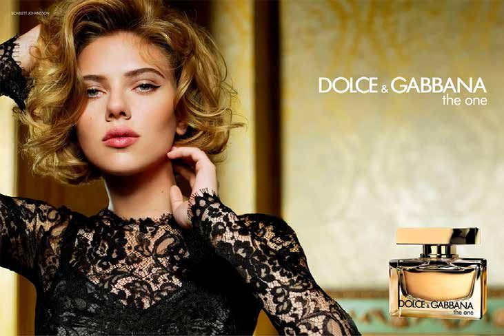
Advertising Dolce&Gabbana The
One, 2009.
Mystica, Marvel superhero, 1978.
debate on the overcoming of the Modernism and egli stesso – Jumpman – con l’inconfondibile sagoma of not coordinated image, which is full of heuristic sperimentazione accademica quanto nella pratica
Postmodernism, and digital revolution9. In this “alata” per animare il brand Air Jordan8. examples11. professionale, un genere nuovo, più attuale, adente
regard, it is important to highlight the rise of a new Tale spostamento da una triade all’altra, grosso In this regard, some of the most important brands allo Zeitgeist e simile al concetto di Liquid Modernity
concept of corporate image in which the logo is no modo tra gli anni Settanta e gli anni Ottanta del in the world have recently adopted a pure dynamic di Zygmunt Bauman10: il marchio dinamico, fluttuan-
longer the core of the concept, but it simply repre- Novecento, va inquadrato all’interno della Terza fase attitude. Few examples can help in clarifying this te, fluido o addirittura liquido, si potrebbe dire alla
sents an important communicative means. della Rivoluzione industriale e dei complessi feno- point. Mtv’s logo (by Manhattan Design, 1918) was Bauman. Quest’artefatto comunicativo “mutante”
This change has become relevant in the phase meni che vi sono connessi: globalizzazione, dibattito characterized by a pre-established shape whose – quasi fosse un supereroe della Marvel – è sapien-
of brand planning, which, similarly to Bauman’s sul superamento del Moderno e sul Postmoderno, colors changed depending on the context. Although temente progettato per assumere configurazioni via 9. This is described in the last
chapter of Corporate Image. Un
concept of Liquid Modernity10, it has become more rivoluzione informatico-digitale ecc.9 Per quanto Google has been reinterpreting its logo since 1998, via diverse, perché il progetto non sta nella forma ma secolo di immagine coordinata
dall'AEG alla Nike (Lupetti,
dynamic, fluctuating, fluid or even liquid in order riguarda ciò che c’interessa più da vicino, quel che it is highly recognizable because colors have been nel processo. Tale approccio è basato sull’idea che «il Milano 2005), an essay that, with
to adhere to the current Zeitgeist. This changing s’intuisce è l’emergere di una (corporate) image-at- arranged following a specific order that facilitates marchio è il processo», affermata da S. Caprioli e P. great pleasure, I have written
with Vanni Pasca.
communicative means has been consciously pro- mosfera – più che di una (corporate) image-marchio the recognition. Nordkyn is a touristic Norwegian Corraini nel loro in un breve – ma intenso – Manuale 10. Zygmut Bauman, Liquid
jected to be able to take different forms since the – della quale il marchio non è più il fulcro fondante island whose logo can be defined as generative, di immagine non coordinata, ricco di esempi Modernity, Policy Press |
Blackwell Publisher Ltd, London |
project does not lie on the form, but on the pro- ma semplicemente un importante artefatto comuni- for it changes according to the data provided by euristici11. Oxford 2000.
cess. This approach is based on the idea that «the cativo tra gli altri. a weather station. Casa da Musica is the biggest A tal proposito, alcuni marchi, influenti a livel- 11. Stefano Caprioli | Pietro
brand is the process», expressed by S. Caprioli and Per quanto riguarda la progettazione del mar- Portuguese concert hall whose graphic project lo planetario, hanno recentemente adottato un Corraini, Manuale di imagine non
coordinata, Corraini, Mantova
P. Corraini in their short, yet intense, book Manual chio, negli ultimi tempi si è affermato, tanto nella was created by Stefan Sagmeister; its logo is a 3D indirizzo squisitamente dinamico. Qualche esempio 2005, p. 28.
_ 28   _SICILIAINFORMA_NUMERO SPECIALE_                                                                                       _HONG KONG-PALERMO | FLUID CITIES_                              29 _

                                                                                                                                                                   Mtv, original logo by Manhattan
                                                                                                                                                                   Design, 1986.
                                                                                                                                                                   Neue, generative identity of
                                                                                                                                                                   Nordkyn, 2010.
                                                                                                                                                                   Neue, one of the various
                                                                                                                                                                   configurations of Nordkyn logo,
                                                                                                                                                                   2010.
                                                                                                                                                                   Office for Metropolitan
                                                                                                                                                                   Architecture | Rem Kolas, Casa
                                                                                                                                                                   da Música, 2005.
                                                                                                                                                                   Stefan Sagmeister, Casa da
                                                                                                                                                                   Música dynamic logo, 1986.
                                                                                                                                                                   Richard The and E. Roon Kang,
                                                                                                                                                                   beams of coloured lights of MIT
                                                                                                                                                                   Media Lab logo, 2011.
                                                                                                                                                                   Richard The and E. Roon Kang,
                                                                                                                                                                   some of the many MIT Media Lab
                                                                                                                                                                   dynamic logos, 2011.
                                                                                                                                                                   The Stone Twins, redesign of
                                                                                                                                                                   the (dynamic) logo of Design
                                                                                                                                                                   Eindhiven Academy, 2010.

       model of the polyhedron-shape building composed             può aiutare a chiarire questo punto. Il marchio Mtv
       by 17 faces. In this project, special software (Logo        (Manhattan Design, 1918) si caratterizza per forme
       Generator) takes the main colors from the poster,           e posizioni prestabilite in una moltitudine di colori e
       which features the event, and screens them on the           decori. Benché il marchio Google sia stato reinter-
       external faces of the concert hall. The logo of MIT         pretato di continuo dal 1998, è sempre riconoscibile
       Media Lab (2011) is based on three cones of colored         perché i colori si trovano in un preciso ordine iden-
       light, which represent technology, multimedia, and          tificativo. Nordkyn è un’isola turistica norvegese il
       design, through which an algorithm creates 40.000           cui marchio è di tipo “generativo” nella misura in cui
       different configurations using 12 colors, in so doing        la forma muta in relazione ai dati provenienti da una
       each teacher or student is provided with a person-          stazione meteo. La Casa da Musica è la più grande
       al logo12. A further example is represented by the          concert hall portoghese il cui marchio è stato proget-
       Design Academy of Eindhoven, whose stylised “E” is          tato di Stefan Sagmeister; la sua configurazione è
       liable to be filled in by a calligraphic lettering, three   regolata da un software, Logo Generator, che applica
       key words or a slogan.                                      sulle 17 facce del marchio (una stilizzazione tridimen-
       An analysis of the above-mentioned examples shows           sionale dell’edifico) una palette di 17 colori ricavati
       that the concept of corporate image has changed             da qualsiasi immagine per contrassegnare di volta
                                                                                                                                                                   12. The MIT Lab logo was re-
       completely in the last thirty years. Between the            in volta l’evento. Il marchio del MIT Media Lab (2010)                                          elaborated in 2014. For further
       1970s and 1980s logo (as well as typographic char-          è basato su tre riflettori (fasci di luce colorata), che                                        information see: Dario Russo,
                                                                                                                                                                   UNIPA | L’immagine della cultura,
       acter and range of color) started losing its impor-         simboleggiano Tecnologia, Multimedia e Design, tali                                             in Dario Russo (edited by),
       tance, conversely the popular imagination related to        da riprodurre – virtualmente – ben 40.000 confi-                                                Identità | I colori del progetto,
                                                                                                                                                                   Palermo University Press 2017,
       the brand has become the new focus since the 80s.           gurazioni con 12 colori attraverso un algoritmo, che                                            pp. 138-143.
_ 30                               _SICILIAINFORMA_NUMERO SPECIALE_                                                                                                                                                          _HONG KONG-PALERMO | FLUID CITIES_                                              31 _

 Red Bull, Felix the best, 2012.
 Autore, Impossible is Nothing
 advertising, 2016.

                                   In this regard, it is essential to understand the im-     assicura a ciascun docente e studente un marchio           under discussion concerns the brand or the ideas?         della pagina Facebook). Non c’è dubbio che que-
                                   plications that this change has brought in this field.    personale12. Infine il marchio della Design Academy        Commercial ideas or values? Economic values or            sto lavoro è un’attività molto utile per un’azienda.
                                   Despite this new trend, many professional designers       di Eindhoven si risolve in una “E” stilizzata che può      lifestyle? It is possible to answer these questions un-   Tuttavia, nell’intenzione di raggiungere importanti
                                   keep projecting the corporate image focusing almost       essere riempita di volta in volta con un logotipo calli-   derlining the fact that nowadays our lifestyle is de-     risultati in termini d’immagine (corporate image),
                                   exclusively on the logo. It is only in a second phase     grafico o tre parole-chiave oppure uno slogan.             termined by the most prestigious companies, where         visibilità, “posizionamento”, è necessario sviluppare
                                   of the project that the popular imagination related       Un’analisi degli esempi menzionati mostra che il con-      the term prestigious is here identified with wealth14.    una strategia sui concetti fondamentali, sulle idee,
                                   to the company is developed and shaped through            cetto di corporate image è totalmente cambiato negli       The brand represents now a model to follow and im-        sui valori connessi all’azienda o meglio all’immagine         13. In this regard, the origins of
                                                                                                                                                                                                                                                                                corporate image could be tracked
                                   specific communicative items such as business cards       ultimi trent’anni. Se tra gli anni Settanta e Ottanta      itate. As Fulvio Carmagnola and Marco Senaldi have        dell’azienda che s’intende progettare.                        back to the symbolic elements
                                   or websites. There is no doubt that this work has         il marchio (come pure il carattere tipografico e la        pointed out, «goods are no longer items to be used,       La marca o brand, per usare un termine anglo-ame-             codified in the art of heraldry
                                                                                                                                                                                                                                                                                by Federico Barbarossa around
                                   a great importance for the company. However, to           gamma cromatica) comincia a perdere centralità,            but they carry specific meanings and values»15.           ricano, più che un segno grafico, quindi un’immagine          1150. See: Aa. Vv. L’Encyclopedie
                                   achieve significant results in terms of image, visibil-   l’impalpabile quanto cruciale atmosfera della marca        This new way to perceive the brand has some collat-       su carta, funziona ora come un’immagine mentale. In           Diderot et D’Alambert. Blasoni
                                                                                                                                                                                                                                                                                e araldica, raccolta di tavole,
                                   ity, and popularity it is necessary to develop a new      diventa il fulcro della strategia di corporate image       eral effects. Considering how deep is the influence        altre parole, è un’idea o, meglio, un insieme di idee         Libritalia, s.l. 2000.
                                   strategy focusing on ideas, values, and concepts          dagli anni ottanta. In cosa consiste allora questo         of brands in modern societies, Ugo Volli has won-         che sfumano in un’atmosfera, una sensazione, che              14. For more information about
                                                                                                                                                                                                                                                                                goods fascination and lifestyle
                                   that represent the base upon which the company            spostamento dal marchio alla marca? Dal segno gra-         dered if our values can be the same values carried        dev’essere progettata in modo quanto più possibi-             see: Dario Russo, Il lato oscuro
                                   has been created.                                         fico all’atmosfera? Nonostante i nuovi trend, ancora       by these brands16. In somehow brands have a demo-         le convincente, desiderabile e sexy. Deve attrarre,           del design. Lupetti, Milano 2013.
                                                                                                                                                                                                                                                                                15. Fulvio Carmagnola | Marco
                                   This is due to the fact that the brand cannot be          oggi alcuni professionisti continuano a progettare la      nian and misleading nature, and designers project         quest’atmosfera, dare un senso di piacere ma anche            Senaldi, Synopsis. Introduzione
                                   longer considered simply as a graphic image, it is        corporate image basandosi quasi esclusivamente sul         commercial images, brands that tell stories and           di elitaria appartenenza; una familiarità, se vogliamo,       all’educazione estetica. Guerini
                                                                                                                                                                                                                                                                                e Associati, Milano 2005, p. 84,
                                   now a mental image. In other words, it is an idea,        marchio, come si faceva un tempo: prima progettano         impose (fake) values within the capitalistic system       che è quella dei re e dell’aristocrazia di un tempo13. Di     my translation.
                                   an atmosphere, a feeling that must be as persua-          il marchio e poi lo declinano, pressoché automatica-       in which everybody is deeply entangled. As design-        che stiamo parlando, di brand o di idee? Di idee com-         16. Ugo Volli, Semiotica della
                                                                                                                                                                                                                                                                                pubblicità. Laterza, Roma-Bari,
                                   sive, attractive and sexy as possible. At the same        mente, negli artefatti comunicativi che sostanziano        ers we are responsible (or guilty) for the creation of    merciali o di valori? Di valori economici o di stili-di-vi-   2003, p. 113: «Nowadays brands
                                   time, the brand must create a sense of pleasure and       l’immagine coordinata dell’azienda o dell’ente per cui     items which trigger our need to buy and consume.          ta, di “lifestyle” (termine proprio del marketing)? Non       have replaced ideologies and
                                                                                                                                                                                                                                                                                religions, or better, if they now
                                   exclusive belonging, similar to the one old aristoc-      lavorano, dal biglietto da visita alla carta intestata,    We cannot do anything about that, it is our nature.       sono forse le aziende più importanti, quelle più pre-         represent our aims and values
                                   racy 13. In the light of what has been said so far, it    compresa la homepage del sito (che vale oggi, in           In this regard, Papenek has provided an enlighten-        stigiose – dato che oggi il prestigio è anche un indice       […] can our values represent
                                                                                                                                                                                                                                                                                the tales of the brands?», my
                                   would be possible to wonder if the main subject           termini di visibilità e quindi di comunicazione, meno      ing and crucial criticism underlining the fact that       commerciale –, a determinare il nostro lifestyle?14 Il        translation.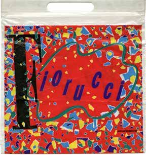
_ 32                               _SICILIAINFORMA_NUMERO SPECIALE_                                                                                                 _HONG KONG-PALERMO | FLUID CITIES_                                          33 _

 Chrisann Brennan, Bit the Apple   the main aim of the industrial designer consists on       brand è un modello verso cui tendere, una sorta di          ha bisogno, con denaro che non ha, allo scopo di            Taylor Hackford, The Devil’s
 advertising, St. Martin’s Press                                                                                                                                                                                     Advocate movie, 1997.
 2013.                             pushing people to buy stuff that they do not need or       ideale, «per il quale le merci non sono valori d’uso ma     impressionare altre persone che non ci pensano per
                                   that cannot afford17.                                      portatori di mondi di senso»15.                             niente, è forse quanto di più falso possa esistere.
                                   However, with this project between Palermo and            Questo nuovo modo di percepire i brand ci espone a          Subito dopo arriva la progettazione industriale, che
                                   Hong Kong we have now the possibility of redemp-          non pochi effetti collaterali: se «le marche sono ciò        appiana le sgargianti idiozie propagandate dagli
                                   tion. We do not aim at projecting a persuasive and        che oggi sostituisce ideologie e religioni, insomma         esperti pubblicitari»17.
                                   seductive brand that prompts the need to buy a            l’insieme dei fini e dei valori […] possono essere i        In questo caso, però, tra Palermo e Honk Kong abbia-
                                   specific product. Rather, our goal is to develop an       nostri valori le favole delle marche?»16. Del resto, per    mo ora una possibilità di redenzione. Non si tratta di
                                   urban image which identifies and promotes the true        certi versi, il brand ha in sé una natura demoniaca,        progettare l’atmosfera seducente e coinvolgente di
                                   local values (genius loci as Romans used to say) and      fuorviante; e i designer progettano immagini “com-          una marca per innescare nel target l’irresistibile de-
                                   their cultural, historical, and symbolic aspects. It is   merciali”, brand, che raccontano storie (storytelling)      siderio di acquistare qualcosa. Si tratta invece di pro-
                                                                                                                                                                                                                     17. Victor Papanek, Design for the
                                   for this reason that in this project we have focused      e impongono (pseudo-)valori all’interno del sistema         gettare un’identità urbana – urban image, si potreb-        Real World: Human Ecology and
                                   our attention on two key-elements such as the water       capitalistico nel quale ci troviamo immersi fino al         be dire – individuando, estetizzando e riprogettando        Social Change, Pantheon Books,
                                                                                                                                                                                                                     New York 1971, p. 7: «There are
                                   and the light, which represent the trait d’union be-      collo, che ci piaccio a no. Come designer siamo pro-        i veri valori del luogo (genius loci, dicevano i Latini):   professions more harmful than
                                                                                                                                                                                                                     industrial design, but only a
                                   tween Palermo and Hong Kong, since this workshop          gettisti (ir)responsabili di persuasione immaginifica       culturali, storici, simbolici. Pertanto, abbiamo pun-       very few of them. And possibly
                                   is based upon the fields of multidisciplinary and         in direzione commerciale. Non possiamo farci niente:        tato su due elementi-chiave tanto di Palermo quanto         only one profession is phonier.
                                                                                                                                                                                                                     Advertising design, in persuading
                                   multiculturalism, where nothing can be given for          è la nostra natura. Cruciale e profetica è qui la critica   di Hong Kong – la luce e l’acqua –, quali trait-d’union     people to buy things they don't
                                                                                                                                                                                                                     need, with money they don't
                                   granted, and everything is possible.                      di Victor Papanek, in tempi ancora non sospetti:            tra le due città. E il lettore mi perdoni se metto un       have, in order to impress others
                                                                                             «Fra tutte le professioni, una delle più dannose è la       “tratto” francese tra l’Italia e la Cina con traduzione     who don't care, is probably the
                                                                                                                                                                                                                     phoniest field in existence today.
                                                                                             progettazione industriale. Forse, nessuna profes-           in inglese; ma questo workshop nasce all’insegna            Industrial design, by concocting
                                                                                             sione è più falsa. Il disegno pubblicitario, che tende      della multidisciplinarità e della multculturalità, dove     the tawdry idiocies hawked
                                                                                                                                                                                                                     by advertisers, comes a close
                                                                                             a persuadere la gente ad acquistare cose di cui non         nulla è scontato e tutto è possibile.                       second».
Puoi anche leggere